But it is usual that the iPad landscape view will display desktop, isn’t it? You need a solution to prevent displaying the parallax feature on iOS Safari browsers.
It’s not Blocs. Your setup should work fine on tablet (landscape) but when you rotate to portrait it will make the three pictures very small. You need to select the 3 picture row and in the side bar there are two views, the second is display images vertical. Then the three pictures will display one at a time.
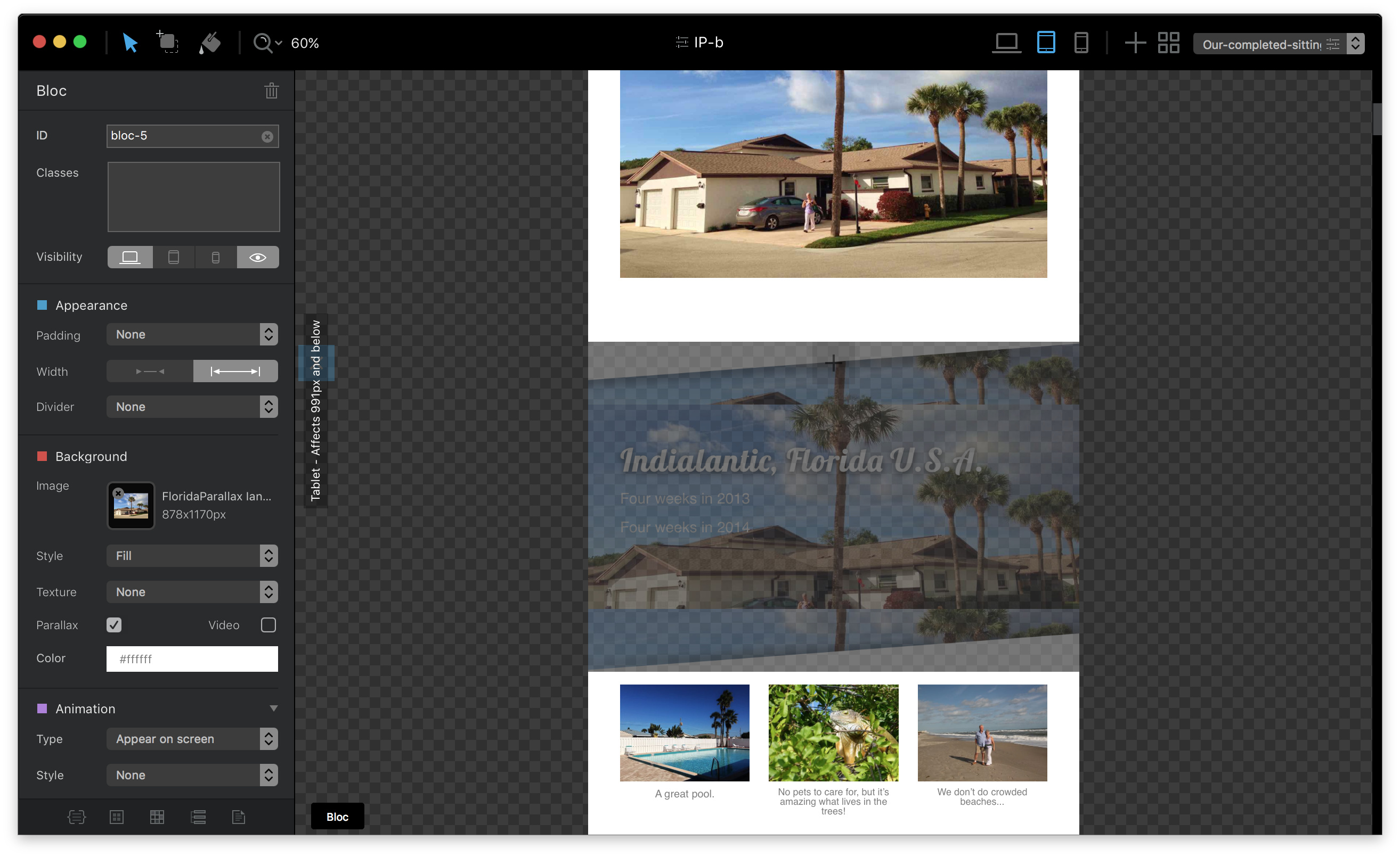
The parallax feature on the desktop version works fine but on the tablet it becomes a static image.
You have to design around this. As BlocsAsddon correctly pointed out, iPad landscape is considered desktop width. My advice is to remove the parallax effect and just use a single image.
Just because a feature exists it doesn’t mean that you have to use it for your application. Good design is using a design that everyone can see on all devices. IMHO parallax effects are dated and often problematic on slow older devices.
If iPads could be prevented from seeing non-functioning areas of desktop content, it would be a useful feature.
Google can tell me how many iPads access my websites because it can identify devices. Apple’s own website handles parallax on different devices, showing it or not, according to device.
I expected Blocs to be able to do similar, and show/hide content appropriately.
So I’m having to compromise the desktop version so it will work on iPads, where I didn’t want to use it anyway.
Blocs does a lot of things but it can’t do everything. It’s possible to write browser/OS specific CSS but its not something I’d add controls for in Blocs.
Before I continue, I should mention it’s possible to change anything with Blocs by writing your own CSS code tweaks and attaching the additional style sheet to a page in the page settings.
I’m not sure I fully understand the issue, in Blocs parallax is switched off on the Screen dimantions of an iPad, and below the 768 breakpoint. Maybe something in your site (an additional style etc) is preventing this or maybe your iPad screen size is different from the one targeted in the Blocs code.
When parallax switches off on mobile/tablet you get a standard background effect. Are you not getting that, I can’t tell from your screen shot?
If you can share the following I’ll do some tests:
iPad model( screen size)
Live URL with issue
Notes on what section is problematic.
If this is a weakness in Blocs, let’s work together to make Blocs even better!
While I don’t have an iPad, I am beginning to think this is a real issue with Mobile Safari that may need addressing. @Ian can you install Chrome on your iPad and tell us if it renders in landscape as expected. It does here on an Android tablet, but I have an associate that says the same site on iPad is just nuts.
I am having him send me screen shots and will post again after I have a look.
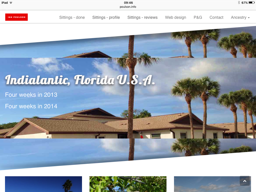
It renders the same on both browsers. No parallax on either browsers looking at landscape mode. It shows the original full screen photo and then repeats the smaller background image with one showing the play sacrament’s and as you scroll down it show the same background with stellar facilities.
It renders fine here on Android. It also renders fine in Safari “responsive design mode” on desktop, but not as it should as iPad modes all render with parallax (sigh Apple).
I have different blocs designed to be shown on desktop versus mobile. On desktop they are semi-transparent over parallax, and on tablet and phone they have an opaque white background.
@Ian does it render correctly when the iPad is in portrait orientation?
On my iPad mini it is certainly different from landscape, which renders well - in portrait it’s missing backgrounds and if you look closely has double-rendered text (same as mine).
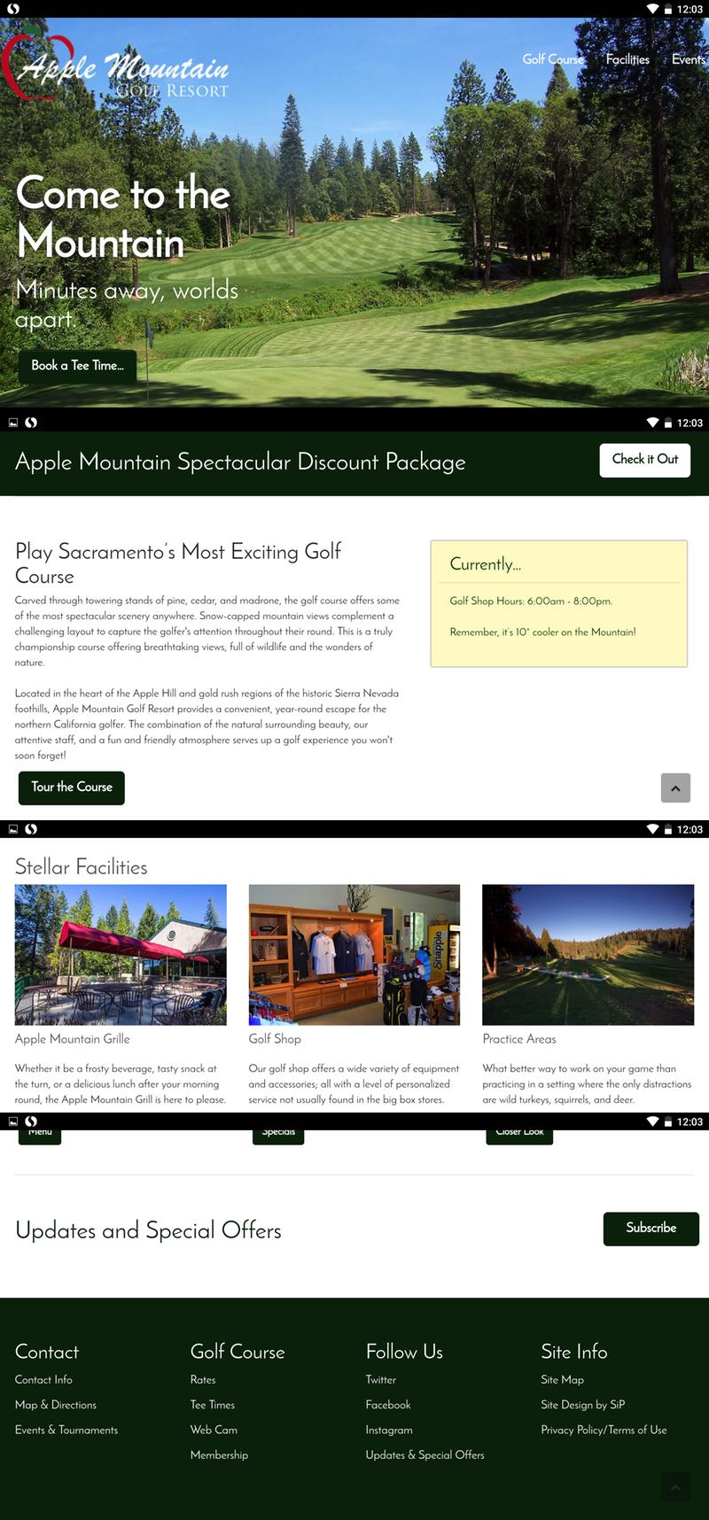
You also have two text boxes escaping to the right, ‘Check it out’ and ‘Subscribe’.
Well… that is really unfortunate. Here, it all renders fine on two Android phones, two tablets, and even an old iPod Touch running iOS 6! I wouldn’t have thought that I had to physically test on an iPad but it appears that Responsive Design Mode is utterly worthless in Safari desktop… and Apple has screwed the pooch again on the iPad (BTW did you say which model you’re using?).
Still waiting for screen captures from an associate with a 9.7" Pro to see what’s going on there.
Hi Norm, I’ll have to get back to you on Friday on this. Thanks for the text width tip, I’d never have worked that one out. Now, bizarrely, my Asset Manager has lost ALL images EXCEPT the previously missing parallax ones I sent you via Dropbox. The images remain on the canvas and publish fine though. Bizarre!