My background is in professional photography and coincidentally also went to Plymouth College of Art.
I have only looked at this briefly on a desktop, but that must have been quite a lot of work putting it all together. The text could stand being a little larger for easy reading. I like the large carousel images at the top of the pages and you have done well to maintain a consistent look.
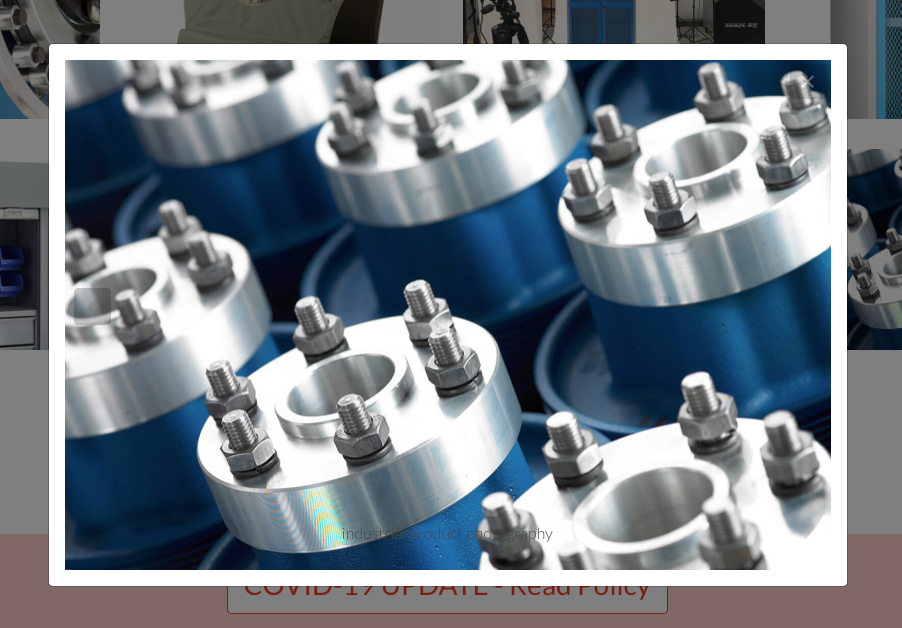
It wouldn’t hurt to add a little colour to break things up and also draw attention to areas of importance, such as the view portfolio buttons. Also I noted that the arrows in the masonry popups like the one below are barely visible, making navigation less clear.
Good to hear from another ex Plymouth College of Art student and thanks for the feedback it’s really appreciated.
The arrow buttons defiantly need addressing, you’re right they are not visible of some of the images, also I’ll take a look at increasing the text size. Maybe some colour would help break things up, I’ll experiment with adding some.
I basically felt the overall impression was a bit too grey. It’s common for photographers to use grey, white or black and that is fine in itself, however you could definitely introduce a bit more contrast in the design to give it some punch without distracting from the images.
As an example, you could include sections with dark backgrounds and light text to break things up a little. Perhaps the top area below the carousel with some text and the view portfolio button could be dark with light text and a contrasting button that creates a call to action.
This creates more visual interest on the site, but also makes it easier to navigate and separates areas of key interest. A prime case for this could be the footer area, so visitors understand they are reaching the bottom of the site and that the area is separate from the main body.
Don’t be afraid to create areas with more negative space, so there is room to breath and emphasise key points. On your contact page for example, you have your title crammed up just underneath the menu and then allow very little space between that and the contact form below. This makes it harder to read and loses the emphasis on your key points. Presumably you will have clients who are art directors, so they will want to think you have some appreciation of graphic layouts.
One other point I forgot to add. Try using the clean url export option. It leads to better looking urls when you send them out or for marketing purposes.
Thanks, it’s amazing how many former Plymouth College of Art students I come across in my work.
I’ve experimented with some of your suggestions and updated my website accordingly. It’s still probably a bit grey, typical of photographers as you said, but hopefully by changing the backgrounds it has more punch…
That’s a definite improvement. I would experiment by trying to place certain areas as white text on black instead. That would give you a bit more visual impact.
You could try that here https://www.sv-photography.co.uk where it says PROFESSIONAL COMMERCIAL PHOTOGRAPHER and also lower down where you have the phone number for example.
I’ve added more dark backgrounds to highlight the text and moved the page title to above the carousel, plus a few move tweaks to make the mobile version a better experience. I’m fairly pleased with the result now
Thanks for all your help.
That is looking better. Try making that view portfolio button black with white text and see how it looks. The point is that you presumably want visitors to view the portfolio there so you want some contrast to grab their attention.