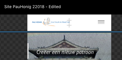
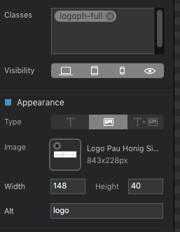
I placed a logo in the nav section. Desktop and tablet shows the logo well… but in the phone view the logo is far too small. But I can’t resize it with the classmanager or giving it new dimensions in the ‘Appearance’ tab…
Resizing objects is far from being intuitive, there must be an easy way to achieve a bigger logo in the phonemode… Anyone out there who’s got a clue how?
In the desktop view: don’t set the width to anything in the sidebar UI - you’re default image size looks reasonable
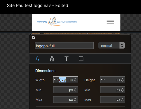
In tablet view: in your logoph-full set the max width to roughly 600px
In phone view: in your logoph-full set the max width to roughly 320px (It will push the nav hamburger down, but the desire was to get a large image in phone view)
Thanks Bill, I will give it a try. I’ll check first my settings in desktop mode, or re-import the logo from the assets menu.
I discovered that the hamburger was pushed down when setting max width, but the logo didn’t change, only the bounding box got bigger.
As far as I’m concerned things shoud work in the way as you already said Bill, and I’ve already done that many many times. In Desktop and Tablet mode I can change dimensions, its the phone version that seems to be sticked at something… moving the sliders a little movement occurs in de boundingbvox but the logo stays the same. Side UI bar odes nothin at all either… Annoying this.
@Norm This could be done a lot easier I suppose… and more intuitive?
the logo in the screen shots looks the correct size IMO on mobile, considering it has the menu to consider too, it takes up less space which is a priority on mobile.
My thoughts aside, I think the logo is fixed to a specific size and placement on mobile by design, I’ll take a look at making it possible to change this.
Hi Norm, I would like to place it full width on top, if I change the bounding box then the Hamburger goes beneath it…thats fine.
I can see now small movements when moving the slider upwards or changing dimensions, but then it gets stucked.
And I can’t break up the logo in two pieces because that affects the tablet and desktop mode also.
Hey you can style the logo in Blocs on mobile to have a bigger image you just need to use the correct class type.
Rather than add a class to the logo link you will need to target the actual image within the link.
To do this you must use a subclass, a subclass basically is a class that is not directly attached to the object but will let you control sub parts of the children located within the link.
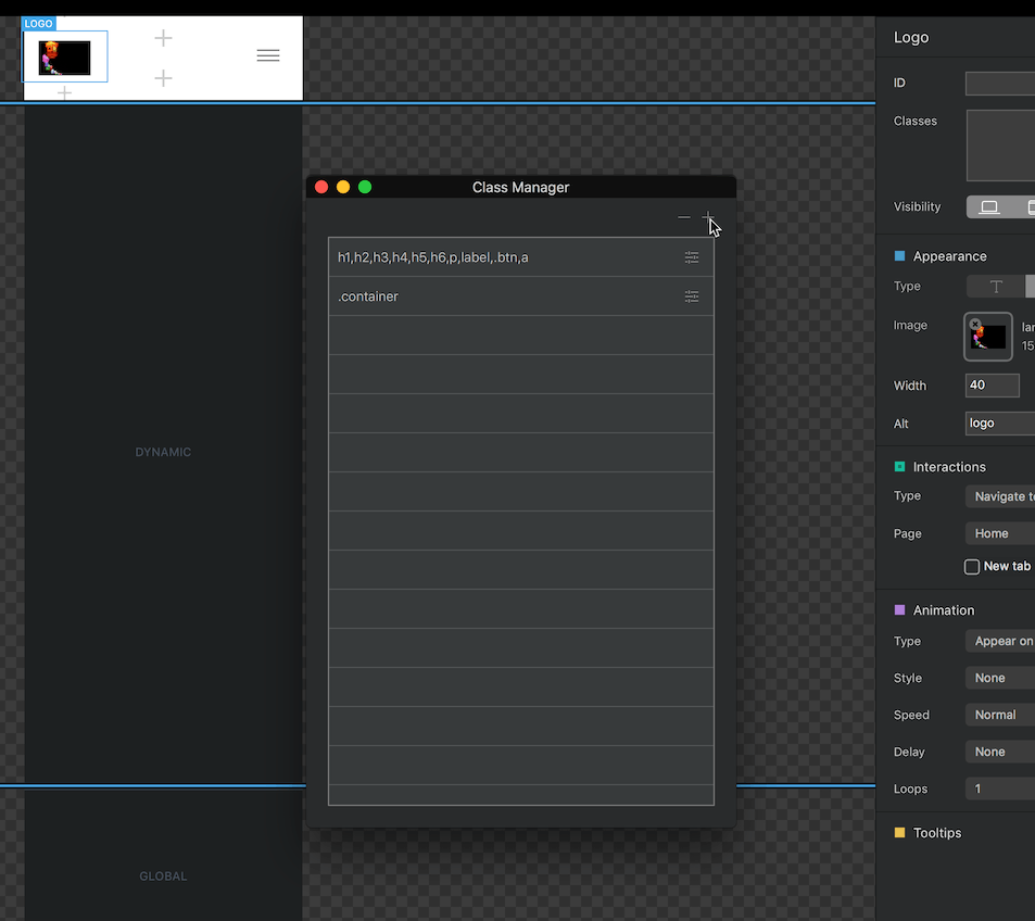
The logo link in Bootstrap 3 has a class name navbar-brand and to target the image within navbar brand via a class we would use img, so the class we need to add is: navbar-brand img.
Now because this class cant be directly added to the item we need to add it via the class Manager, like so.
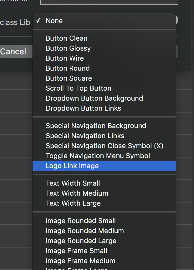
Ive also added a subclass for this in the subclass library in Blocs 2.5, so going forward you just need to use that to auto populate the class name to save you remembering.
@Norm, I have found it helpful to use a LOT of sub classes. How hard would it be to set up the class manager in such a way that we could view the created sub classes in different ways. ie: A-Z, Z-A, Newest, Oldest, Un-Used, etc. The last one is so I know which sub classes I can safely delete. Thanks, Randy
@Norm? Still waiting to hear back from you on this… This forum has been very quiet as of late… Not getting any activity on several posts. Would you rather I connect with you via email? Warm Regards, Randy