Hi.
I’ve rewritten my site and would appreciate any technical or constructive feedback.
APS Woodwork
All the framework and most of the elements were done in Blocs, with some imported code added via html Brics. These were sections of written code, externally built image galleries, and an Instagram plugin.
I have to say a huge thanks and show immense appreciation to @PeteSharp and @Flashman particularly for detailed help and guidance, and lessons from @Eldar as always serve very well.
![]()
As I am a cabinet maker, this wouldn’t be possible for the likes of me without Blocs being so easy to use; so power to @Norm and the team, and all forum members.
In terms of styling don’t be afraid to use contrasting fonts for headers and body text. Loads of advice on the internet about stylish font pairing and it can really transform a site, giving it personality. I would also say that the main paragraph text could be a little heavier and larger for easier legibility. Also place a line space between paragraphs for the same reason.
@apswoodwork, its coming along mate, its a lot faster to load now.
I would not have the testimonies at full width, on a large wide screen its massive and the rest of the content is contained.
As @Flashman said re heading text. Although your font doesn’t support very heavy text as an option, you could use a different complementary font. The main key is consistency.
I really like how you have minimised the site with mainly black and white your kitchen photos stand out.
Don’t be afraid to increase white space. You can use the Bootstrap padding classes on the Divs’. eg P-1, P-2…P-5 or use custom classes.
Hi.
I’ll look into a different alternative font as one doesn’t apply a bold setting.
I like Ubuntu, so I’ll google a complimentary one.
Testimonials size - I’m on a laptop so I never considered that. I’ll set it to 2-8-2 columns on a large screen.
Thanks, Andy
1 Like
Take a look at the websites of top players in your area of business who will have spent big bucks on their websites and see what style of fonts they have gone with. If one or two stand out there is a good chance the fonts had something to do with that.
You are in a very design focussed business with discerning customers, so you need to look at least in the running. Chances are that your competitors will have used premium fonts for good reason, but if you don’t want to go that route at least look for close free alternatives.
Just a few things from my very quick look.
The home page is offset on the right - the right panel tops are lower than the left.
I think the transition (horizontal scroll) timing for your sliders is far too quick - I found them generally uncomfortable to watch, especially when two are visible together!
The site has a lot of content - it almost documents the work of your business entirely, but I think you have far too much content and it’s too much “I” but it should be more about the services offered to the potential customer.
There’s needless replication in the footer of items in the header and the terms used in the header are sometimes different to the footer ( contact me/ message / message me).
The legend of the home page slider should start with a capital B.
Feedback form. Great idea, not sure it’s necessary to have the link on the site, but consider using a follow-up email thanking the client for their business and wishing them many happy times in their new kitchen, together with a link to a feedback page.
I can see you are great at what you do but I think the site should focus more on the personal touch that you give as a craftsman rather than being a comprehensive history of all of the work that you have ever done or are doing and listing every testimonial you have ever received. It may be pleasing to you, but potential clients can’t be bothered about a complete history, they just want assurance of quality and skill and that you are a good match for them.
Less would be more, and the emphasis should be on your craftsman ship, not on documenting past work alone. A case study, a small paragraph on why bespoke craftsmanship is better than mass-market, etc.
It’s just my opinion.
Paul
1 Like
I just noticed your menu jumps on hover too. Since you have a coloured bottom border on hover it will push the text up. You can get around this by adding a white border at the bottom for the normal state.
Thanks @pauland
I’ll take this is it’s intended, as constructive advice, and make some changes.
I do a follow-up email for feedback with the option of emailing back or using the form, so that stays.
The testimonial page; you’re right. I’ve added a lot but had my blinkers on; less is more likely to be noticed.
The footer replication of links needs a tidy up too, I agree.
I thrive in these comments, so thanks,
Andy
Hi @PeteSharp
I thought I had sorted that out, but a cache clean reveals it’s still jumpy.
Good spot thanks.
Hi
@PeteSharp and @pauland
A quick follow-up.
White space 
Testimonial slider (?) can you check please
Jumping links
I liked the off-set panels, but I’ll give level a try
I’ve worked both the slider timings
Text stripped down
Fewer 'I"s
Footer links consistency
Capitalise ‘B’
Feedback discussed
More targeted text
And one that made a huge difference, so I’m keen on any thoughts;
Fonts paired and changed check_mark
Ouch. That’s endless issues I get with SFX bric from Blocs store. I’ll delete the fade in effect.
Also noticed feedback slider is off centre on phone and may need more text stripping out to bare bones quotes.
UPDATE
SFX actions removed due up constant problems (@Whittfield)
Hi Pete.
Which bit of the slider code lifts the prev/next arrows up as I’ve stripped down on the text resulting in a smaller overall div height?
Thanks, Andy
Hey @apswoodwork
I’m only on my phone at the moment. If you look back in your inbox I am pretty sure I mentioned how to adjust that there.
Let me know how you go. I won’t be back on my Mac until later this evening.
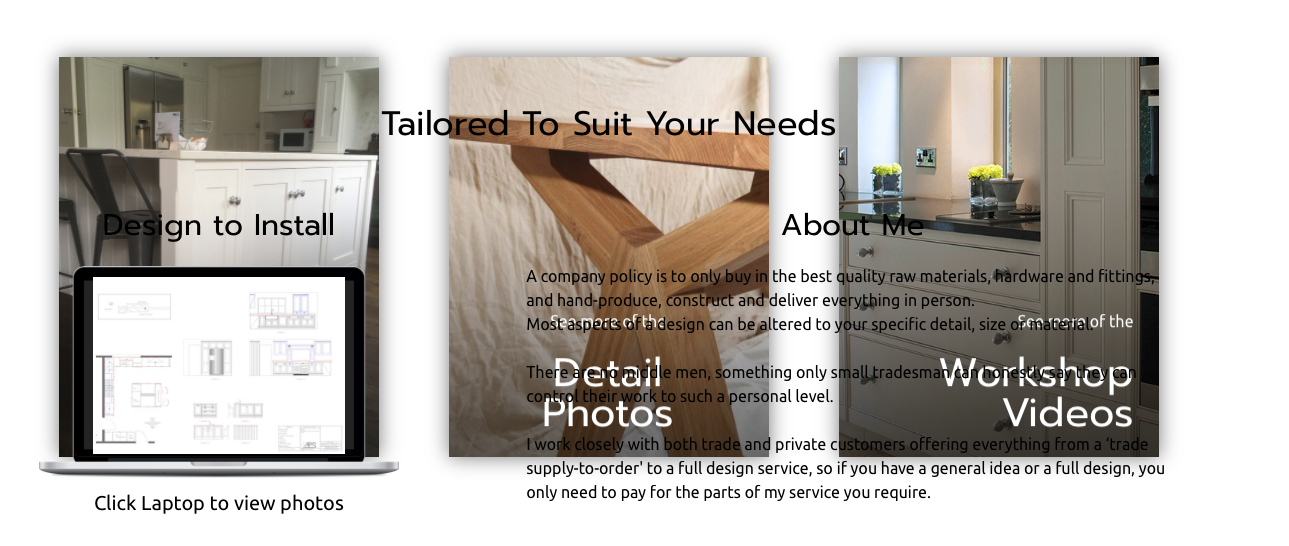
Hi, definitely an improvement, but far from what I would like to see you do, but then it’s my opinion ( though I’m not alone in this), because essentially this is more a site about you than a site about what you can do for a client, nevertheless visitors will be able to see the quality work that you do - we just differ about the most effective way to do that, and in many ways I suspect your website isn’t critical because you probably get a fair number of recommendations and can only cope with a limited amount of work.
I’d like you to look at the testimonials slider and imagine you don’t know what is on each slide. Can you reasonably read the longest testimonial before it’s yanked off-screen? I cant.
The offset blocks on the home page. When I did first see it, it crossed my mind - is this a mistake or intended as a design? The reason I wasn’t sure is that there’s a white-space gap where I don’t expect it and the vertical offset is smaller than I would anticipate, so that led me to think it was a mistake rather than a design feature.
I don’t like the click laptop stuff.
Anyway, I’m sure the site is going to work well for you and I wish you well.
This site ( https://www.carpentrybycraigross.com/ ) is one that is closer to where I think you should be. Not an “I” in sight, no whiz-by sliders, more oriented to what the customer is looking for.
I’ll not make any more comments and leave you to get on with it!
Paul
1 Like
I agree entirely with @pauland. Potential clients are mainly interested in the potential benefits and value they would derive from a product or service being offered.
By all means have an about page with a couple paragraphs of background information, showing how you learned your craft and company values. In reality this should just be used as a second bite at putting forward your sales pitch and establishing some credibility. The rest of the focus across the site should be on the design, materials and other benefits they would obtain if they hired you.
2 Likes
Thanks @pauland and @Flashman
No No No.
That’s ‘no’ to holding back; let me have it with both barrels!
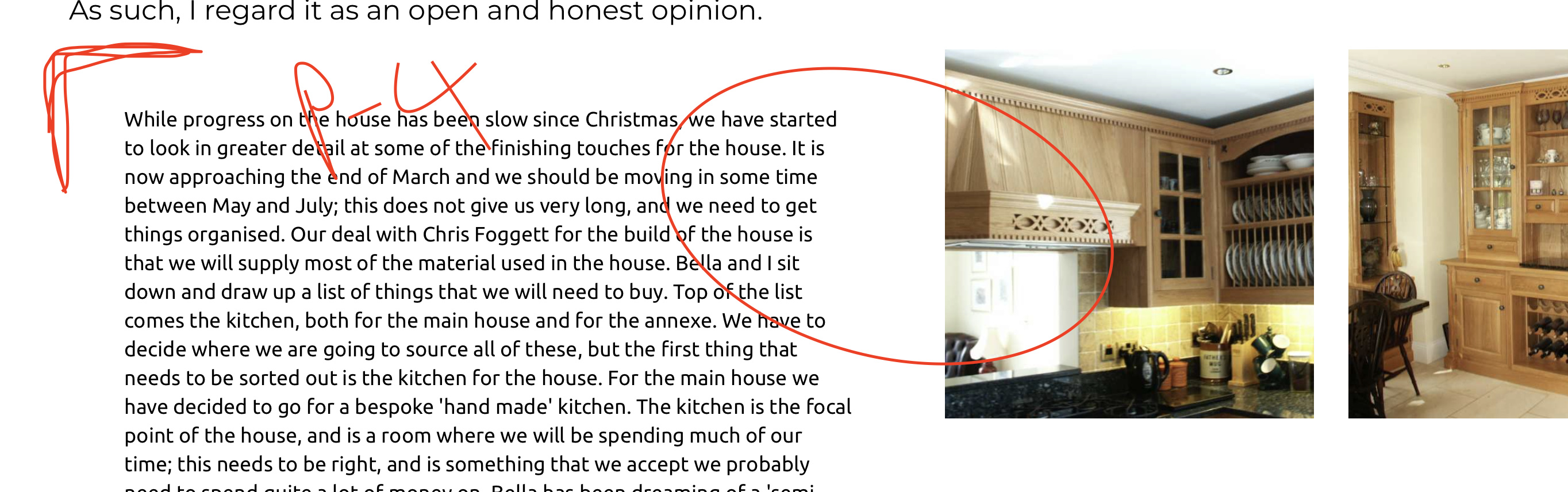
I’ve looked over evolution of this site for 10 years, and there’s nothing better than a fresh, honest opinion.
Yes, it stings but I genuinely appreciate an outsiders perspective as it’s what a client sees, maybe things but would never say.
I want to keep improving it and this all helps.
2 Likes
I can say, from personal experience, that it’s very far from both barrels!
To be fair, you’re doing very well and so many people are probably wondering why I’m suggesting the emphasis is wrong.
The general advice I give to people who are making a website, particularly one that involves sales, is to put yourself in the mindset of the target visitor and not the mindset of the proprietor.
Good to see the excellent kitchens!
One again I agree with @pauland but just to add a further dimension, it’s not just about putting yourself in the mindset of your target customer, you also have to speak their language using the kind of words and phrases they would use and answering the questions they would ask.
1 Like