Hi @apswoodwork
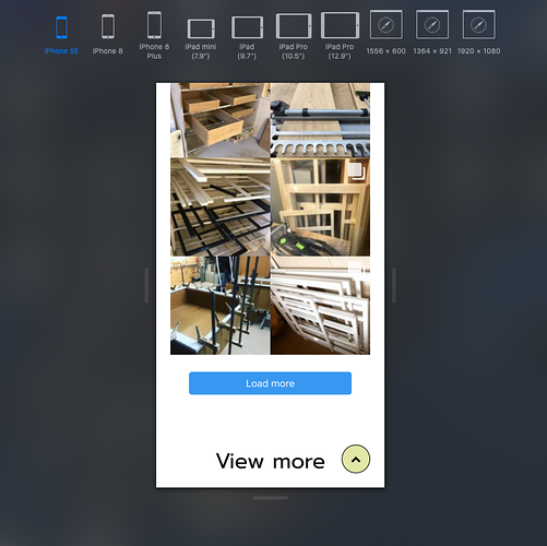
I like how you have progressed from your early days. My only criticism is your images are too small on mobile and don’t do justice to the woodwork (nice dovetails I’d be proud of them  ) @320px let the image take 100% instead of 50% don’t be afraid to make them bigger. Just one question what have you used for the read more effect when loading new images?
Stephen
Hi @steviemc
Thanks for the feedback.
I’m re-rebuilding my site following other constructive comments, so it will change again soon.
The “Load More” button is part of a plugin used for the live Instagram image feed on that Work in Progress section, so its not a Blocs button.
I would assume a simple button with an action to show/hide with itself part of the target would do though.
PS
Is your preview screenshot from Solis?
I never spent the time getting it set up.
Just developer tools in Safari
Hi @Flashman, @pauland, @PeteSharp, @steviemc and all.
Following comments, I’ve re-redone the site with more of an emphasis upon text, visual design and minimal WBS (waffle and bulls##t)!
I’ve taken on board most remarks, still trying to focus on photos with speed’ which has improved massively (53 mobile/93 desktop from Google page insights).
Thanks again, even for the slight stingers! From a new Grandad, Andy
PS I know I still have to hunt down and splat my ‘jumpy’ tabs hover class issue. Padding/margin issue on smaller breakpoints.
First impressions are that it is so much better! I think it’s a much better site now and should be more appealing to visitors and resonate with what they are looking for.
On the downside, the sliders move between too fast and ridiculously fast!
Great improvements clearly visible on a quick glance at the changes.
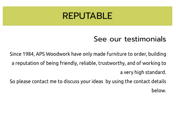
Right aligned text like this is quite jarring and unnatural to read, so I would have that centre aligned in this instance with the two columns. I am not wild about that tone of green and I still think you could be a little more adventurous in your choice of fonts, particularly on the headers. You are selling style and design.
One point worth mentioning is that I once built a set of wooden shelves at school and the finish was pretty rough, yet my parents are still using them some 40 years later. It took me about three months to build and I guess the message here is that it isn’t always easy or pretty when working outside your comfort zone.

Ye, I was thinking of a caps font for the larder H tags anyway; looks more classy.
I kinda like the green myself.
And the image galleries; well I’ve ran out of time today but 'twill be slowed down.
Hi.
Just a quick one.
How do I revise my sitemap now i’ve refreshed my site again following everyones critique?
Things are running much better now thanks.
Getting Google page speed scores of about 60 mobile and 90 desktop (as a benchmark only)
Andy
You could either export it again from Blocs or use an external site and upload via FTP. I can do you one with Scrutiny, however you would probably do well to have a go with the demo of Integrity Plus or better still Integrity Pro and then buy one if you find this useful. These are from the same developer that also makes Scrutiny and just simplified alternatives that both produce sitemaps.
Hi @apswoodwork,
I’m sorry to hear you had issues with SFX that couldn’t be resolved.
If you send me a file I will take a look. It’s probably a conflict of css, mixing of scroll effects with Blocs effects or something very similar.
The issues I see in the thread sound like potential conflicts that might be effecting SFX rather than caused by. That’s possible for sure. Are you using other brics?, are you getting javascript errors on the site, are you mixing SFX and Blocs core animation?
anyway, I’m happy to take a look at a .blocs file or something.
-Whittfield
Hi.
So after mush advice, guidance and assistance from form members, I think I’m finally there.
Much thanks to @PeteSharp, @Flashman , @pauland, a detail spotted by the eagle eyed @steviemc, and other members.
Praise indeed goes out to all, along with that bloke who makes this Blocs thing! (@Norm)
1 Like
Nice website, congratulations! I like the white space around and the solutions you’ve found to showcase your work. My only comment would be about the navigation bar on top, as it disappears when scrolling down (then you have to scroll back up to navigate to another page). Perhaps making it sticky will improve the user experience, but this is only my opinion.
But overall, great job!
Cheers,
Alberto
1 Like
Thanks for your feedback @centurion_basso
I keep thinking about the screen space free for the site content on mobiles devices as most traffic is not on a computer screen.
That’s my thoughts on sticky, but I may give it another try. It has been a sticky nav up to now.
1 Like
You could make it sticky only on larger screen sizes if you wanted too.
One method would be to use a media query in CSS in the header and override the sticky class for smaller breakpoints.
A slightly more complicated method would be having the menu appear when someone starts scrolling up.
1 Like
Ok. I didn’t know you could do that.
I’ll send you some css to put in your header tomorrow if you like Andy.
1 Like
Pete.
I’ve changed to a sticky but styled it to be slim, so all’s good here ta.
1 Like
 ) @320px let the image take 100% instead of 50% don’t be afraid to make them bigger. Just one question what have you used for the read more effect when loading new images?
