I really cannot make a row with five columns and each column an image, the images have to be placed one below the other on an iPhone. With desktop, nicely next to each other over the total width of the screen. 
Can someone help me. Thank you. 
I would be surprised if you could get 3 side-by-side images to display on an iPhone in Portrait orientation. With Landscape, 3 to 4 would be reasonable. Five would mean very tiny icon-sized graphics.
Have a look at my Blocs-made website here on a desktop computer and scroll to the Popular section. Then narrow the browser window width and note at the most narrow width each graphic sits on its own row. I like it that way because each graphic is big enough to actually see. Having multiple graphics side-by-side on an iPhone in Portrait orientation really does make them hard to see.
If I am totally misunderstanding what you mean, it would be appreciated if you could upload an example page for us to test.
1 Like
@JDW Well-made site! 
With this website I succeeded with 4 images, but I don’t know how I did this. 
So it should also work with 5 images.
http://www.knol.be
5 images would be too many. If you shrink the width of the browser window to just before LG changes to MD (MD is where you first see the burger menu icon), you will see that the 4 images are already very small. Adding a 5th would make them too small to see.
In MD (Tablet), I would suggest you have two images side by side (two columns). That would probably look fine in SM too. Then in XS there would only be 1 image per row.
It’s all about putting the images into their own columns and then letting the columns shrink and then move to different rows in a way that your graphics still are big enough to see the text clearly.
1 Like
The biggest issue is Bootstrap uses 12 columns. The way around this is to create a 1 col Bloc, place a Div in that column, give it a class and set the display to inline flex. Then add Divs inside that one, with a width of 20%, and inside those place an image. Adjust the % of the inner divs by breakpoint.
Example Bloc (Blocs 4, and I only set the LG and SM % on the inner Div.)
5 Image Bloc.bex (8.9 KB)
@JDW 5 is not always too small, a lot has to do with content and design.
1 Like
Thank you 
It works great!
I wanted to get this result.
You have made a very happy man 

1 Like
If you wanted some space between the images, add padding to the inner wrapper.
Change the % to suit the number of images per breakpoint. Again also on the inner wrapper
If you using a mix of landscape and portrait images, you would do a different approach.
1 Like
I just discovered this, add padding and have the desired result
(hyperlink removed, page not more needed)
THX
I’m definitely going to need this a lot, so I’m going to dig into it a bit too.
1 Like
Yep, you’re getting it.
1 Like
Well done.
While it might work on Desktop with 5 Columns (I personally would not use 5 cols unless the client demands it against my advice or if it’s a perfect fit from a design point of view) it just just doesn’t look good on my iPhone XR in landscape. It just feels and looks weird having 1 col on mobile portrait view and suddenly 5 cols in landscape, which is barely double the width of portrait on most smartphones.
From a design point of view, I would overthink that decision. Not everything that can be done should be done 
3 Likes
I agree with you 100%, but it is the customer who wants this, has just heard by telephone that he wants it on another page. 
Customer is king, says me here in Flanders
Der Kunde ist König Sometimes Kings need a good advisor though, to prevent them from making terrible mistakes. Can’t help it if they ignore them though 
2 Likes
De klant is koning, maar de waard is de keizer! 
2 Likes
Precisely my point. The currently design incorporates some rather important content that personally looks too small to me; specifically, the button titled KIJK VERDER. Here’s a full screen screenshot taken on my 15" MBP in Safari of the version of @eriks’ page that he said is “the desired result” :
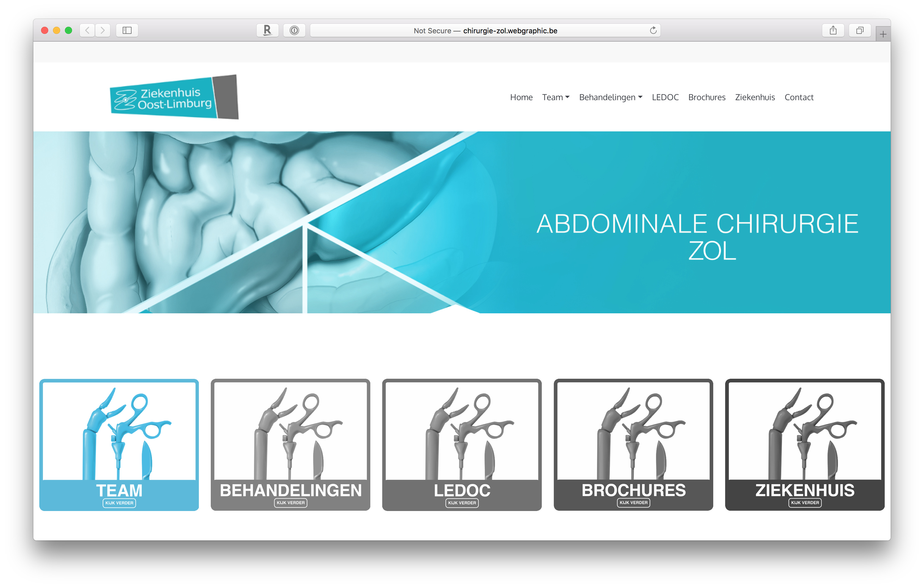
Now consider the following screenshot after I narrowed the browser window width to the minimum width before LG switches to the MD breakpoint:
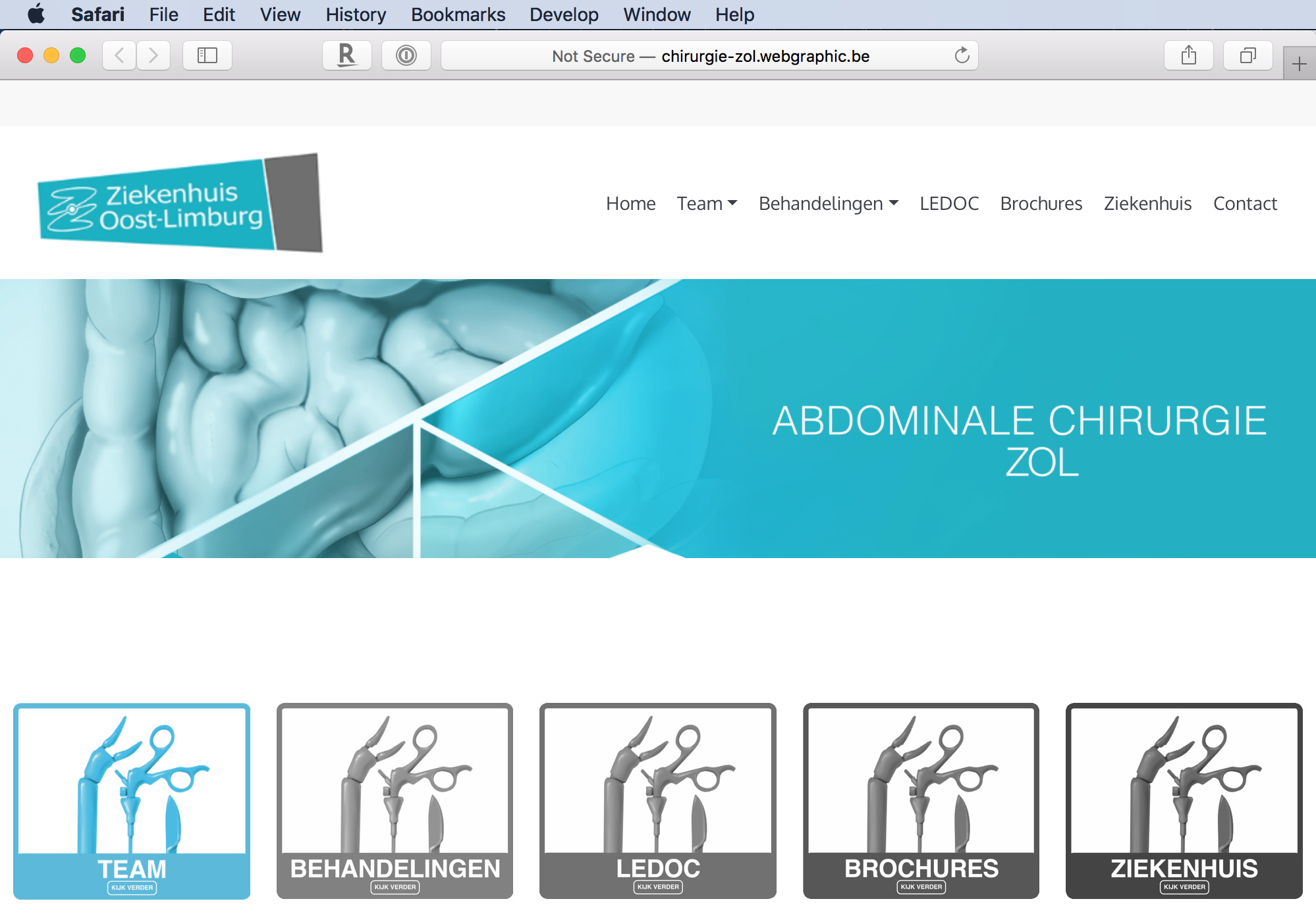
Make that teensy, tiny button bigger when using 5 side-by-side columns of graphics in the LG breakpoint will indeed look fine. It’s a small change yielding a big, positive result. So, yes, design is key. And my point was and still is that it is easier to achieve content that doesn’t get too small when using fewer horizontally side-by-side columns.
The customer is indeed always right, and after living 26 years here in Japan, I certainly know that. But I also know the customer is as fickle as wind and change their minds constantly, either after scrutinizing a completed site for a while or running it through some page checker which flags content as being too small.
Another potential issue with that “desired result” page is the fact what when I just now tested it in Safari and shrunk the window width to the SM breakpoint (i.e., an iPhone rotated into Landscape), there is only 1 graphic per row. If that is what the client wants, I think it is fine, but you then have somewhat of the opposite situation where everything appears too big until you continue shrinking the browser window width further into the XS breakpoint. That is why I said in my earlier post that I personally tend to put 2 columns side-by-side in SM, reserving 1 column per row only for XS, since you have the width in SM to accommodate 2 columns and still make content look large enough, yet not too large, at both the beginning and end horizontal size of that SM breakpoint. Yes, that is my personally thinking, but technically speaking, we all our providing our own personal thoughts when talking about designs here in this forum.
All of these are design decisions that go hand-in-hand with what the client wants. And here in Japan, many times the client feels strongly about what they want until they see something long enough and with adequate recommendations about alternative, possibly better designs.
In the end, I can only offer design advice on what looks good to me and what will likely avoid getting any oddball content flags when the page is run through a tester.
Best wishes to you, @eriks, as you continue to explore Blocs and learn more through experience over time. In my own case, it really takes take a lot of hours in Blocs, testing numerous designs, to better understand what really works well and what doesn’t, in combination with the demands of your client.
Exactly. You can always do what they want, then create one that looks better and show them why. In this case it would be very easy to do that.
I fully agree with your comments.
There have been many e-mails and phone calls about the 5 blocks, i have offered him several visual alternatives, but for this customer it is a must! 
Regarding ‘look further’, I also pointed out to him that it is much too small and I hope that this reference may be removed. It is true that the images are made via the customer and in the first phase there was no mention of ‘look further’.