Thanks a lot everybody for working on this. I had better show gratitude now and pretty quickly apply it to my still odd panels that triggered this cooperative effort.
Enjoy your days
Richard
Thanks a lot everybody for working on this. I had better show gratitude now and pretty quickly apply it to my still odd panels that triggered this cooperative effort.
Enjoy your days
Richard
That video was made using older version of Blocs. I can’t get the Same Height bric to work in 3.2.2. There is no Panel bric in the newest version of Blocs that I can see either. The closest equivalent would seem to be a “card.” But when I try to insert the Same Height bric into my card, “Heading 1” is inserted instead. Is there a workaround to get the same-height trick to work in Blocs 3.2.2?
UPDATE: As per the 90-point guy (Kerry7777) in this StackOverflow thread, I put two Cards into a single column and then typed “d-flex” in the Classes field of of that Column, which instantly made the height of the two cards the same. Great! He also suggests using the class “align-items-stretch” but I tried adding that class too but cannot see any difference with or without it.
PROBLEM: The two “d-flex” Cards are too narrow side-by-side in SM & XS and I cannot figure out how to make them widen to 100% (so one card sits atop the other in SM & XS only). You can see the problem in my document here (be sure to click on the “contact” page to see it):
Archive-fixed.zip (3.8 MB)
(My aim is to recreate in Blocs the content on my existing non-responsive webpage here.)
Any tutorial to use sameHeight Bric?
Hi @Zixuan
The only tutorial is the video on it: https://www.bricsdesign.com/sameheight.html
If you have any other specific questions, let me know.
Bill
BricsDesign
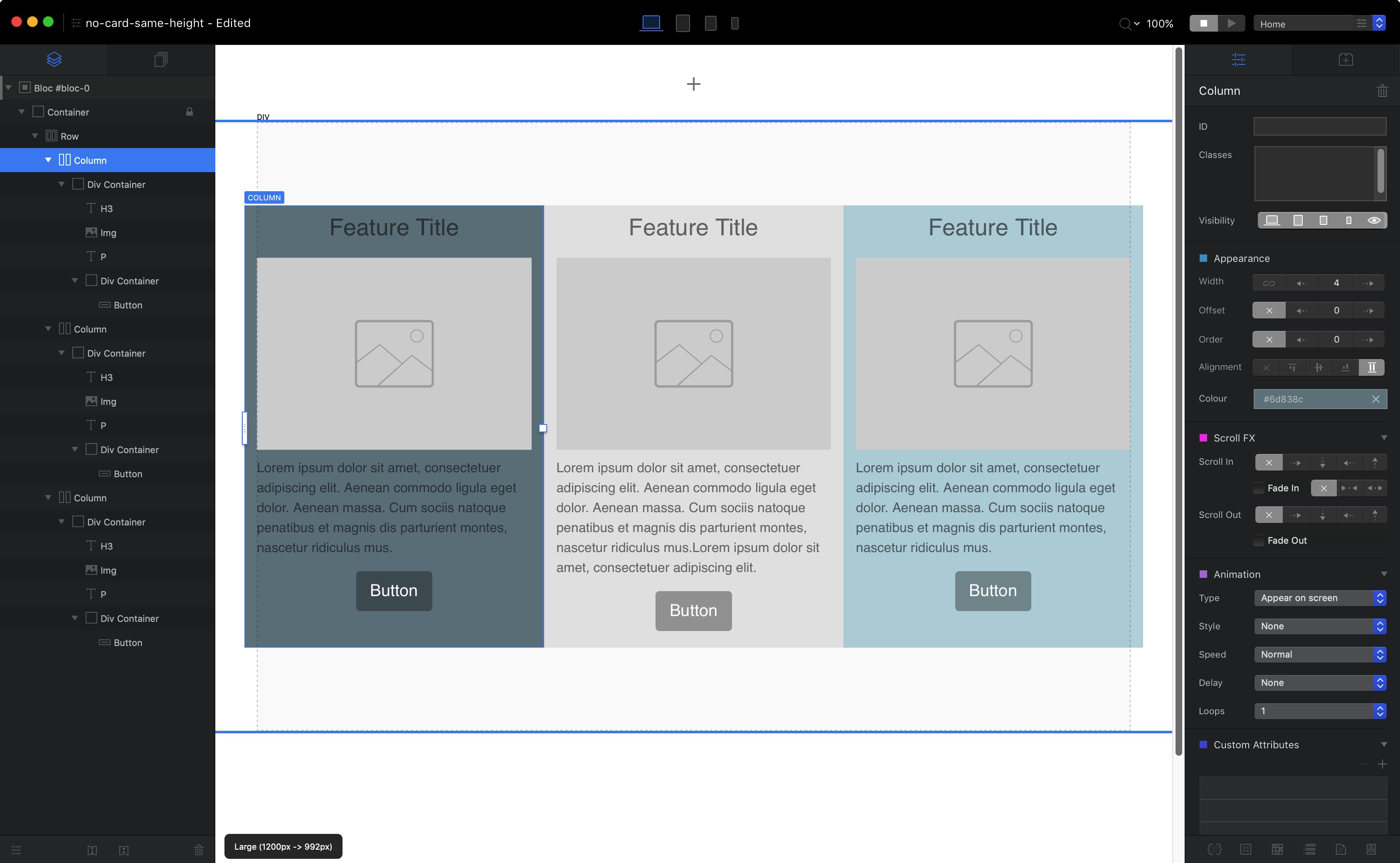
This is really easy now in Blocs 3. Just select a column and press the alignment option in the side panel to make the columns equal.
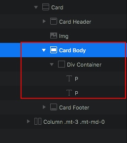
In some cases this will go awry if you have something like a header or image above the text in which case they should first be placed inside a Div bric.
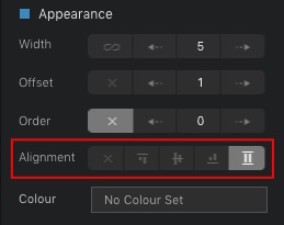
To increase the width of columns, this can be done at each breakpoint, either by dragging sidebars or in the same appearance section where it says width. Offset determines the position on page e.g centred, while order decides which columns comes first or second. Again this is all configurable at each breakpoint.
Just remember that you are aways dealing with a 12 point width structure, so if you have two columns on desktop or tablet the maximum width would be 6 for each if you wanted them side by side. If you want to make them narrower though just reduce the width and adjust the offset as needed.
Same height control works for me on 3.2.2 with my 3 side by side columns. I tried using your suggestion and it did go awry because header/image was above text. I did try to put some elements in a div, but no success. I attached my current page window. Any suggestions on how to make work using your approach?
OK I’ve done this very quickly, but you can check this out as an example using card brics where the text is placed inside Divs. It should work much the same with what you are doing. It’s much easier placing elements inside a Div using the layer tree navigator in the side panel and drag pieces into place that way.
same-height.bloc (215.8 KB)
Thanks for the sample bloc. Yes, this approach seems to work nicely for card structure, but if move elements outside of card structure, it does not seem to work, even if elements are inside a div.
I do like that the column same height works this way with card. Maybe will use in future layouts.
Thanks again!
Paul 
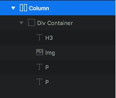
How about this. All the elements placed inside a Div and no card. I did this using a feature 3 column article bloc. If you wanted to add a button at the bottom that should be pretty easy as well.
no-card-same-height.bloc (229.4 KB)
Hi @Flashman,
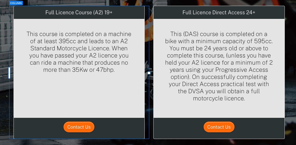
In my simple case, I was trying to get buttons to line up in each column under a single varying size paragraph (see below). The same height bric worked, and as you show, card should also work. Not sure how to get to work otherwise.
Thanks for taking time to look at this. Helping me to learn more about Blocs. 
Paul
Easy. Set a freehand margin under the paragraph text in each case, so the buttons line up. This can be adjusted at each breakpoint to create as much or as little space as you want.
OK, that sounds like another good solution. Thanks for the insight. 
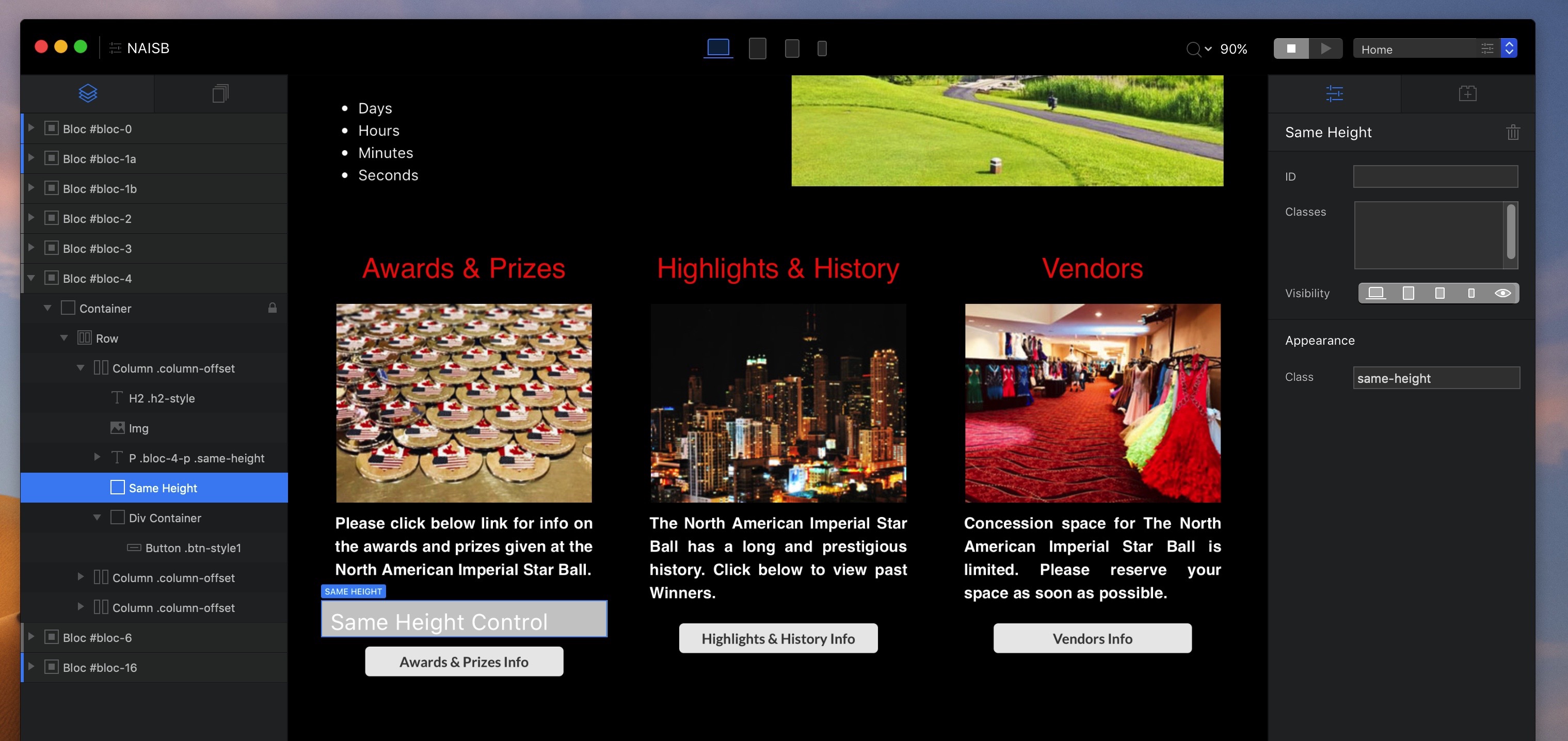
Hi, don’t know if it is the right thing for you. at least another possibility. I have achieved it with 1 row for each element (bric) within each of the 3 columns in Div container. Hope the Screenshot can explain it better than my quirky English. 
You can achieve aligning the buttons by using the SameHeight Bric to set the height of the paragraph text above the buttons. Using SameHeight to act on just the text will make the text areas to be the same height and will push down the butons to be at the same vertical level. I just tried this and it works great.
Add the SameHeight bric to one of the columns after some text, then set the SameHeight Control Class to sameheight-1, and then add a class also called sameheight-1, to each of the paragraph text brics. Then preview to see the buttons aligned.
Yes, this works for the 2 larger breakpoints, but the elements do not stay together at the 2 smaller breakpoints. Btw, I did the same thing you did to find it didn’t work. Thanks for looking at this.
Hi @webdeersign,
Yes, I used SameHeight bric in my original design (see screen shot further above) and it worked fine. @Flashman found a few other ways to do same thing, so that was also good to know.
Thanks for responding!
Paul
Thanks Pruthe. You are right.
Unless, of course, you want to put a 2 column same height element into the SM Breakpoints, I think it would not make sense to use same height elements anyway (at least not in the Xtra Small Breakpoint), because everything is vertically laid out and larger or inconsistent empty space below items would look strange. In that case I would anyway use another bloc for the one or two smaller breakpoints and adjust the visibility for the various breakpoint groups.
And yes, definitely it is most likely not the best way overall. Just my thoughts to work around.
I’m curious for all the suggestions for solutions. 
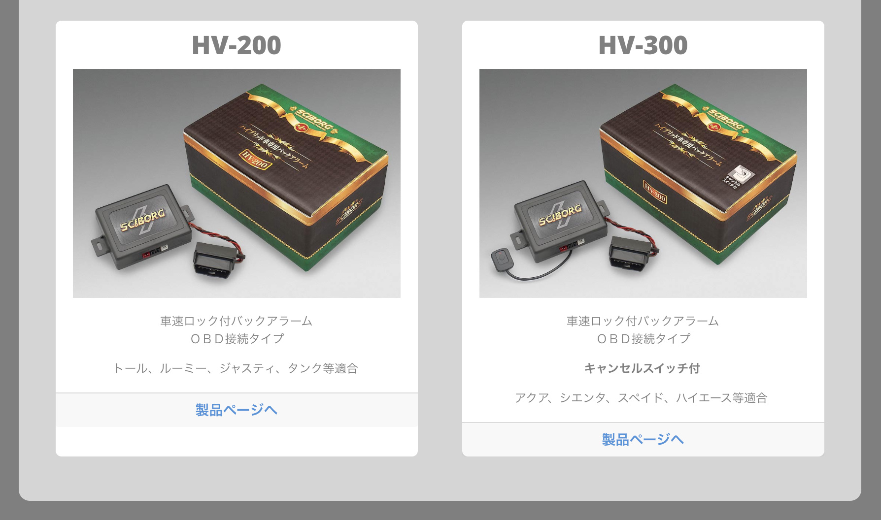
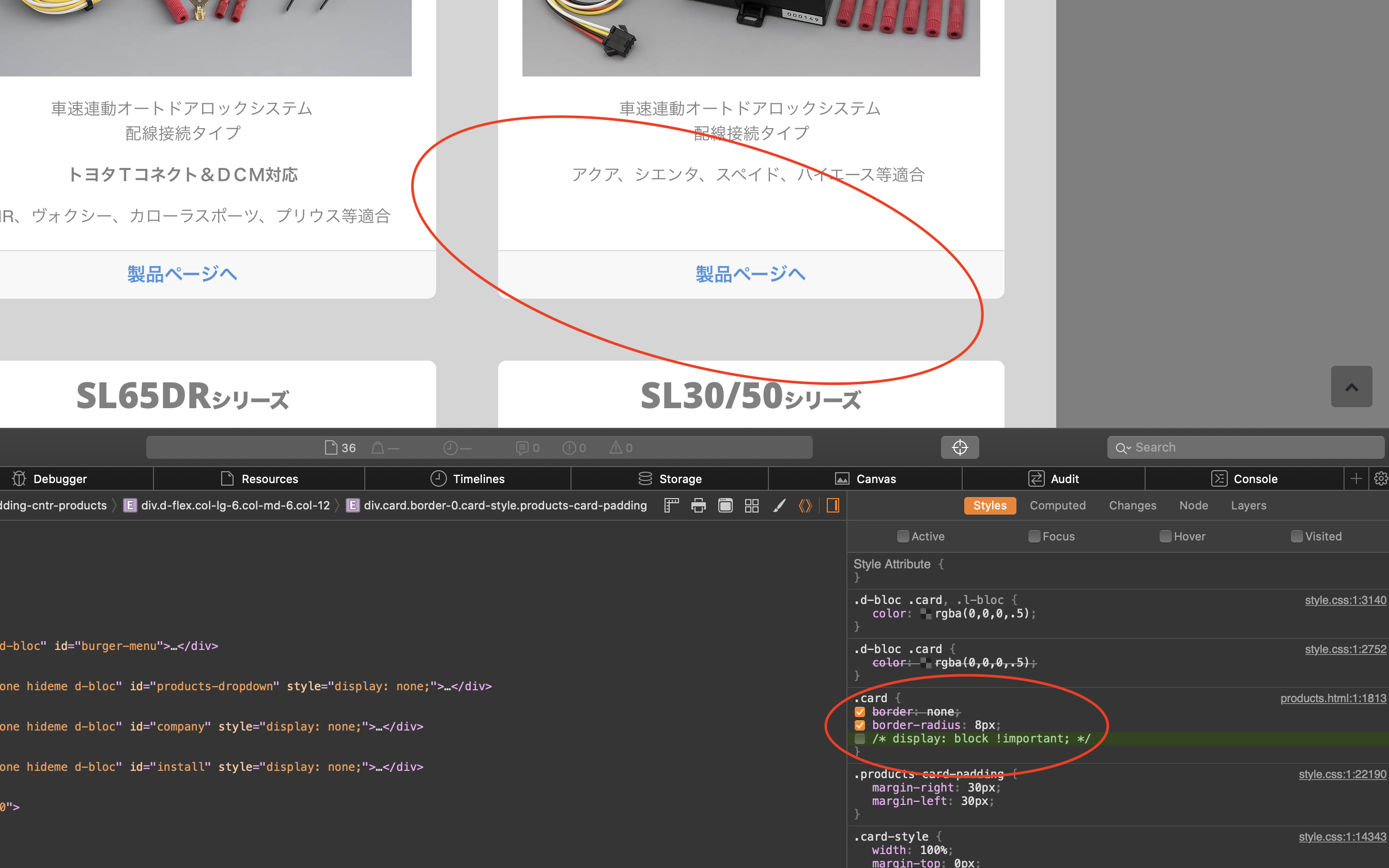
I’m resurrecting this old thread because my attempts align Card Footers isn’t working. Here’s the problem page in my site:
Screenshot of problem area:
You can see the Footer in the leftmost card is not locked to the bottom of the card, only because the List Item text I use in that card is vertically shorter than the text in the rightmost card.
I’ve tried Same Height to no avail, but maybe I am applying it wrong.
I’ve tried putting the List Items in each card into a DIV, but to no avail,
The right sidebar Alignment of each column containing those cards is set properly: 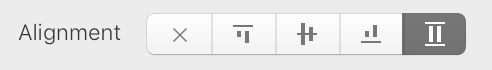
Any thoughts you can share would be appreciated. Thanks.
You have some CSS on the page that is causing the issue
Either remove the display: block!important; or change the attribute to display: flex;
The .card class you have on the page isn’t actually adding anything apart from the border radius. Since you already have the border-0 class on the cards.
Perfect! I deleted “display: block !important;” from the CSS I had in Page Settings > Add Code and the problem is now fixed! Thank you, Pete!