This is a bit above my experience level…but here’s my thought:
Use a Sticky Nav for the buttons, then try this: use a bloc, with a bloc ID for each SECTION you want to scroll to, by placing a H1 or H2 for the Section Heading and then add paragraph bric(s) below the Heading…and see if the ‘scroll to target’ will work for you…also, experiment with each bloc’s padding set to None or play with small or larger, or use padding for each paragraph bric and Heading Text to get the Sections to be separated like the video.
Thanks Norm, though the lingo is a bit beyond my comprehension. By offset do you mean vertical or horizontal offset? IF you mean vertical, then I suppose this means you can control the landing point for the top edge of the scroll to function? What’s a basic anchor??
btw…how do you make a sticky nav? Can’t find instructions in the documents or a complete explanation in the forum…Tx.
My problem is that I can not use different blocs because I use the scroll to ID to move in the mobile view (in the desktop view are 2 columns in horizontal layout within the same block)
Then I understand that there is no way to do what I want
HI - Sorry this exact design doesn’t seem feasible.
I’m wondering, however, if you could use he Tab bric to achieve something similar for your purposes. It wouldn’t be a scroll action, but a pane change when using the trigger, and it can scale to smaller devices with some effort.
Rem – If I understand correctly, a mobile view with horizontally offset triggers and the scrolling sections like in the video would probably not fit in the available screen space on a small device, even if you could do it, especially in portrait orientation.
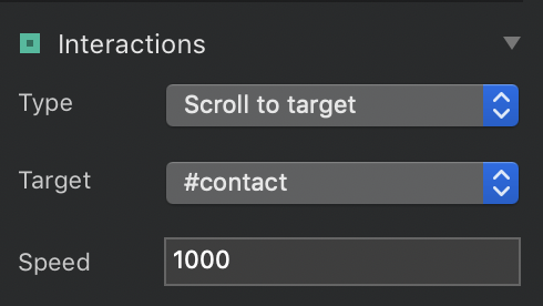
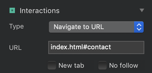
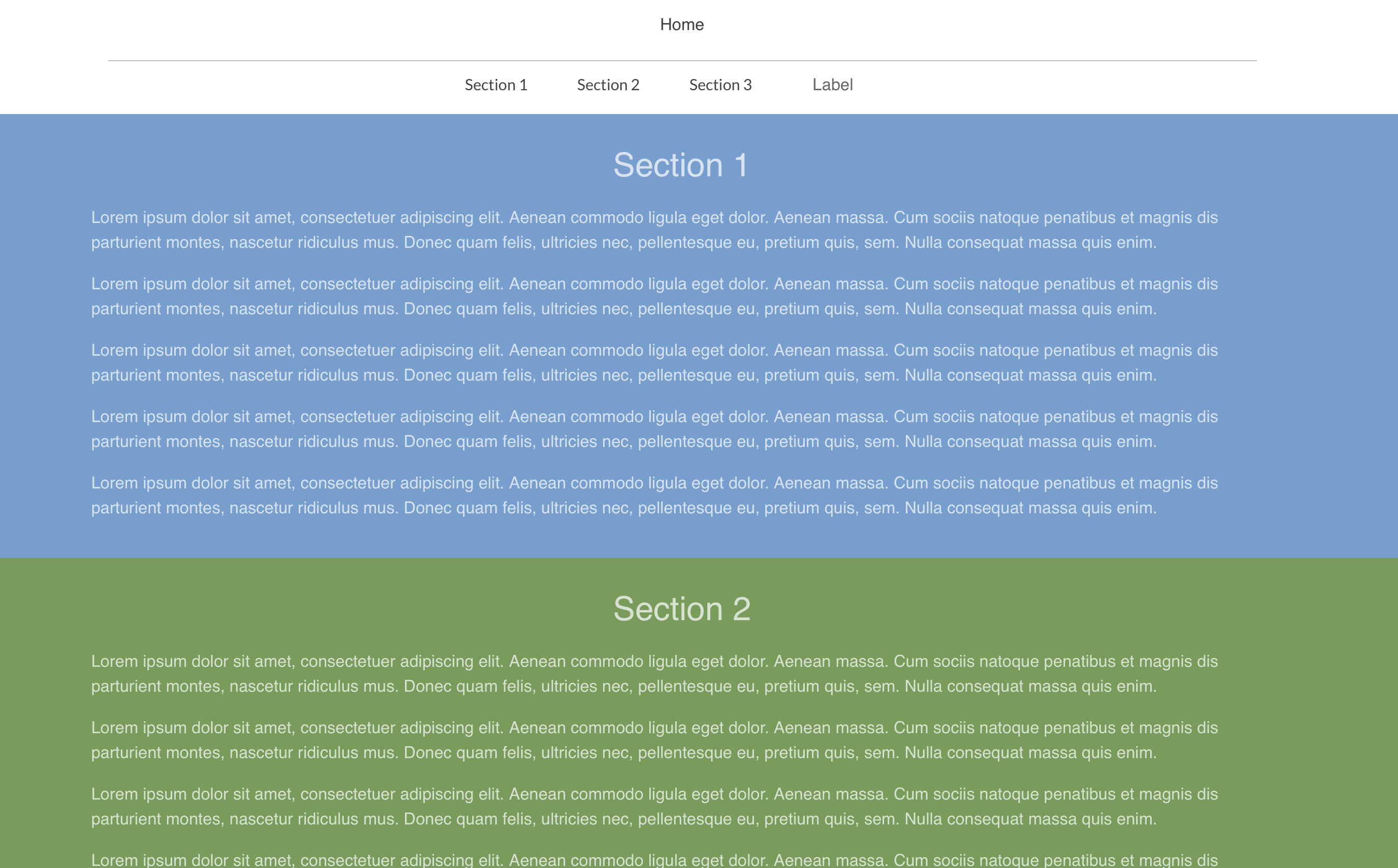
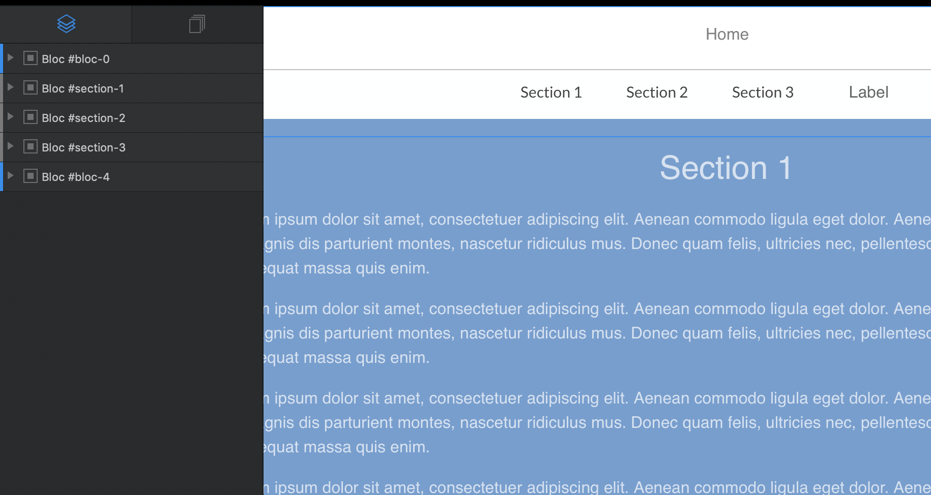
To demonstrate what I was suggesting, I mocked this up in 5 mins, using the Sticky Nav (which I found in the sidebar when the Navbar layer was selected) and checked the ‘Include Content Area’ checkbox to add a div to place ‘labels’ for the scroll to triggers for each section, which are each in separate Blocs w/ IDs used in the Scroll To interaction. (each bloc background is colored for visual clarity). You could even turn off the top navigation link for this page ‘Home’ by unchecking the ‘Include Navigation’ checkbox when the Navbar layer is selected…
Perhaps this could fit into what you’re wanting to achieve, albeit somewhat differently…