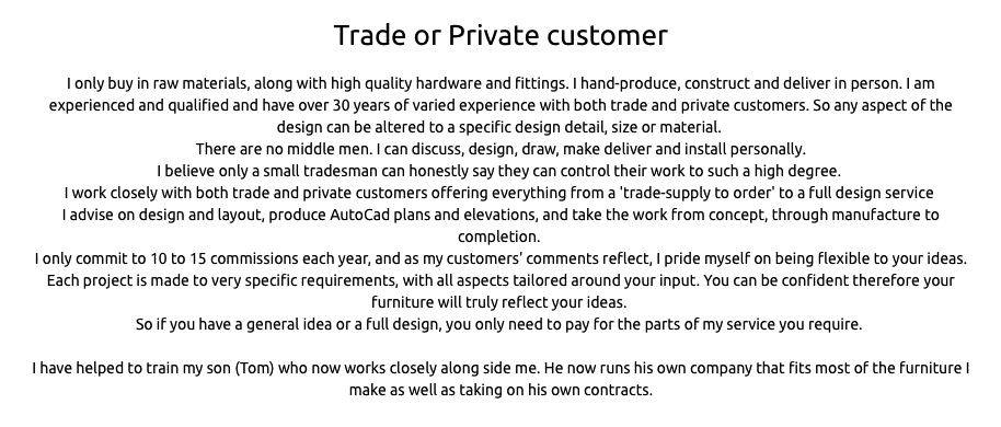
I’m more and more impressed what I (a cabinet maker) can do in the excellent Blocs app with lots of help from forum users.
All this was built or added (via html brick), with no other code editing now post export.
I still have a few issues to iron out, but I’ll be keen to hear any critique.
Thanks to you all, even if I haven’t asked you a question directly, I read whats discussed with interest.
Andy
Seriously impressive site, I’ll be coming to you for tips 
Nice scroll to top button to…
Casey
Probably one of the best looking sites that I have seen yet created with Blocs. The only comment that I would make is the load time seems a little slow here in VT (USA). That could very well be a local provider issue.
Well done, Cheers.
Vince
Thank you. It evolved over time, with the first effort going from start to publish very quickly. Then I added more complex elements like the modal, galleries, light box and modal.
Looking good and it would be easy to just leave my comment at that.
In general, I’d prefer it to be more focussed. Fewer but larger images, more narrative.
I’m not that much a fan of carousels or too many effects, so the amount of movement on your site is just too much for me. I absolutely hate shaking buttons.
Once you see a few testimonials, it’s great, but how many will I actually read? very few, so I wish there were fewer testimonials and no accordion. Testimonials are fine, but I think case histories are far more powerful.
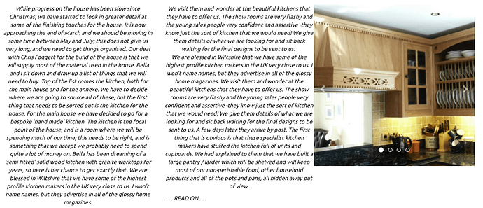
The slab of text on the lower part of the testimonials page is just way to much. Large slabs of text should be in columns - big text blocks are hard to read and to be avoided. To the right of that slab of text is a super-distraction - pictures in a little box, changing all the time. Super annoying.
So why not have two columns for that slab of text and a third column with the images from that image slider presented as static images.
Essentially my message is less is more. Less movement is more, fewer images is more.
Think of it like this. The Argos catalogue has loads of pictures but is absolutely boring, but loads of people love reading the newspaper Sunday supplements - a few big pictures, plenty of narrative.
I really did think twice about whether I should even make these comments, but I’d like blocs users to really think about what they put on websites and why they are putting things on a web page and to put yourself in the shoes of the visitor.
Take a look here:
I’m not holding that site up as an exemplary site, but it has a number of traits that are very good.
Little distracting movement. Fewer pictures. Space to breath. Well spaced text and organisation. Customer-orientated. No carousels or shaking buttons! Nothing to distract the visitor away from the product. It’s nice and functional. Uncluttered. No obstacles for the visitor.
Here’s another:
I would regard this one as classy. I fully accept that several of the elements are beyond the average blocsapp user, but it shows how to build an image and get a message across - we are craftsmen and our product is pure quality.
APS woodwork may not have the same business model and may be 100% bespoke rather than selling ranges, but lessons are to be learned.
I am the bad boy of website comments. Sorry.
Hi Paul.
Ready for the s**t storm?
This is exactly what I was hoping for; constructive comments.
So thanks. I spend ages working on a tweek here and a change there, and I am old enough to know to ask opinions from a fresh perspective. It is genuinely appreciated, and I will act on the comments as I see fit.
Yes to less movement; I get that.
I have the ‘comments’ on a list to change to a carousel of ‘headline’ quotes. I noted a post on carousels with a transparent background, so I’m glad you confirmed my decision.
I’ll amend the article to a summary with select images.
I do think people like plenty of photos. Looking at sites on handhelds (with the attention span of a child), I feel visitors need pretty pictures more than text; so maybe I should think of making the text more an optional panel viewed on selection.
I also know most of my visitors are customers or their friends, who look at my work upon recommendation, rather than me trying to generate new clients from web visits, so I aim towards images.
Your comments are appreciated and not taken as criticism. So thanks for your time.
Andy
I’d leave more breathing space around the text in the footer area. On mobile in particular the phone numbers are crammed against the bottom.
You could also add more space around the other contact details higher up the page and if you open up the site a little with more empty space between each section you may find the design looks cleaner.
On a broader note, I found the text animations a little too much and felt they should either be more subtle or removed entirely. From past experience through Google webmaster tools, I know it often fails to index text that only appears when you scroll to a certain part of the page. In essence this effect may actually impact on your search ranking.
I’m not at all against images - quite the opposite. I just feel editing is important. We all get bored watching the 500 holiday snaps of our friends, when 20 well-chosen images with a story to go with them would have a far better impact, so we can agree to disagree about having too many photographs.
As a user I could care less about a huge list of positive comments. Nice to see a few, but I know that you won’t be publishing negative comments and five good comments is as effective as a hundred. Better still would be trustpilot reviews.
I think it’s common for people to imagine they have to show almost everything they do. Amateur photographers do this - they show off loads of images - while the best professionals only show their best work.
I was bored by all the images - perhaps because I’m not that interested, but that’s not the case. I want to see a wow-factor. Big images. Narrative. Engage me.
I’ve probably said more than I should and more than I initially intended, so I will just wish you well. I know a lot of people will be wondering what the heck I am on about. A lot of people would be very happy to have a site like yours and there’s no reason for you to be unhappy about it. We just have different ideas of how it could be better.
Hi @Flashman.
I never really noticed the numbers so close to the bottom; good spot thanks.
I’m getting the message about stripping out the animations, and I’ll take it on board.
Also I never knew about the appearing text issue, and I’ll definitely strip those out.
Thanks for the helpful pointers.
Andy 
I need people with the balls to be honest, so don’t hold back.
I’ll pass on the bits I disagree with, but I’ll always want to hear them.

Just looked at this again. Centralised headers are fine, but it tends to make paragraphs less legible and ragged in appearance with large areas of text. Just stick with left alignment.
You also have strange, inconsistent spacing between paragraphs if at all and areas next to images need space to breath. I agree with previous comments about too many testimonials.
Hi.
Alignment noted.
Ye, (testimonials page) I’m working on this when I get time.
Thanks, Andy
Just the feedback to turn into a carousel now, thanks to you all.
You have to love Blocs, eh?
Very nice site. I enjoyed it. There is still a lot for me to learn 
Under “work in progress” it is not clear how to move from page “1 of 3” to “2 of 3” etc. There is also a constant message on top that images are being loaded …
Hi @redrinus
Nice spot. I’ll work out how to add arrows to thumb grid.
Also I don’t know how to make a section disappear after a time period.
I’ll investigate.
Thanks, Andy
All sorted thanks. It took a bit of fiddling and working out, but I got there.
1- wrap the text in a
brick with an ID ( in my case called’ italic-div’).
2- add script below to in page settings.
3- Only works on preview in browser.
 <script>
    //When the page has loaded.
    $( document ).ready(function(){
        $('#italic-div').fadeIn('slow', function(){
           $('#italic-div').delay(6000).fadeOut();
        });
    });
    </script>
BINGO
Nice work, would be even better with more padding for the sections and more line-hight for the text.
Thanks for your comment.
It should look a bit bigger and spaced out now.

