Can I Desktop, Tablet & Cell (Mobile) be a different image?
Explain or share Tutorial please
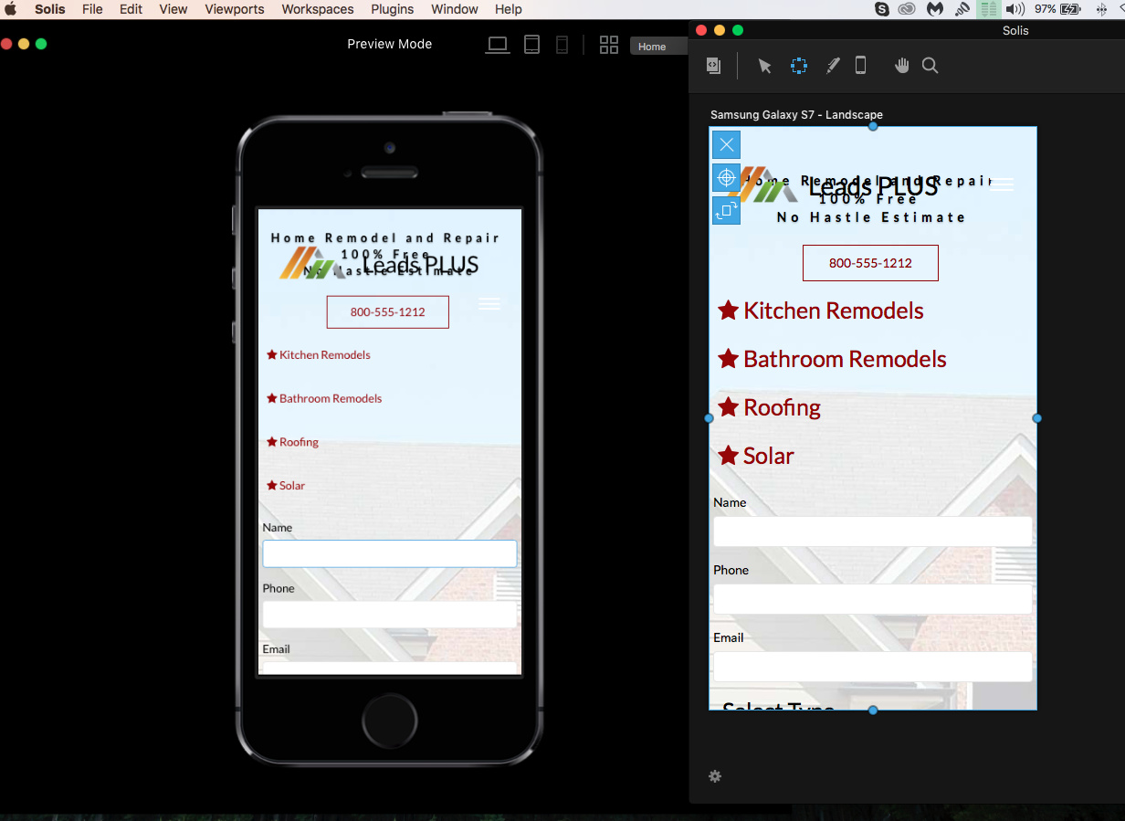
It’s seems that Tablet & Cell are linked. When I make changes to one it affect the other. Even when I make separate Custom Classes i.e. one for Table & one for Mobile. The Desktop, Tablet and Mobile must be not interconnected if the user decides that’s what they want.
I’m asking because the Cell format is a mess.
In Cell view, when editing, it should not be affection Tablet. Am I right?
Thanks to anyone willing to take the time to answer.
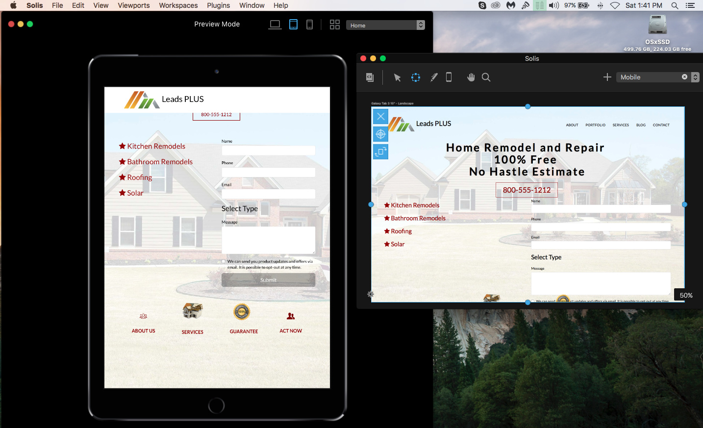
Hey, Blocs currently uses the bootstrap 3 framework and uses the 3 lower end breakpoints ( these are based on screen width ), and cascade down, so the table breakpoint effects the mobile breakpoint as you mentioned. The mobile one should only effect the mobile view.
Is it the header area you want to style specifically for mobile. If custom classes gets to messy, you could always us the visibility features in Blocs and create a custom mobile layout and show/hide the content on mobile.
Hi Norm,
It makes perfect sense to you, but to me I’m still learning the tweaking feature you’re referring to.
Any videos or docs explaining available?
I want the header to work just like the mobile, but it is not working that way.
Because of that I made a custom class area only for mobile, but it is messing with my Tablet. Hence my question about interconnection.