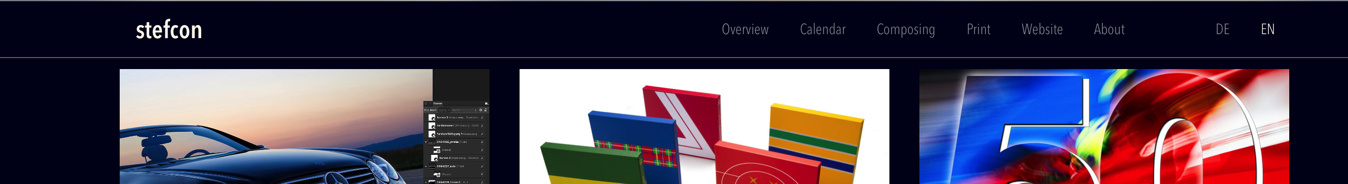
Hi everyone, my website is ready: http://www.stefcon.net/index.html. I would be very happy if you could give me feedback, especially regarding the view on mobile devices. Please feel free to say your opinions. @MDS was so kind in helping me out with the nav-bar!
Hi @Steeve
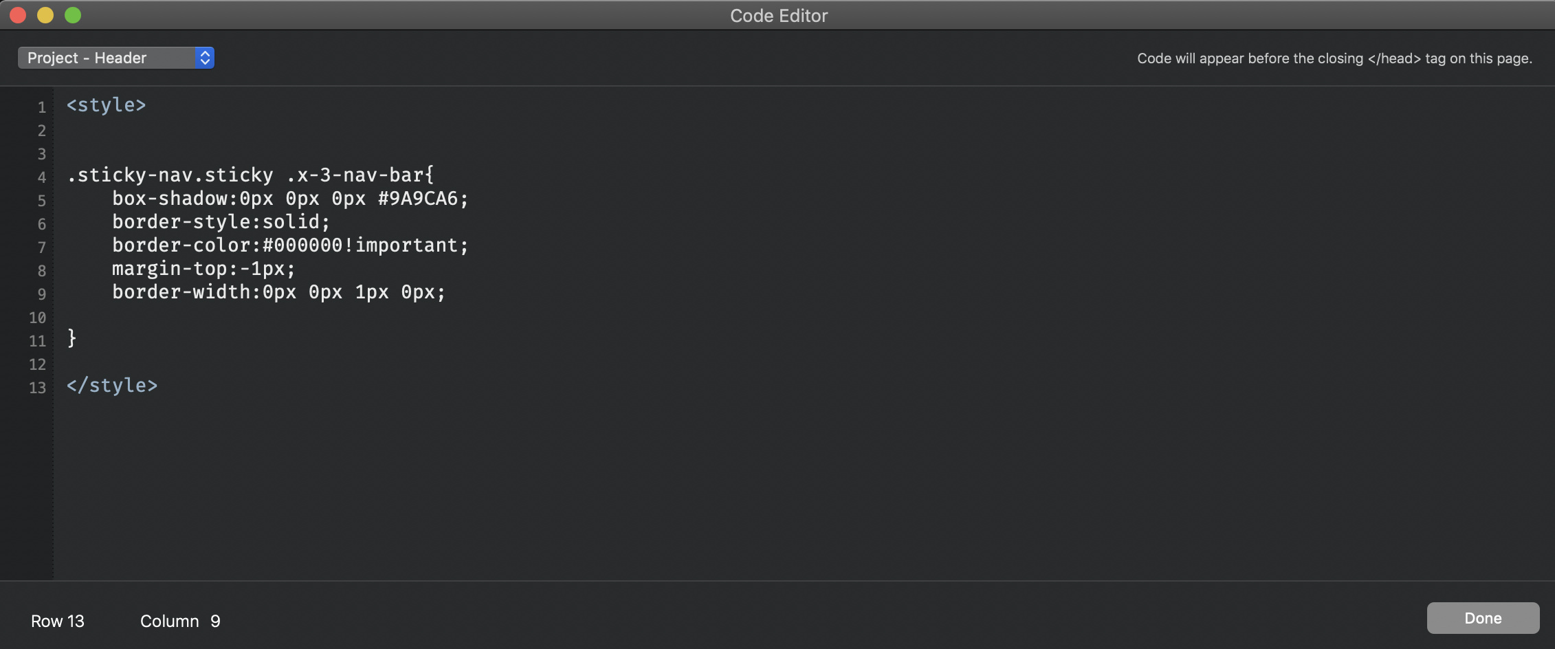
You can add the following piece of code to the Project Header settings which you find under the Menu Window -> select Code Editor. This will hide the line once the sticky is activated and you scroll down.
<style>

.sticky-nav.sticky .x-3-nav-bar{
	box-shadow:0px 0px 0px #9A9CA6;
	border-style:solid;
	border-color:#000000!important;
	margin-top:-1px;
	border-width:0px 0px 1px 0px;
}

</style>
MDS
On the sticky you need to add the border and remove it from the nav-bar
Add this code:
.fill-bloc-top-edge.sticky {
         border-bottom: #70717B;
         border-bottom-width: 1px;
         border-bottom-style: solid;
}

.x-3-nav-bar {
        border-width: 0px 0px 0px 0px;
}
Good luck.
Thanks  I think, a hidden line works best for me for now.
My site does not look great on an iPhone SE or iPad Pro. I think I should adjust it individually in Blocs in terms of visibility for each MD, SM, XS, which I did, but it’s not „WYSWYG“ 
Indeed there seems to be an issue everything is really tiny. You say you’ve optimized for mobile? What has been your process so far?
If you wish you can private message the bloc file and I can have a look.
MDS