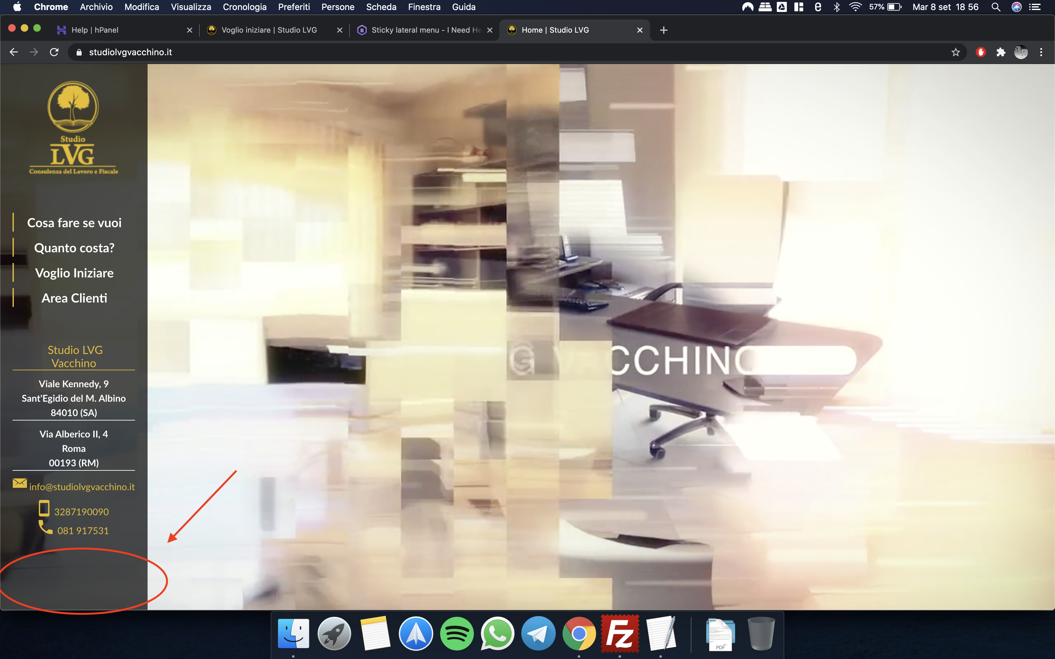
How can I make all responsive and remove the space at the end?
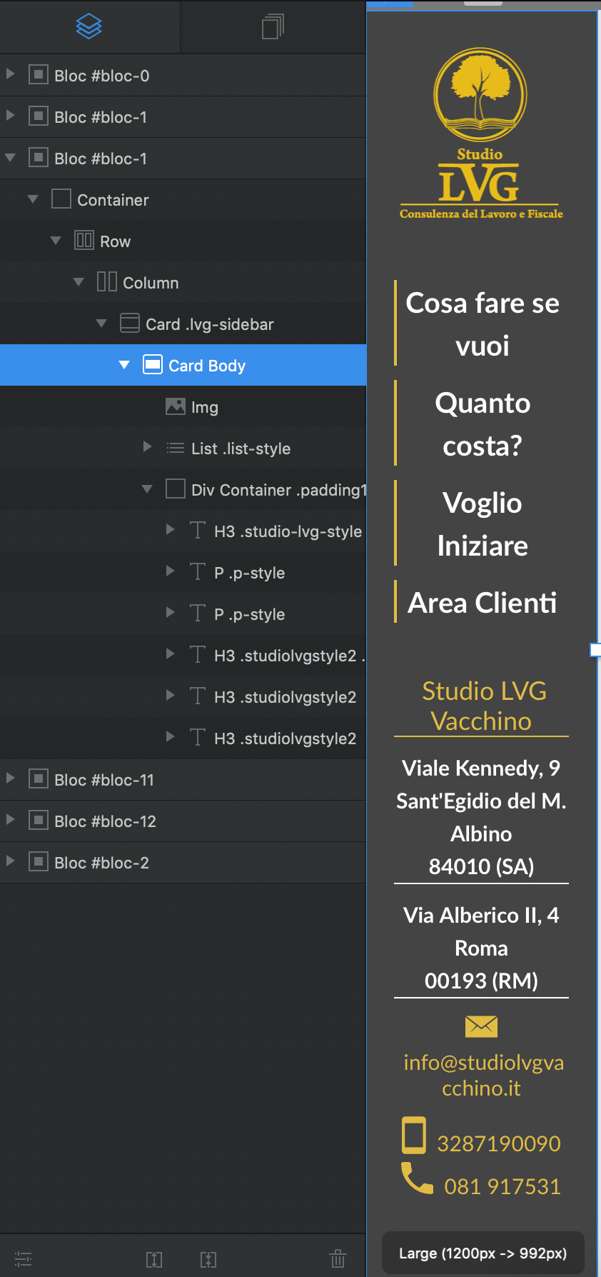
This is the blocs tree:
I have to create a new class? What value I have to edit to make like this:
-Logo
-space
-Menu list
-space
-Contact text
The space have to change to use 100% of the height, for example if we have 1000px height:
100px-Logo
200px-space
300px-Menu list
200px-space
200px-Contact text
if we have 500px height:
50px-Logo
100px-space
150px-Menu list
100px-space
100px-Contact text
I think you would have a lot of trouble doing it that way. Not to mention halving the text size would make it difficult on touch devices.
Responsive isn’t just making things small. It would be doing a series of things such as collapsing your icons at the bottom by removing the text and having them space out horizontally. At some point you will also need to collapse the navigation. There is a reason why vertical menus like this go horizontal on small break points.
Responsive for the most part involves changing the layout in a way that keeps the site consistent and looking good while maintaining function on different screen sizes.