Hi,
is there a way to style the edges of the modal bric ? And also the close symbol ( x ) ?
Thanks Tom
Hi @tom2,
You can do this a couple of ways depending on what you need to do.
-
You want to change the Modals across your entire site, then just add the Bootstrap classes for the Modal to the class manager, then it will override the default styles. The classes to add for example would be…
modal-content (use this one to change the border around the whole modal)
modal-header
modal-body
modal-footer
The close symbol would be something like .modal-header .close (preserve the spaces between the classes) -
You want to change one or selected modals. Just create your own custom classes and add them by select the modal through the layer navigator.
2 Likes
Thanks for the Modal BS Class info.
Question: for option #2, if I want to change the background color of the header & footer for an individual modal within a site that has multiple modals which use the Bootstrap classes, what settings do I use in the Custom Class to change the color? I’ve tried changing the color in the Custom Class ‘background’ tab, using the ‘content box’ but that didn’t have any effect. Thoughts? TIA.
I can make the changes using the right panel inspector ‘Appearance’ color option by selecting the parts of the modal card I want to change, but I’d rather do it with a custom class for better efficiency and reuse.
Hey @DanielF
The way I would do this is to assign the modal a class. (other people have different ways, this is how I work.) For example if you take the project I have attached here, I did this for the Blue modal
- Added a class to the modal called
.modal-blue - Created a series of classes in the class manager. (make sure you keep the spaces).
.modal-blue .modal-header
and
.modal-blue .modal-footer
And set the background colour to blue on each of these classes. You dont have to add them in design view, but they will show in preview.
The main reason I work like this, is if I even need to create another modal that is the same, I only need to add one class to the modal for all the others classes to apply. I find it a quick way to work. If I need to make changes to the modal, I can search the class manager and I get them all come up. So easy.
Blocs_Multi_Colour_Modal.bloc (1.4 MB)
yes…this is the reason I wanted to use custom classes
Thank you so much for the file, I’ll take a look 
It’s well worth making use of the bootstrap classes like in this case. And that’s all I am doing here.
If you don’t know what they are (there are lots), they can be found using the inspector in Safari.
Basically this…
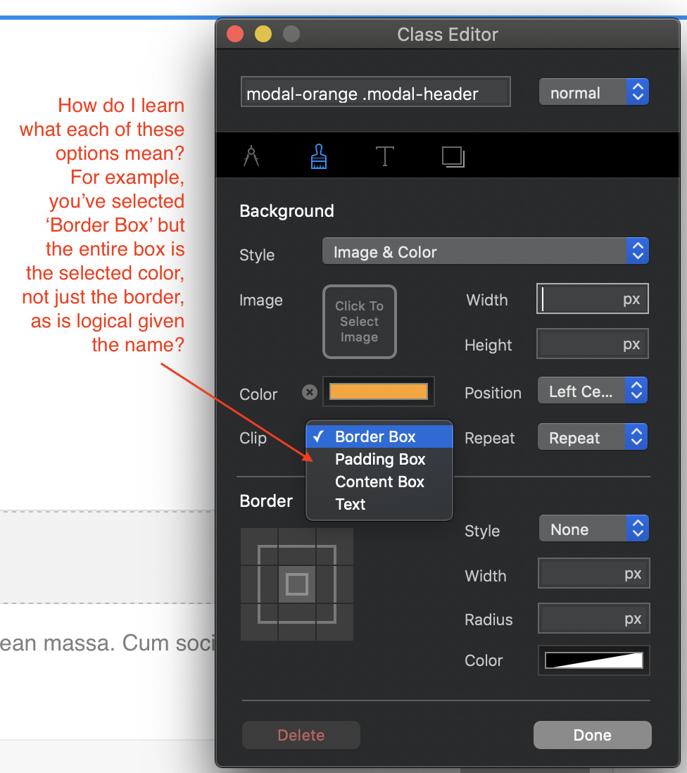
https://www.w3schools.com/cssref/css3_pr_background-clip.asp
The text one will used the text as a mask, only the text shows the background, you can do text gradients etc with this.
Box border is the default, I didn’t select it.
ah: “The background-clip property defines how far the background (color or image) should extend within an element.”
Very helpful. Thanks!
ok. Now I’m confused. I’m not following how everything relates to each other??
In the editor, the modal is not ‘blue’, but it shows up blue’ in preview when active.
Is there a method to see it in the editor without having to preview?
Why is the class showing in Class Manger, but not in the Custom Class field?
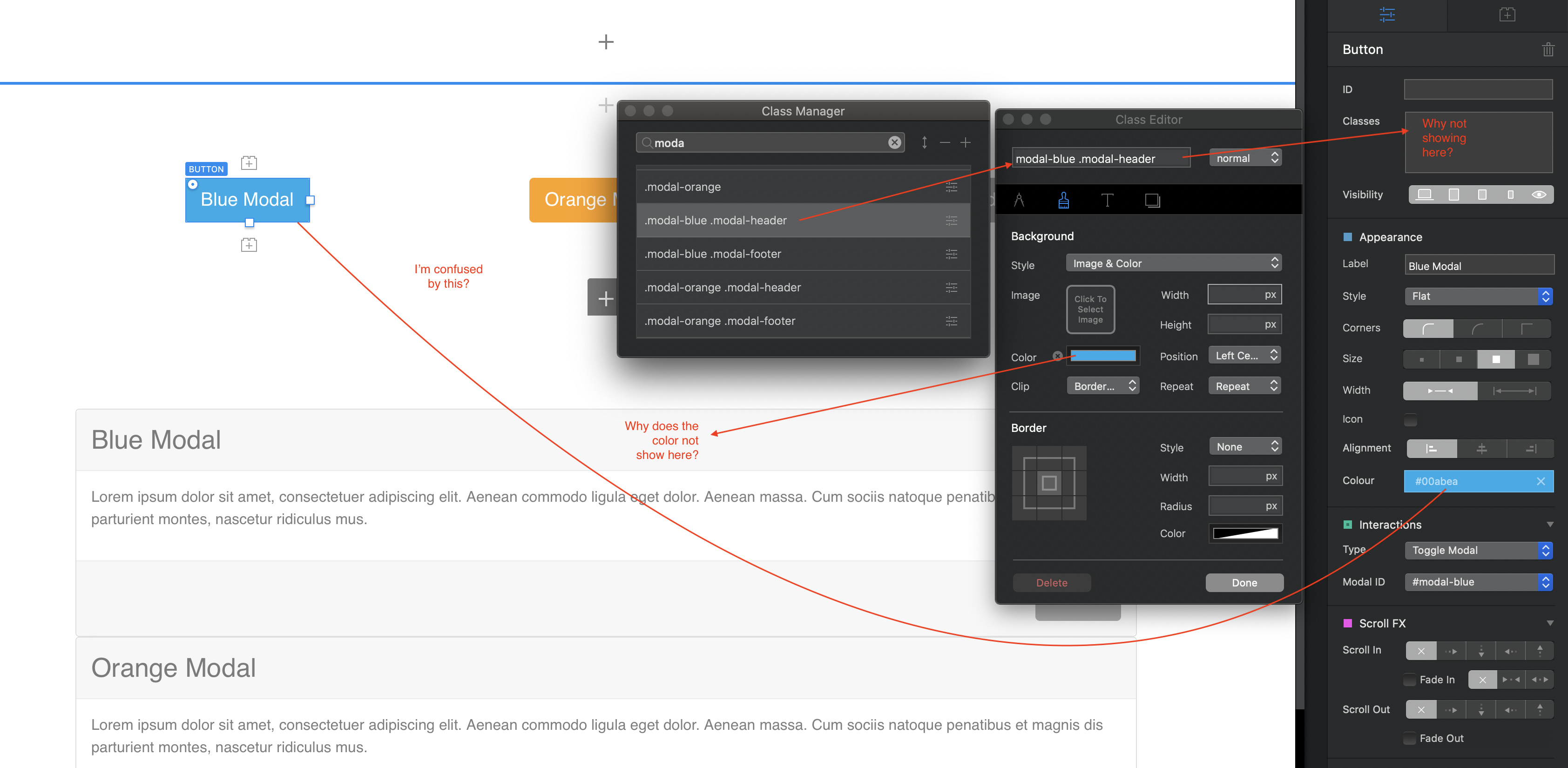
Because the browser is apply the style. The Blocs designer isn’t, it would if you put the class in the side bar. This is something I would like to see changed in Blocs.
Some things to do I find. Eg if you made a class to adjust the heading text
.modal-blue h3
That would dynamically show in design mode. It seems inconsistent to me.
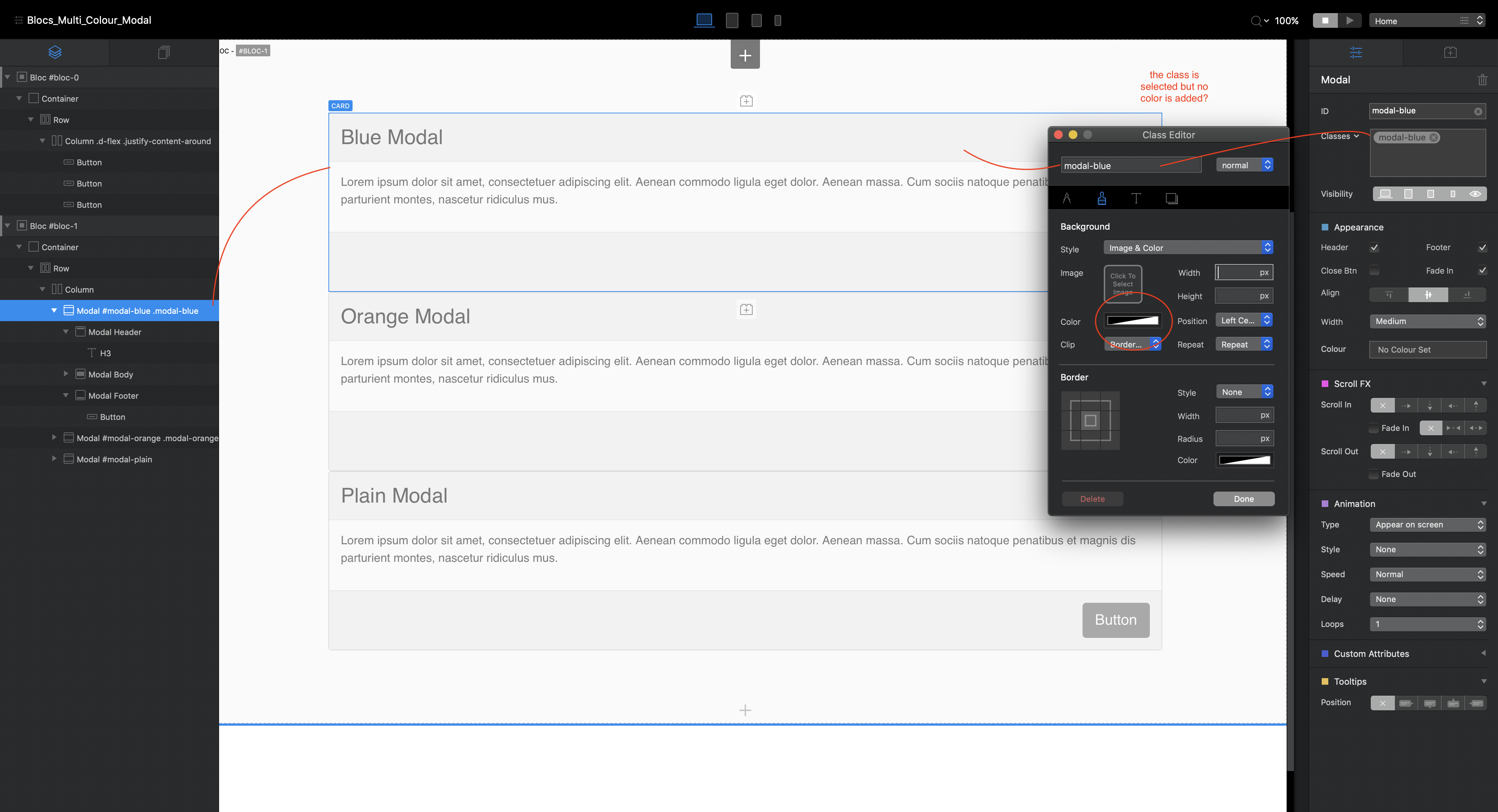
…and this is where I run into a road block, as I’ve tried to apply a Custom Class in the standard way while having a part of the modal card selected (i.e. the header), and then try to change the color in the ‘background’ with clipping options in the Custom Class editor, and it is not happening.
Perhaps there is Bootstrap class that is not allowing the ‘override’ to occur?
I am able to make the ‘heading/footer’ background color change using the right ‘Appearance’ panel settings, but again, that is inefficient as I would need to do it for each instance of a modal (I’m planning to have many modals on the page), rather then using a Custom Class to do that…perhaps I’m not quiet doing something correctly (likely) but I’m yet to discover what that is using this method. Thanks Again!
I’m probably missing something here, but why can you not use the standard styling options provided in Blocs? You can select the header, footer and body of a modal and style it independently for each Modal - like this:
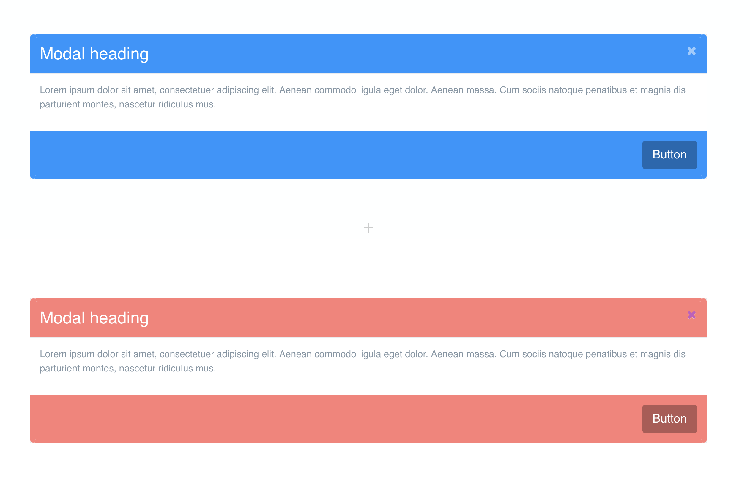
The close icon is a standard icon that can be selected and changed to another icon. You can also apply a colour to the icon.
Hi - Thanks for chiming in. My intent is to add modal pop ups for blog posts that have multiple notes within the body of the text, (i.e. [1], [2], [3], etc).
The notes are currently bullet listed at the bottom of each blog post, but I want the reader to have the option of reading the note inline with the text and not have to scroll down to the bottom to read them, so I will have many modals to build for each post.
The best solution would be Custom Classes.
Ok, got it!
…and now its working…sometimes Blocs stalls when building Custom Classes; I tried it again, and this time it worked as desired. I have the sense that what is happening when making changes, it takes time for the code to get generated (just a guess) behind the scenes, and so it becomes glitchy…?