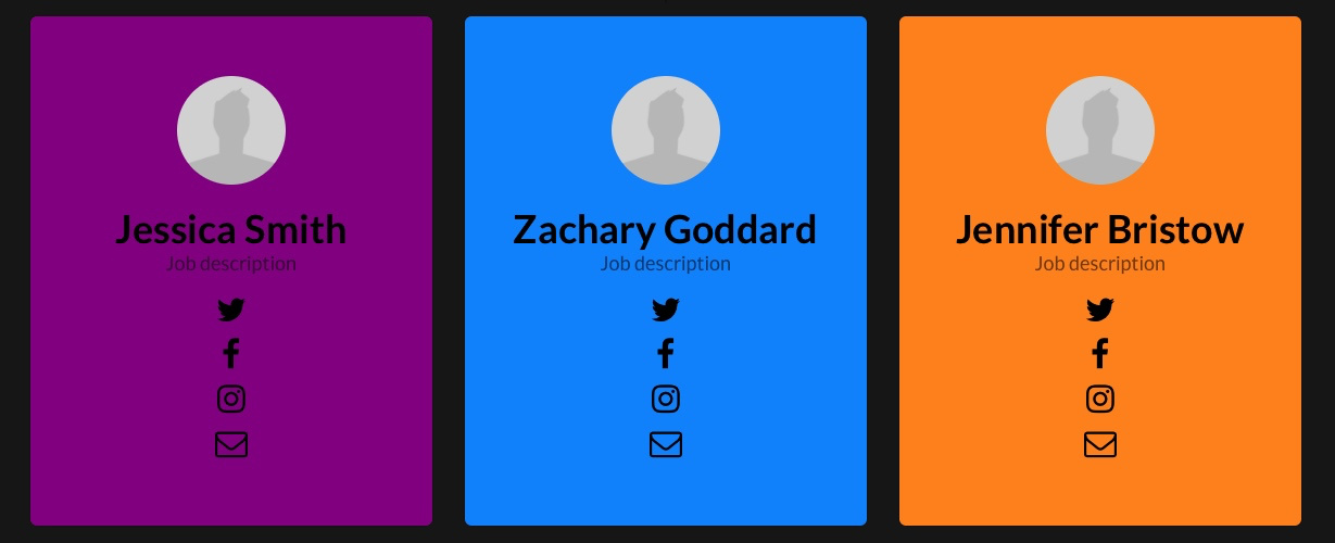
Out in the wild though, I can see the separate elements are shunted to the left on several mobile devices, whether in landscape or portrait as shown below.
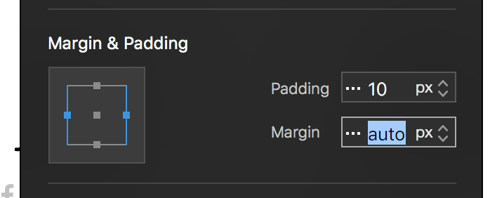
To make these panels to always stay in the center on tablet devices, open the class assigned to this panel and set the margins of both sides to auto. See screenshot below.
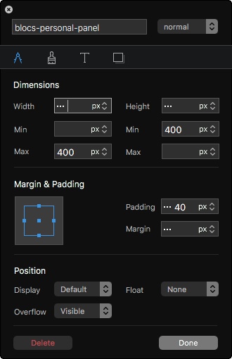
There is actually a custom class shown below that was applied to panel by @Norm when the Bloc was created, but in that case it applies to just a single panel inside a 3 column row. I’ve duplicated the panel to make it a three panel row, which might be where the problem comes from.
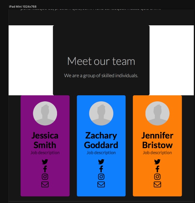
I’ve copied what you suggested and it appears to work on the panels, but it has strangely messed up the formatting on the text above the panels on tablet devices as shown below. It seems to be OK on mobile and desktop though from what I’ve seen.
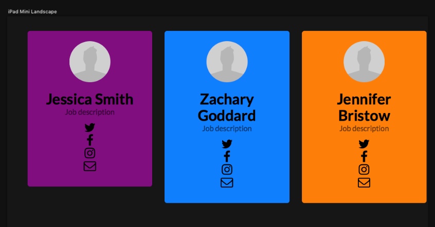
@Eldar Deleting the bloc above the panels, quitting Blocs and then adding it again seems to have done the trick and it now looks correct apart from when viewed on tablets in landscape format where the purple panel is still shorter than the others. I’ll upload the change to the site, but reducing the maximum width of the panels may help.
Actually Solis has just come to the rescue here by the look of it. The panel width has to come down to a maximum of 250 pixels at which point it all looks good and I was able to check this in real time as I adjusted the custom class. There was no need to summon the wizard of oz either, which was somewhat before my time
Just a thought @Eldar but I am sure it would be useful for many if some of your core training videos showed how to get the best out of working with Blocs alongside Solis. https://store.eldargezalov.com/dashboard