Attached (see screenshot 1.png) is my Home page. Note the title and introduction two column write up.
See screenshot 2.png where I decreased the width of the page in Safari. Note that the paragraph breaks with a space between the two columns…is there a fix for this?
Make one bloc for desktop/tablet and another for mobile only, so you have two versions of this bloc, one for mobile with a single text para and one for desktop/tablet with two text paras.
I thought I could go into the Mobile view and add a single column there, but when I make the change the Desktop and Tablet views convert to a single column also. How do I single out the Mobile view so it does not change the Desktop and Tablet views?
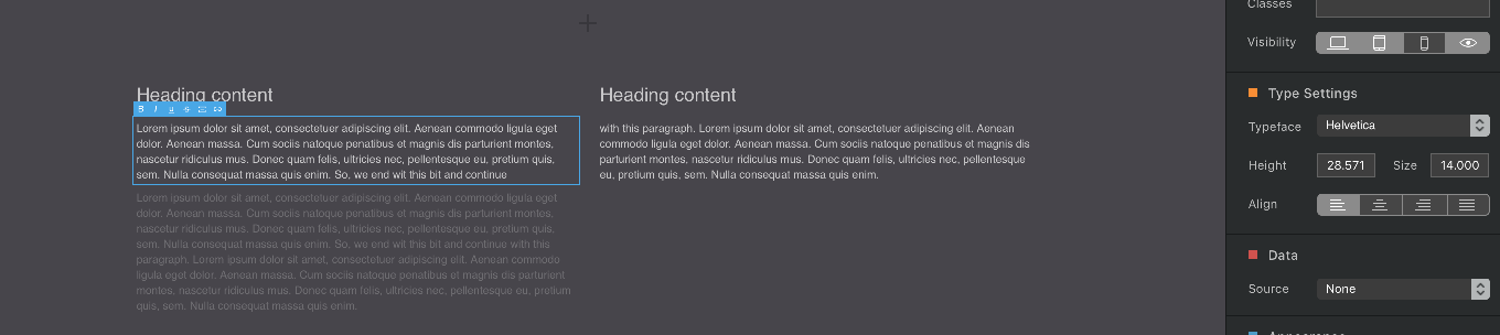
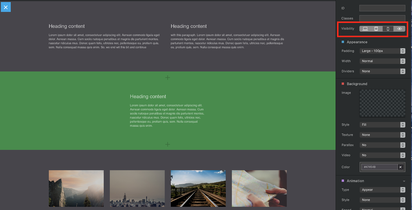
I’ve attached three screenshots (e1, e2, e3). On the first you can see that the bloc has attributes so it is only visible in the mobile view.
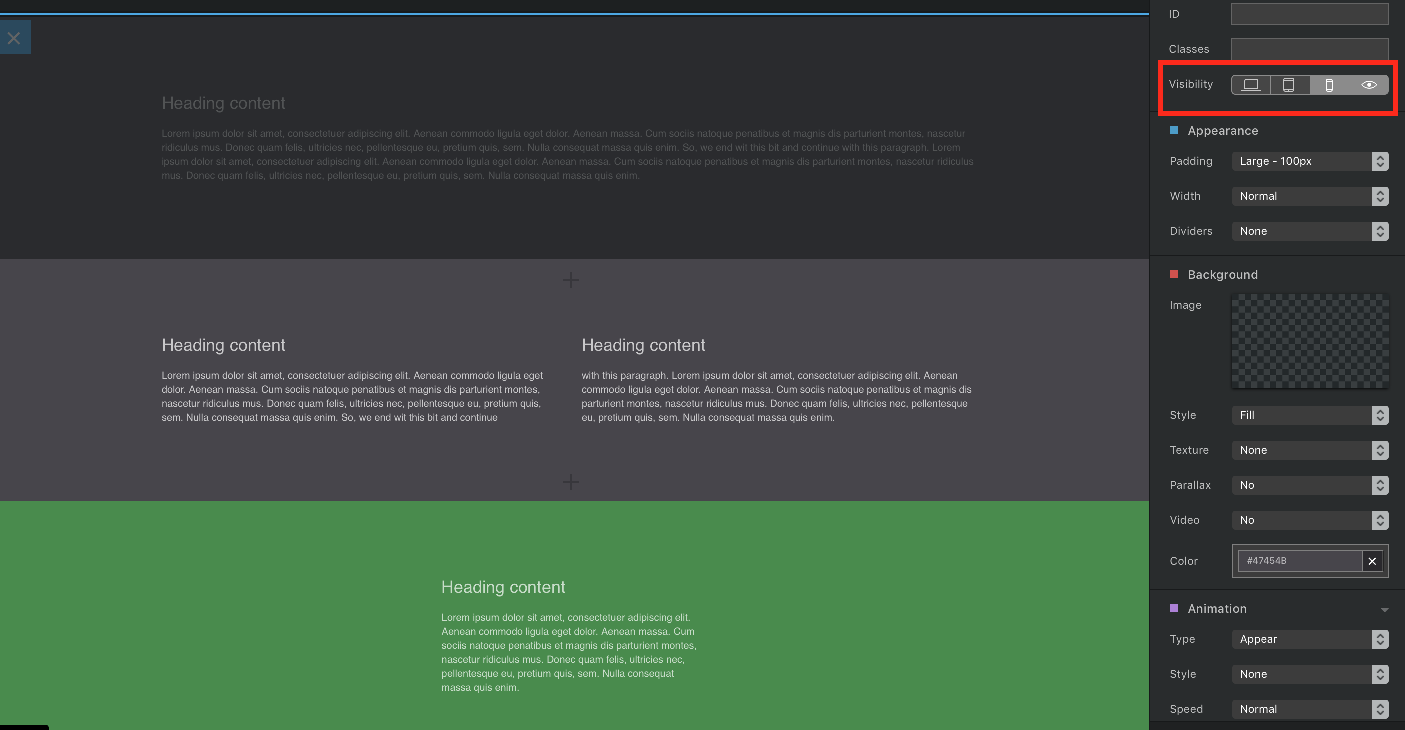
On the second the selected bloc is only visible on desktop and tablet.
On the third an alternative approach, the bloc is visible on all platforms, but the bloc content varies according to platform and I’ve added a mobile-only paragraph and the other paragraphs are tablet/desktop - only. On the e3 screenshot you can see the mobile-only paragraph is darkened and the selected paragraph is desktop/tablet only.