I’d really like two side=by-side columns in iPhone view, but everything I try defaults to a single column.
Is it possible?
I’d really like two side=by-side columns in iPhone view, but everything I try defaults to a single column.
Is it possible?
Thanks APS, any chance of a screen shot of your settings as I can’t seem to get to grips with classes?
(If you take a look at my opening page, I want to have the eight coloured boxes in four rows of two, with a small margin in between, if that makes sense!)
They’d be tiny on mobile. Try 2 rows of 4 maybe?
Well done. It took me ages too.
I ended up with a bloc for larger screens, hi hidden on phone with a separate bloc for phone only. Then trial and error until I got it right.
Andy
@apswoodwork Hi Andy,
Good to see that someone is fiddelling successfully. Nice trick for mobile device.
I was a bit curious about your results so had a look at your site.
I recognized your side bar (mobile) has still an issue wich has driven me bunkers for a while.
If you click on the sliding in menus they disappear before any action.
This is solved meanwhile, so if you save your project again with 2.3.1 it will work properly.
Just for your information.
Cheers Kilian
Sorry folks. I don’t get it.
Ian your site is wonderful.
Can you please try to explain how you did the trick with the 2 rows on mobile?
I just don’t get it.
Hey @Bootsie
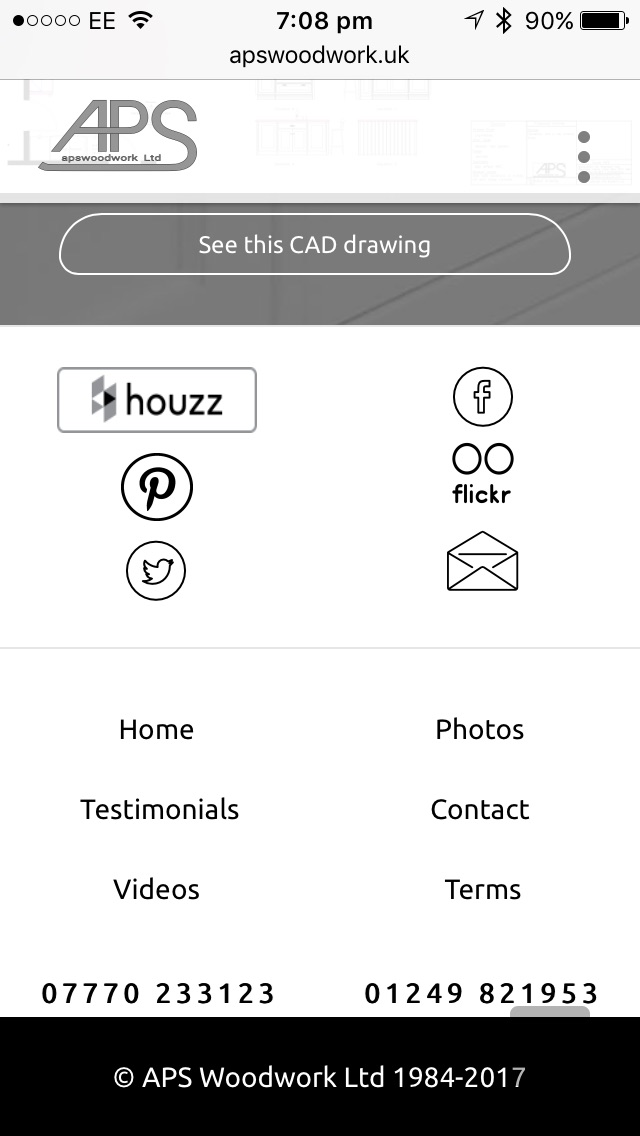
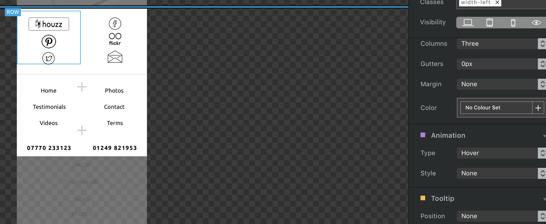
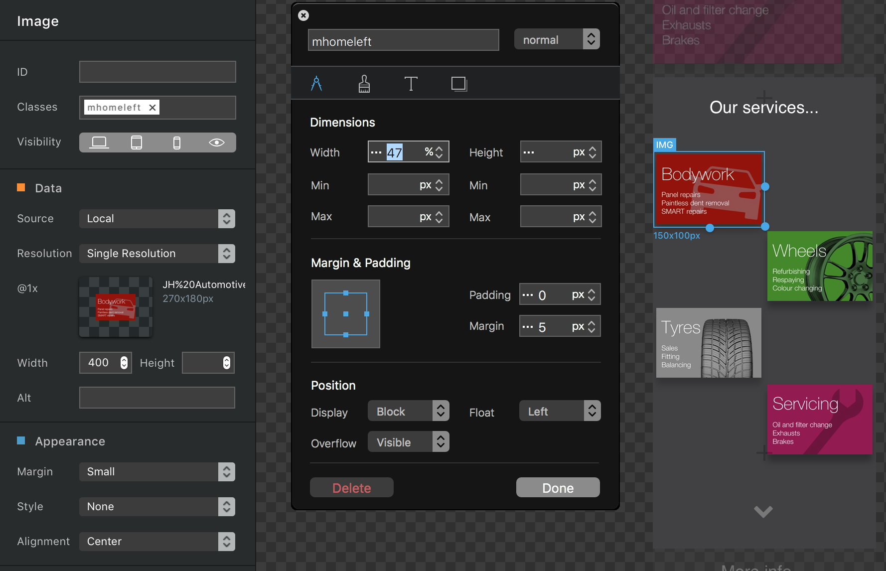
I have a row of social icons. On smaller screens these ended up in a column; and that’s bad!
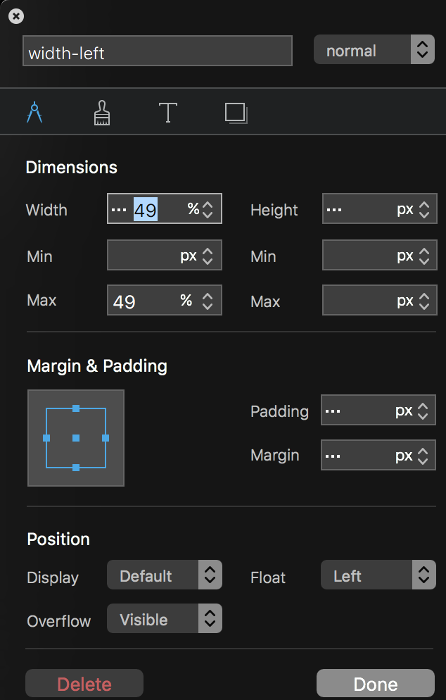
I made a bloc just for smaller breakpoints only and made 2 custom classes, width-left and right (see screenshot).
NOTE THE FLOAT
In these are a 3 row brick (see screenshot) with icons. These then default to a column due to the breakpoint.
This uses the initial problem to achieve a result.
It’s like getting the kids to do what they don’t want to; feels kinda good!
!!Power to the Blocheads!!
Well, I never thought I’d be giving advice!
I struggled to understand classes, but finally got it - on a basic level.
So, this is what I did… hope it helps…
Reverse it for the right images.
Ignore the preview of the page, it’s rarely correct!!!
Agreed.
That’s the joy of WYSIWYG, it just doesn’t always render correctly on (V) preview.
Alt-cmd-B better, export best
Alt-cmd-B doesn’t work at all on phone or pad view!
Think I got it.
Make some tests and report.
Hello, did you try in Safari the responsive view in Developer Menu?
You can chose any single equipment, or resolution.
Probably you already know it but, it could be someone here that doesn’t know.
Sorry to interrupt…