Good day to you all,
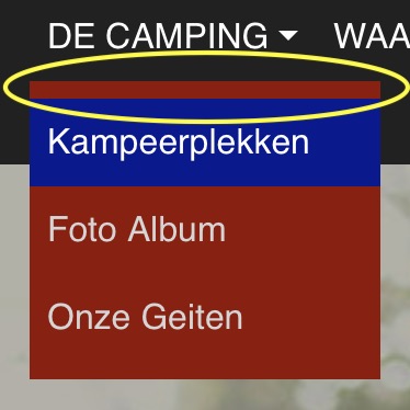
I can’t get rid of this ugly gap. Can somebody help me with that? I think it’s standard if you make a dropdown navigation. If it doesn’t have a reason why there is this gap it might be something to change in Blocs 4. But if someone thinks it’s nice or handy leave it as it is now. If there is someone who can tell me how to get rid of it, maybe something simple or a piece of code, you will make me very happy.
Have a nice day, Rob
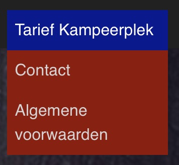
(Ugly color composition in the image are for example)
It’s consistent throughout BS, and is likely linked to a good basic design of white spac?? It looks right in most cases, especially if you look at the examples in the BS documentation.
But the good thing with BS is you can change it all to best fit your design. Like your case for example, it looks better without the padding. No biggie and easy to adjust.
Indeed, no problem and easy to adjust. You just need to know. Most menus are in white or there is a slight difference in color on a mouseover. Then it doesn’t matter much. I will write down the solution for when I come across this little problem again. I am rather forgetful. (Will be the age).