I’m currently trying to figure out which settings overwrite each other when it comes to the styling of headings.
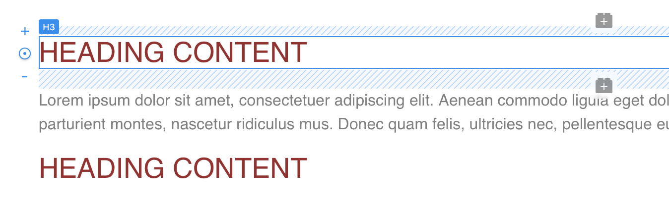
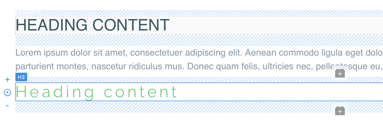
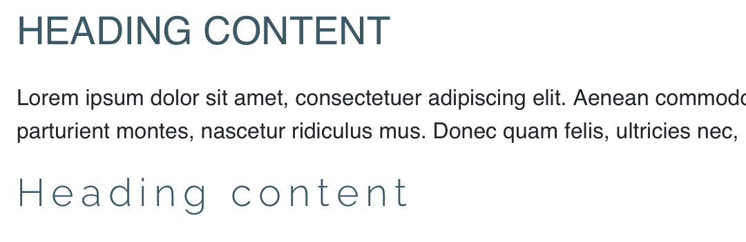
So I created a simple project that contains a <h3> with a <p> and another <h3> below. I mainly changed colours, then inspected to code to see what happens behind the curtain.
In the project setting I set the text color of the <h3> to a red, which automatically creates a h3 class in the class editor with that color. So far so good. I then added text transform to uppercase, just for fun. All this is reflected in the code.
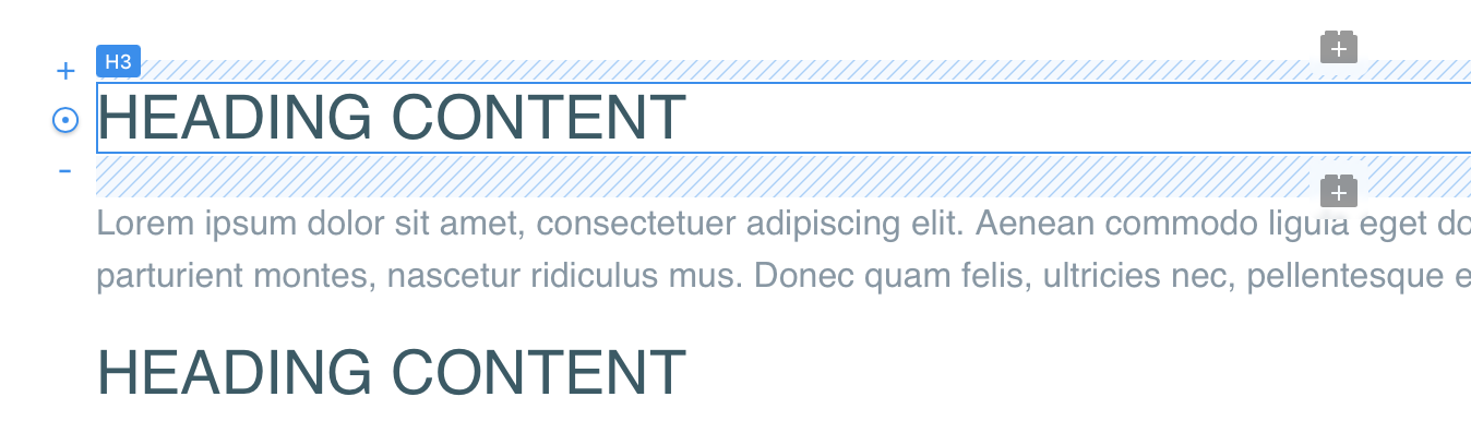
Now, changing the color of the <h3> in the side panel to a darker blue-grey, adds the class .tc-dark-slate-gray with !important to the color setting to every <h3>. Got that.
I can’t answer if it’s the bug or feature, but that’s how it works in Blocs. If you set the color for H3 to black, and then, you set the custom color via sidebar to blue, all H3 brics inside this one BLOC will turn Blue. When you add a class with Red color to of these H3 brics, it will make all other H3 brics in this BLOC appear to be blue in Blocs editing mode, but then in preview, it will switch to the default Black (which we have set in the H3).
I agree that is inconsistent (different between what we see and what we get in preview), but I have never experienced a problem like this, because I don’t think it’s a good practice to color and style headings this way. I would either leave the colors completely out of the default heading classes and set the color BLOC, or (more often) I would set a default color, and only use custom classes to set other colors when I need to stay away from default colors for some reasons. In other words, don’t try to mix all of these (default classes, custom classes, sidebar settings, etc) inside one bloc (or the whole project for that matter).
I was not going to use all of that in a project, I was just trying to figure out which setting gets a priority in styling text. Be it headings, buttons or paragraphs. And I sill find it confusing.
For the best control on text, just use classes, if you want full control of size, color etc.
The sidebar controls (with the exception of color) will write to a class if you assign a freehand class.
Using the colour selector in the sidebar is a little different, its a global colour swatch, they have some benefits but they can also create confusion if you are styling your text in various ways.
I should add that global colours generate their own class names which you cant customize. If you change the colour, the class name changes for the global swatches.
To be brutally honest with you, global swatches are one of the oldest parts of Blocs, the underlying mechanics are the same as they were in Blocs v1. Its very likely they will see a big overhaul at some point this year.
Definitely better to use custom classes for colour styling, rather than the side panel.
Just one point worth adding if that if you intend to style text with variations like bold or italic etc this can be done with custom classes as well, however it is generally better practice to source the correct variation e.g bold italic font rather than trying to do it through CSS styling to a regular font. The correct font selection can also be chosen with the class editor.
That is one of the reasons I always try to use fonts with several weight and style options. Colour is not a problem here.
Changing the typeface and alignment does not create a class though, like e.g. font size or line height, which automatically creates a p-style class, unless I’ve already assigned a freehand class to write to. So I assume that those setting (typeface and alignment) are assigned to the element?
So best - at least for me - to avoid using the swatches. Though I like the idea with the swatches.
Looking forward to that. Until then… no swatch using for me Thanks for clearing that up, @Norm
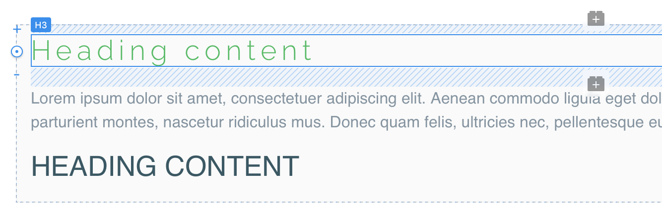
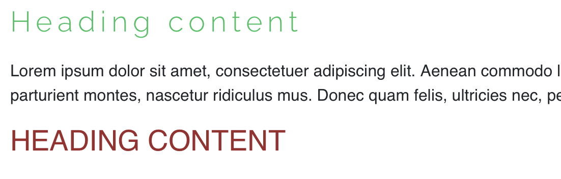
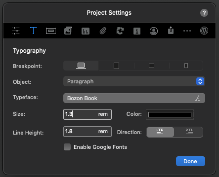
I use the project settings for basic font choices as global choices for paragraphs etc. You can see here how I have used Bozon Book here for paragraphs.
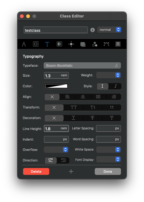
If I wanted a section of text to use italics I would set that with a custom class and select Bozon Book Italic, so all the styling comes from the font itself, rather than a CSS interpretation.
The advantage of doing this is that you will see the font as the designer intended with perfect consistency from one browser to another, plus you should avoid potential issues like faux rendering.
I remember once trying to style a regular font to make it like an italic style using Rapidweaver and it resulted in jagged edges, because I was trying to make the font do something it wasn’t designed for.
Blocs has all the styling options there for your convenience, however there is a lot to be said for thoroughly planning in advance and choosing fonts that will allow you plenty of flexibility. Quite often this is a point that separates free fonts from premium alternatives.
But once the elements (heading, paragraphs etc.) appear in the class manager, one can change those there as well, right? That’d be easier than always opening the project settings, close them review, open the settings again etc.
Sorry if these sound like noob question, I’m not new to Blocs and know quite a lot, but some things are still giving me headaches and confusion
The project settings are global in that they apply to every paragraph or link etc, unless you apply a custom class.
The project settings can be changed. Just be aware that these are global changes that apply site wide, so this can have a big impact on spacing and layout etc. This is why it is worth spending some time experimenting with fonts early on to make a choice you are happy with.
If you make a change to a font inside a custom class that will also occur site wide, but only in the areas where that class was applied. It’s all editable, though you obviously want to work efficiently where possible.