My site is completely not responsive now despite efforts to make it so because viewport data did not get exported into my code.
Any ideas on what I should actually insert into my code manually to regain responsiveness? I know very little (i.e. NOTHING) about viewport data except that it is needed for my website to be responsive.
It’s responsive if you view on a desktop browser (Safari) and resize to be smaller. For some reason when viewing on my iPhone 8+ it appears not to be responsive. Hopefully, someone else has a suggestion.
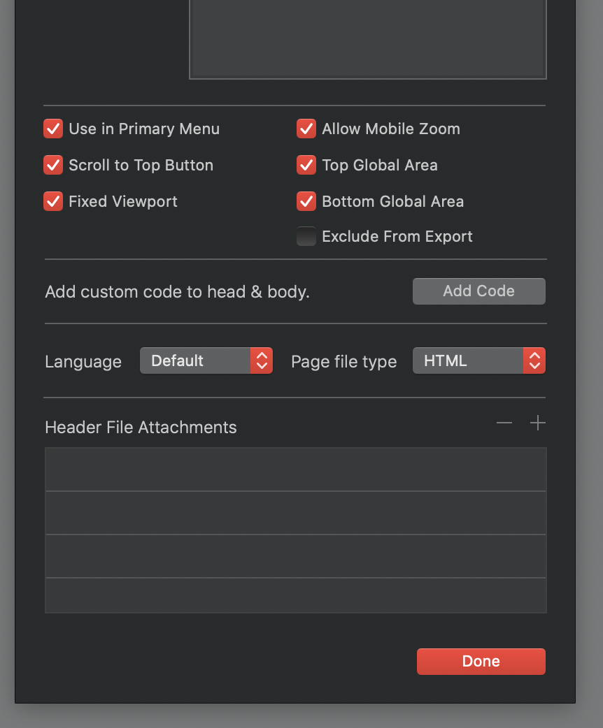
Ah HA! That was not ticked. I did read about this setting on another thread, but I couldn’t find the settings in the export options and thought it must have been changed or updated to not have those anymore, but I didn’t look in page settings. I have ticked them all. Let’s try this again…
By the way - while we’re on the subject of export settings - is there one that makes this “Show Simplied View” option pop up on mobile devices? I noticed that as new when I launched this new version and I don’t really like it, I wish it would go away, but I’m not sure if it’s an option or if it’s just something completely different that is out of my control.
Well, it worked!! Clicking the “fixed viewport” option on page settings was the trick.
Everything seems to be a lot better now. The only weird thing that happened is buttons not lining up correctly on mobile view (the nav buttons at the top, “tandem” “booking” and “get info” on the xs breakpoint view.) I’m sure this could be solved somehow easily by making them fill to 100% of the width of each breakpoint, I’ll do a thread search now on how to do it.
 You saved the day!