Hi,
Jsut finished the first draft for my friend who is a dj/producer. He just wanted a simple page where he can announce his next shows etc.
Would love to get some feedback ![]() http://johan.alerius.se
http://johan.alerius.se
Thanks!
Hi,
Jsut finished the first draft for my friend who is a dj/producer. He just wanted a simple page where he can announce his next shows etc.
Would love to get some feedback ![]() http://johan.alerius.se
http://johan.alerius.se
Thanks!
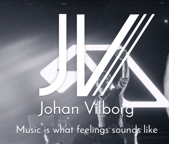
I think it will work fine for what he is looking for. My only problem is the large logo over the image. They compete for each others attention. Maybe try a different color for the JV//. Another possibility might be to apply a dark outside stroke to make it stand out from the background.
It looks gross.
A DJ is not a butcher.
Gentle greetings from Germany
And I duck myself
Thomas
Yeah, I’ve struggled a bit with that. I don’t think that will be the image for the real site, but I will try to find a way to make it better.
Thanks!
Wow, don’t know what to say. Thats not the feedback I thought this forum would give me.
If you don’t like it thats okey, but there is no need to be mean?
I’m sorry … my first review.
Just my feeling.
I’m sorry …
Thomas
Thanks, he’s not a child. But will take it in consideration
I’m sorry.
Thx.
PS.:
If I may say something else,
the people must be more at the end of the page.
7 people look at him?
PS.:
And do not used Adobe Flash.
The picture is taken close to the stage. It was a huge crowed that night
More People … more fascination.
It’s not about the one night.
Well the picture is cropped that way, I’m not the photographer.
Don’t understand what you mean with adobe flash?
@calerlus sorry for such a hard review from vandieck. I know its not easy when someone gives a review that is a little blunt. I try to give my opinion but also be respectful. Try to look at what someone says and analyze why they might think they have a better idea. Sometimes it might makes sense but other times you might just like the way it looks. You must remember that your doing this for a client and if the client likes it then that’s what matters. I’ve had clients that have not liked some of my designs that I thought we’re some of the best I’ve done.
Maybe look for another photo for the footer area that maybe conveys more of the mood that a lot of people are having fun at the show.
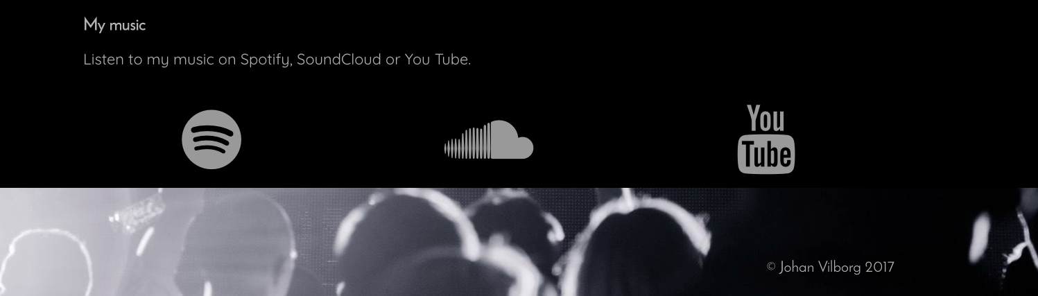
I think the icons are ok myself, my only suggesting would be to give that Bloc a little more padding.
Casey
Adobe flash no one wants longer.
And uh …
“Next up” must be under “Monday Bar Summer Cruise 2016”.
Except one is famous.
I’m sorry … I’m so german;
… but in reality I’m from Austria.
Ok, well I haven’t used adobe flash. Son no need to worry!
Well he is quite famous, so I think it’s okey. But thanks for the input!
I will not say a word.
Famous … and good.
I just got surprised thats all. But all good now. All critique is good I believe, one must always be honest, but you can say it in so many ways. 
I will see if he has any other pictures, I agree that these are not perfect for the site. But thats the one I got for now.
Thanks for your input!
Hi @calerius, Macky here! Can I join hehe. For me the Photos are good already. No problem with that. Maybe I can suggest… add more color palette to it? Like violet or purple kindda blue? To give more life to the design. I’m not an expert on Website hehe but it’s helpful to have a story to it. I agree that the logo is too big? maybe a 20% less will do. For the icons, make it smaller too and adjust the spacing… the icons now are big and the space is huge for me it’s kindda scary to see haha. Also more space? The contents are too tight together? Maybe add margins and paddings to lose a bit. Looking forward to your updates
@calerius I think you’ve done a great job and am sure your friend will be happy with it
He just wanted a simple page where he can announce his next shows etc.
He can definitely do that with this site so well done ![]()
Hi @calerius,
Your site looks fine. Just add a little of padding to the blocs and under some of the elements (like video) and it would be even better.
Just for reference, this is one of the websites I have build with Blocs which looks somewhat similar to yours. Maybe you can get some ideas from it.
http://blocstemplates.com/demo/music/s
Cheers,
Eldar