I have just finished a small website for a family friend - she looks after feet etc… WARNING!!! There are a few images of some bad feet as she wanted them on the website - so please, if bad feet is not your thing…do not click the URL!!!
Any advice will be greatly appreciated. My client is over the moon and the fonts, design and what I have created is exactly what she has asked for - so I will not do too many changes, but any advice is accepted if not done on this one, will be noted for the next one.
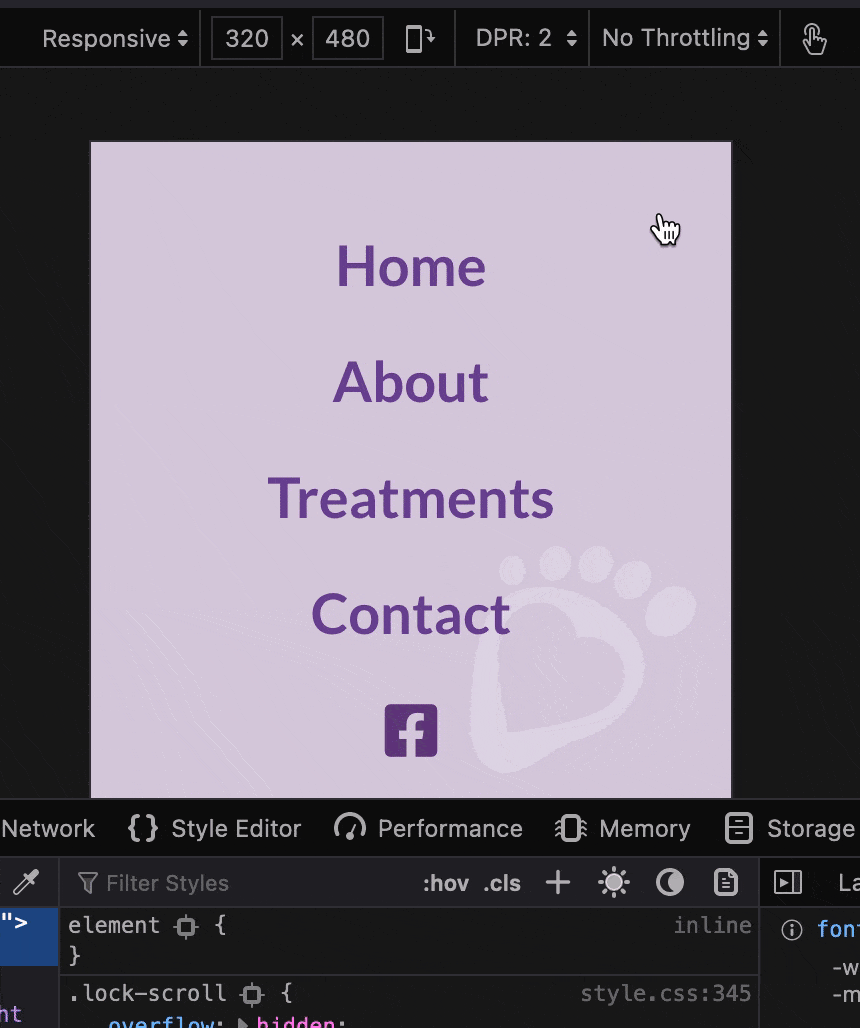
I used the page transition bric as I wanted something different on this one, and on the contact us page it took a small bit of time for both google maps and facebook to load, so I delayed the page open a fraction more on this page…hope it works!
My aim of builds is simple for the user to navigate and not inundated with loads of information at one time.
Thanks for the comment @pruthe - yeah, I bought the bric today and not really had a play with it yet, but I will bring that into it and also look at bringing @PeteSharp copyright bric into it - I have a few websites I can add those on.
@pruthe - Thanks for finding. I have just had a play around with this - took the page transition off and still doing it so added that back. I have re-made it and still the same.
Very very strange ! using Easy Burger - but Pete said nothing to do with that. @Norm this something you have noticed before?
In that video clip it seems to still show when you click on the X It flashes straight back to that page again.
I get it on mobile only and not when trying to emulate it on my mac. Really strange.
Using no CSS on the website - just 3 brics, page transition, image comparison and easy burger.
On testing I’ve took it all off and still happening - I’m wondering if it’s something @Norm can look into - not sure if it’s a bug. I’ll file it later.
I’m not sure if it’s a bug either, but one workaround is select the Sidebar menu style, along with disabling the X close symbol (as you did). When viewing the sidebar menu, you can just click outside of the menu area to dismiss the menu.
Perhaps you client could choose better before and after images. What is there doesn’t instill much confidence.
The client portrait image at its current size is a touch too large for my taste - personal opinion obviously.
Over-all clean and effective.