Hello everyone, I am putting together a page with the app (blocs). It’s not the final page I just want to know your opinions ![]()
3 Likes
 Good job!
Hello!
It looks great indeed! Love the bright colors!
I am sure @mackyangeles loves the colors as well! 
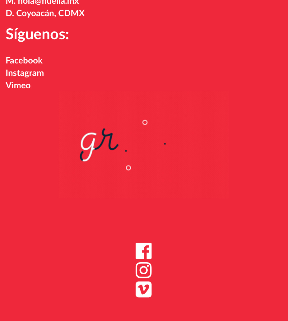
The only thing I would suggest is to rebuild the social icons manually, because right now they look odd on mobile devices.
Looking forward to checking the final version!
2 Likes

I really like it, but … …it would benefit from some partiitioning of the rows - you have a lot of elements set in a sea of white and I think using the alternating rows background colour techniques would improve the usability and visual aesthetic.
Great job.
[ Not a criticism of you, but on my Mac the menu bar suddenly appears on scroll and really we’d all like to see that as a smooth scroll. Norm? ]
![]() thanks @Eldar, I would like to achieve something like this how is it done? (social icons) http://blocstemplates.com/demo/lawyer/m/ Good work!
thanks @Eldar, I would like to achieve something like this how is it done? (social icons) http://blocstemplates.com/demo/lawyer/m/ Good work!
thanks,
I will try to slow down the movement 