Carnival is a BIG thing in the western provinces of Germany.
For all of you outside the Rhineland, carnival has been celebrated over here for centuries (some say it goes back to pre-roman times) and it’s utterly bonkers and terrific fun!
You love or you hate it - but the easiest way to survive the “fifth season” is to simply join it!
That’s what I did and for years now I have been, and still am, officially a fool and proud member of the most foolish, honourable and oldest Carnival Association in town, one of the oldest worldwide - the Mainzer Ranzengarde (The Belly Guard of Mainz).
After last year’s Rose Monday Parade, I couldn’t keep my mouth shut (I am a fool, it simply happened… I wonder wether it was due to the marching rations (barrels of Riesling) or the general merriment after a successful campaign. Must have been the merriment, most definitely!) and I ended up with the Field Marshal General of the Guard giving me a new assignment and sending me on a fools errand: Redesign the website of our honorable society!
Aye, aye, sir!
I started with unearthing and analysing the old website, a pleasure for every archaeologist!
Very advanced for its time but hopelessly outdated (built with Active Server Pages about 20 years ago), it was a monster of an application: membership and fees administration, newsletter client, archive, website - and then some! No way, I was going to recreate something similar! Instead of such a frankensteenish monster created by a “foolish mastermind”, I opted for something simple - Blocs!
Here ist the outcome: https://mainzer-ranzengarde.de
I aimed for a very clean and simple design, nice to look at on computer and mobile, clear, clean, logical - in other words - foolish!
Let my point out a few details:
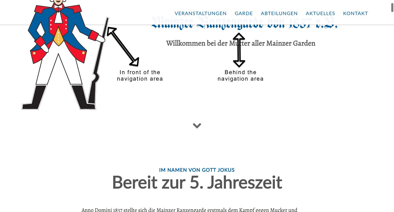
Start screen
Very simple - on purpose. When you start scrolling, the guard (on the left side) will remain above the navigation area, while the text will vanish below. How do you like the effect?
Section “Veranstaltungen / Termine”
Ticket corners flying in from the sides. Round tool tips.
I might be a fool but I give credit to those who deserve it,
@Eldar: Thank you for your foundation template, which inspired my card design in the sections “Veranstaltungen” and “Termine & News”. How do like the ticket corners? The ticket shop is already finished as well but I have to wait until the final decision wether we are going to have indoor events during this campaign or not before I can reveal the links (due to corona/covid19).
Section “Das Kommando”
@PeteSharp: Thank your for your example of the flip cards! It was the basis for the flip cards I used in this section. I just added the rounded images, some text, the buttons to reveal the column with the next flip card… the slider like transition to the next image is actually a Blocs functionality. I played around with the visibility to hide and reveal the columns.
Section “Abteilungen marsch!”
The tiles with “das Bataillon”, etc. are square, no matter how you scale the screen. I still haven’t figured out how I figured this one out!
The secret is to place a div inside a div inside a div inside a div and assigning the width in a certain order. I will post details when I find the time to unscrew my brain. The solution is weird but it works. A fool at work!
Section “Kontakt zur Garde”
Hero bloc with a border assigned via a custom class (frame around the image)
Further below, maps from OpenStreetMap
Lots and lots of modals! I managed to make it a one pager, well nearly… I had to make ONE exception for Google Calendar. I had to make that an extra page here, because otherwise it forwards the IP of the visitor to Google before he/she is informed about this behaviour. A NO-DO over here in the GDPR-controlled countries, at least if you want your website to be compliant.
Using OpenStreetMaps is still ok until Brexit. Before New Year I will have to come up with a new GDPR-compliant solution as the the UK will then leave the EU and there’s no agreement between the two yet. Sigh! Bloody politics!
Let me know what you think! Critique is welcome!
PS: In case anybody is wondering why the images are showing people in uniforms of the late 18th, early 19th century. Well, this is the Guard of Jokus, the god of fools. The origins are deeply rooted in the history of Mainz. If anybody is interested I can post some more details.
