Just add another text bric, like when I added the H3 text. Actually if you wrapped all the text in a div, you can have all of it fade up and in together.
Hi Again – Thinking further on this, it would great if your videos will include some really basic diagrams & or verbal explanations that explain ‘bootstrap’ elements, and how they are deployed in BlocsApp!
For example, I see you use DIVs a lot, and it would be great to have a detailed explanation of ‘why/when/how to’ deploy them, and any implications for using this little bric…stuff like that, so that it’s not taken for granted that such ‘bootstrap’ or ‘coding’ terminology is understood by ‘non-coders’, but instead is described (both conceptually & application-wise) when used so that when using ‘code’ the user (me) has full understanding of what should be seen as the result along with any limitations or ‘issues’ that arise in order to be able to recognize when things go sideways and why it does.
The free tutorials are not exhaustive by any means. I do in the hover video, mention why I set the opacity in the page header and not in the class editor, but to go into more depth would either make the videos very long or multiple sessions—which would take a lot more time, and some things are covered in other videos. So the scope of the free tutorials, as I am sure you can appreciate won’t change too much.
Feel free to comment on them and ask questions, my methods are always “the way I would do it” at the time, and I’m always learning.
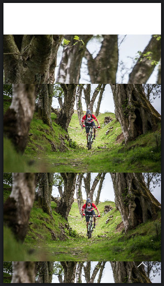
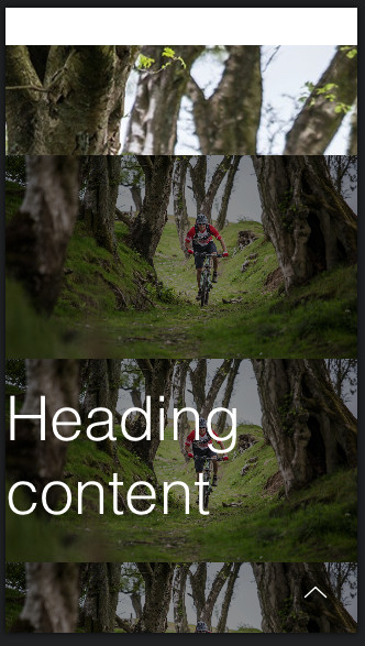
Hi @PeteSharp cheers for this, what does yours look like on tablet & Mobile? This is what I get, not sure it’s an easy fix, or whether I’ve done something wrong. Cheers
Thanks for taking the time to put this together.
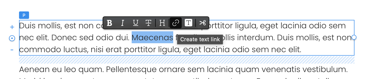
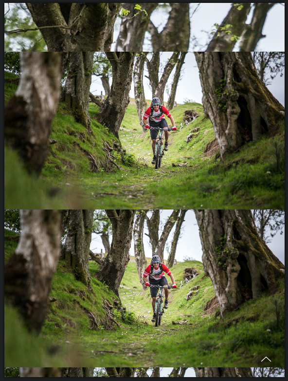
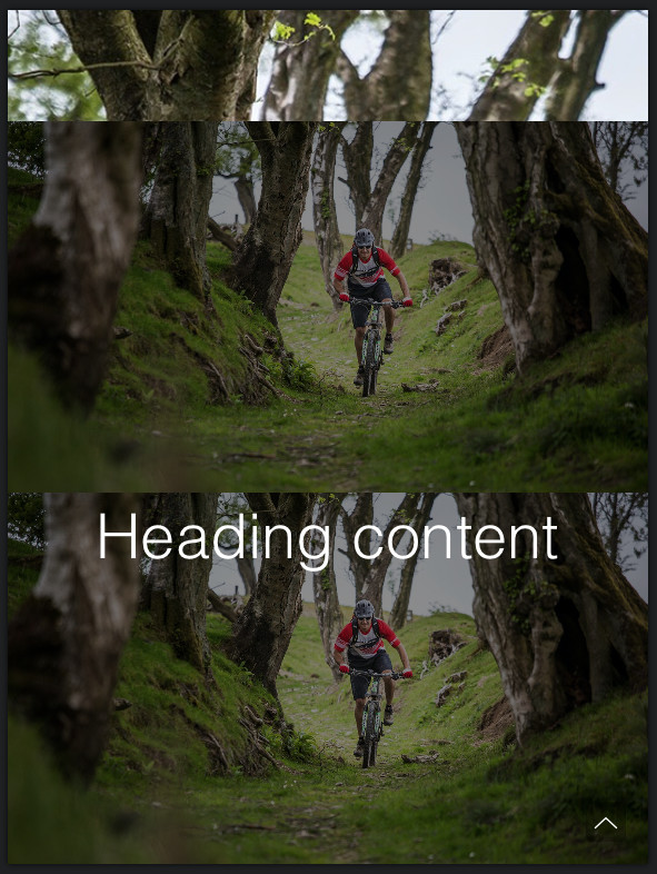
Question: How can the image act 100% responsively? In other word how can the image be shown in full, but shrinks to size. It appears to be cropping.
Thats the effect of setting the image background size to cover. Its a fantastic style thats very handy for things like this. It will always fill the space without stretching the image.
If you want an image to maintain a fixed width and height ratio, it really doesn’t flow well to mobile screens, they become very small, which is not ideal if you have content overlaying.
Lots of ways to do this. Cover is the easiest. The rest require lots of work per breakpoint. Not impossible when working with a full bloc effect like this.
When doing something like this in a confined space, my original video works well, you can adapt that to cards, Divs Columns. All sorts of things.


