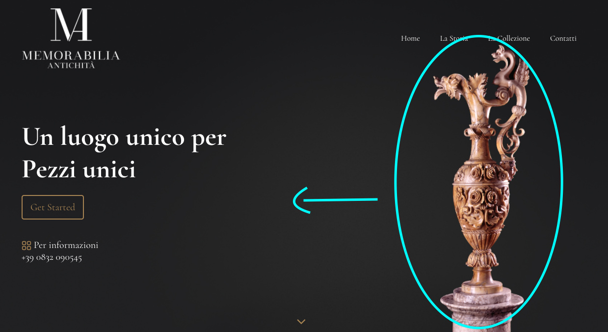
maybe it’s a stupid question, but I’m new so I’m asking you anyway. when I view this website I’m workin on http://classyday.xyz/memorabilia/ in a large window everything is ok, but if I narrow the browser or if I view the site from a smartphone, the vase on the right disappears and I can’t see it anymore. how do i pin the background image on the right so that it is always visible?
tx
1 Like
What I would do is edit the image and pull the vase a little more to make it fit.
Another option is to use two blocks, one for desktop and tablet and the second block for mobile version and crop the image to fit.
1 Like
tx for your answer, how can u do to change a block only in the mobile version?
Hi, have two blocs on the page, one for larger screens and one for smaller, and hide whichever one at the breakpoints you don’t want.
It’s a bit odd working with the 2 blocs showing, but you get used to it.
You can set different images for each breakpoint also in the Class Editor.
Another option is to have the vase as a separate asset and set the position with CSS.
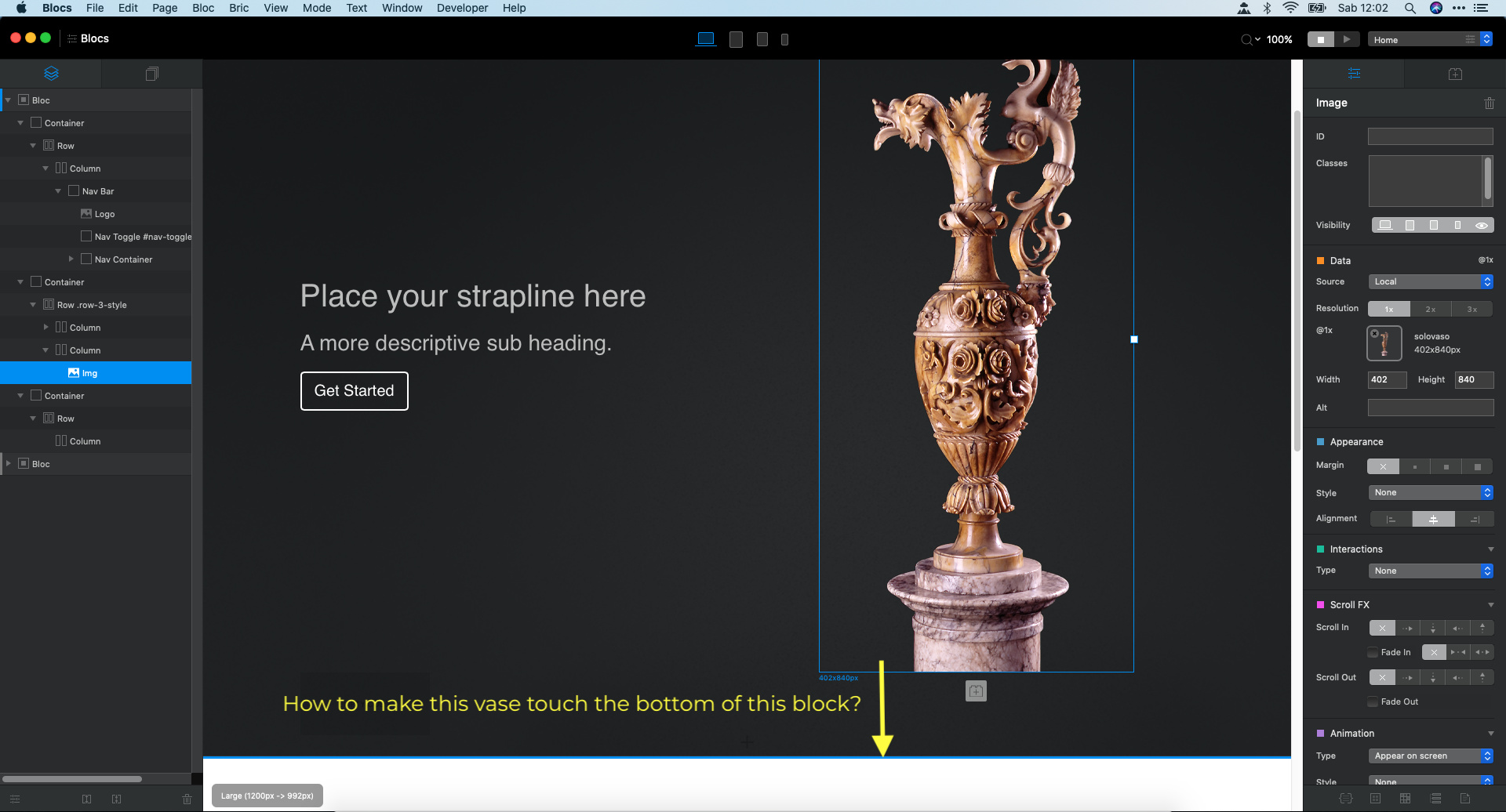
I’m trying the second option (using the vase as a separate asset), but I can’t make it go down till the bottom of the black background.
You set the background image by breakpoint like other classes properties.
Select the breakpoint for the canvas (top icons) and change the background image in the Class Editor.
I did it, but as you can see, the vase is in a strange position (under the gray background)
see here http://classyday.xyz/memorabilia/
how you did you do the change on the sticky nav var? By the way you can also make a break point on your css file and add a image optimized for mobile versions 
for the change in the sticky nav you can read this thread