Hi @area49,
As you have experienced the full Bootstrap 3 grid system and its related features are not yet present in Blocs.
But if it helps for your reference, and this discussion as a whole. The following are the present Breakpoints / Media Queries used by Blocs. You will find them at the bottom of the exported “style.css” to explore further.
@media (max-width: 1024px){}
@media (max-width: 992px) and (min-width: 768px){}
@media only screen and (min-device-width : 768px) and (max-device-width : 1024px) and (orientation : landscape) {}
@media (max-width: 991px){}
@media (max-width: 767px){}
@media (max-width: 400px){}
And this is the present structure you get with the mentioned approaches above:
<!-- Main container -->
<div class="page-container">
<!-- // ------------------------------------------------------------------------------------------------- // -->
<!-- This is the First Basic Bloc, single row set to two columns and set to not stack Tablet and Mobile -->
<!-- // ------------------------------------------------------------------------------------------------- // -->
<!-- bloc-0 -->
<div class="bloc" id="bloc-0">
	<div class="container bloc-lg">
		<div class="row">
			<div class="col-xs-6">
			<!-- * If set to stacked it becomes -->
			<!-- <div class="col-md-6 col-sm-12 col-xs-6"> -->
			</div>
			<div class="col-xs-6">
			<!-- * If set to stacked it becomes -->
			<!-- <div class="col-md-6 col-sm-12 col-xs-6"> -->
			</div>
		</div>
	</div>
</div>
<!-- bloc-0 END -->
<!-- Bloc Group -->
<div class='bloc-group'>
<!-- // ------------------------------------------------------------------------------------------------- // -->
<!-- This is the Second Basic Bloc, default two rows and two columns -->
<!-- // ------------------------------------------------------------------------------------------------- // -->
<!-- bloc-1 -->
<div class="bloc" id="bloc-1">
	<div class="container bloc-lg">
		<div class="row">
			<div class="col-sm-12">
			</div>
		</div>
	</div>
</div>
<!-- bloc-1 END -->
<!-- bloc-2 -->
<div class="bloc" id="bloc-2">
	<div class="container bloc-lg">
		<div class="row">
			<div class="col-sm-12">
			</div>
		</div>
	</div>
</div>
<!-- bloc-2 END -->
</div>
<!-- Bloc Group END -->
For additional reference, this discussion has been talked about in similar fashion previously:
In both those two threads I posted some additional related info.
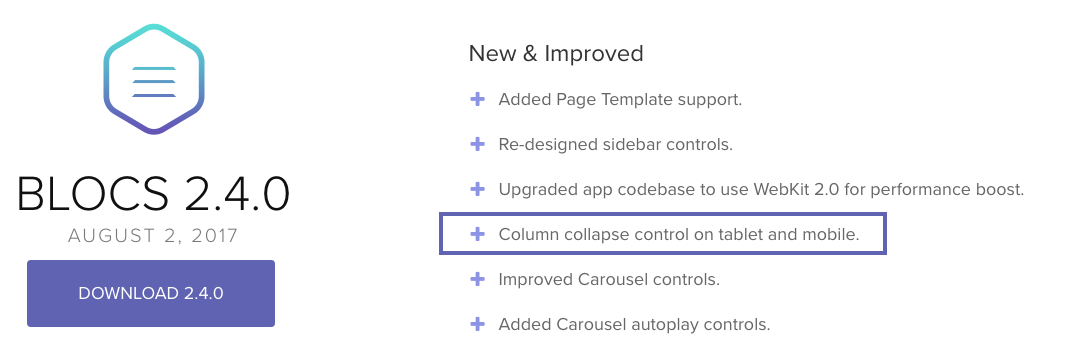
With Blocs 2.4.0, it brought “Column collapse control on tablet and mobile”

But again, as you have experienced the full Bootstrap 3 grid system and its related features are not yet present in Blocs.
So only @norm could provide insight as to if or when they will be - or if a future Blocs version with Bootstrap 4 will have access to it’s entire grid system. Certainly when Blocs gets to Bootstrap 4 and it’s use of FlexBox and many other enhancements to the grid system it will help users if fully implemented in Blocs. As would the more complete grid system of Bootstrap 3 presently, along with more structure Blocs, etc.,
I am sure things will continue to improve with Blocs in these areas and others eventually.