I can’t find where to change the collapse or stacking of columns moving from a large screen to a smaller one. I.e. you want to collapse a 2 column layout to a one column on top of the second column at mobile or tablet. Or perhaps you don’t want the columns to collapse when using buttons for example.
Is the current implementation fixed so that it always stacks for mobile?
The application here is to create 2 buttons side by side that remain side by side on all devices. Currently the 2 buttons collapse when they would not only look better but use less space if the 2 Col was not collapsed. I have searched the settings and can’t find a way to stop the collapse for mobile. Similarly if I wanted to have say 5 social icons on a row, I would like them to remain in a row and not stack on top of each other for mobile.
Sounds like a good follow up to the discussion in the previous thread ([Columns order and object alignment] (Columns order and object alignment)).
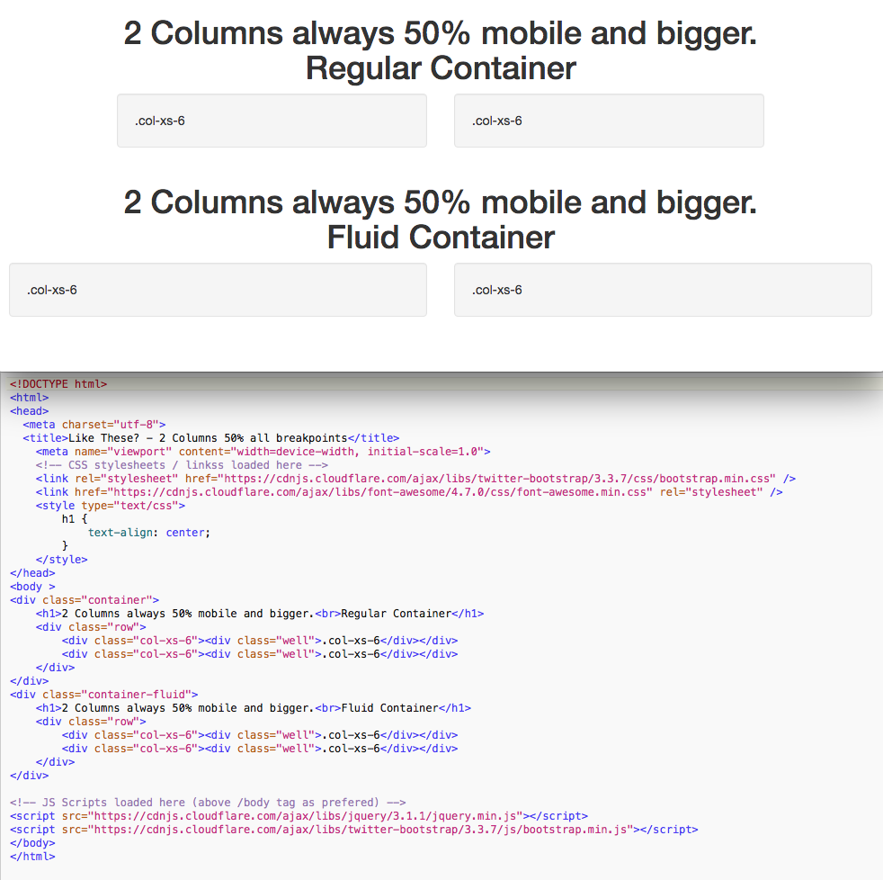
On the most basic level there is “col-xs-6” which will be two columns across all breakpoints. I have shown a basic RAW HTML example (Not a Blocs example), I assume this is what you mean?
In the meantime you could maybe do your own manually with the HTML widget Bric, or manually after export. However you will probably have to contend with any CSS overrides that Blocs has in place already as well, concerning styling or create your own in addition to get it how you want.
So as @mackyangeles says, “more structure blocs” or even better to have the ability to set the desired structure for Blocs and Brics via the UI concerning the Bootstrap Grid Classes, push & pull, etc., or a more expansive use of the Bootstrap Grid in available Blocs/Brics.