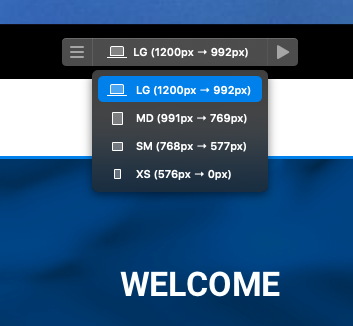
I need to know if changes made to one responsive layout section will automatically reflect on all of them. It’s important for me to understand how the responsive sections work in Blocs to edit confidently. I’ve noticed that some changes stay within a specific section, while others affect all sections. Thanks in advance.
Custom Classes (or CSS) cascade down, so style changes made at the top flow down, unless you have overriding classes which may appear to prevent that.
The only exception to the rule is the column controls. Bootstrap currently has mobile first approach here so their class structuring works upwards. This means if you change a column width on a lower breakpoint its effect will travel upwards. (I’m looking into changing this to make it more uniform)
Aside from those, also consider some of the inspector options (not many) only have one setting mode which means it’s the same style on all breakpoints.
The button corner controls are a good example. If you use the quick and simple inspector controls for a buttons corner style, it will be the same on all breakpoints, however, if you customise a buttons corner style with a custom class, you can adjust corner per breakpoint in much greater fidelity.
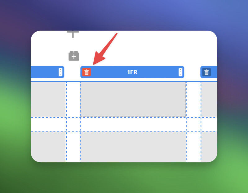
Is there a way to make adjustments specifically for mobile devices? I’m having trouble centering elements on mobile—everything looks fine on desktop, but I’m struggling to get things centered for mobile. Any suggestions?
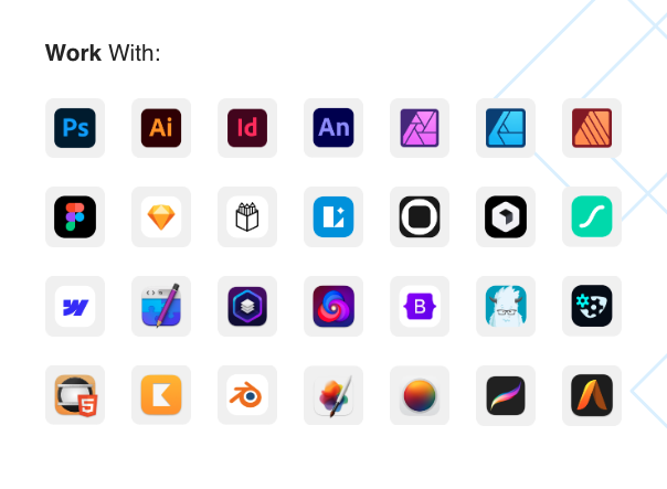
I’m having trouble with my website rebranding project and I need assistance. Take a look at my own website rebranding that I’m currently working on using Blocs. The grid I’m trying to create doesn’t maintain the desired three-column layout in the mobil layout, which I need in order to showcase the large icons of the apps I use. If anyone can provide guidance, I would greatly appreciate it. Desktop size is good, but when you see the page on a phone… it’s bad.