Hello,
Is there anyway of applying an open close indicator in the accordian bric?
Thanks in advance
Hello,
Is there anyway of applying an open close indicator in the accordian bric?
Thanks in advance
I have the same Problem 
I’ve copied a shortcut arrow inside the Text like  .
.
Unfortunately you can not edit the Label/Headline-text anymore.
I also do not know how to keep the first point closed.
I am looking for something similar. I have a website with a summary of a book that is very long and I’d like that to be visible only when clicked. Given the length of content it really needs a close option at the bottom as well and there doesn’t seem to be any obvious means of doing this in Blocs.
Unfortunately the accordion in blocs is very basic, and it automatically adds the “show” class to the first item. The way around that is to delete the first item in blocs and they will all be closed.
You can add arrows and indicators with some simple CSS.
Yeah I know how to delete the first part and do that regularly. In this case I just want a single area that can be clicked on to reveal the summary contents of roughly 50 chapters, but have the ability to close it either at the top or after scrolling to the bottom. I’ve also thought about doing this in a modal where you do at least have a close option for the footer.
Right now this is the one impediment from rebuilding a Rapidweaver site in Blocs. They have a few stacks that can do this sort of thing.
Whoops, I mis-read the thread.
If I understand correctly, you can add something at the bottom of the text and turn it into a close link using Custom Data Attributes. This could be text or an icon. You can also animate with some CSS.
eg.
data-toggle=“collapse”
data-target="#accordionContentID"
get that ID from here
OK thanks I’ll give it a go.
When we first create a new Accordion and then Preview, the topmost item is expanded by default. How do we make it collapsed by default?
FIXED MYSELF: Delete the topmost Card! That’s it!
So @Flashman, did you implement the accordion toggle indicator, and if so, how did you do so? Thanks in advance.
@PeteSharp came up with a solution that works. I have tried to save as a custom bloc however this is not working at the moment and I’ve really been too busy with other work to spend time on it as I’ve had five new website jobs arrive in the last week alone.
At the moment with the saving custom blocs with code widgets issue being outstanding, I can post the steps and code here if people want it?
Hi @PeteSharp,
I would be interested if you could tell me how to do this. I’d also be interested if there’s a way to add a ± indicator at the beginning of each accordion card heading to show whether the card is closed or open.
Thanks so much!
I’ll be able to post it later tonight (NZDT)
Hey @pruthe,
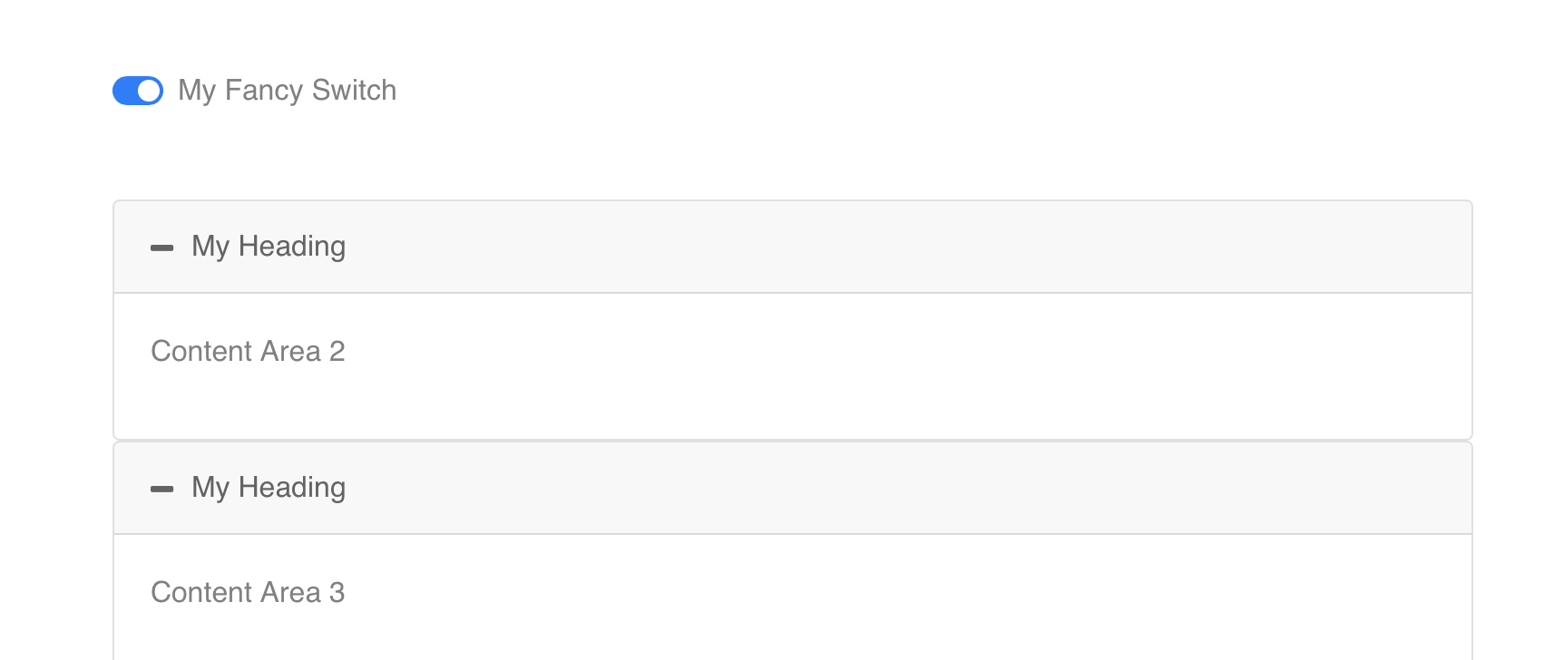
Accordion With Toggle All Switch
I modified this to work with Blocs built in Accordion, the original was completely built using the code bric. So if there are some issue, please let me know.
Steps
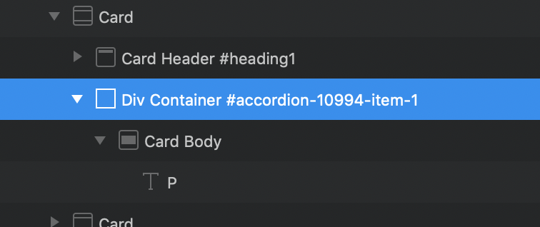
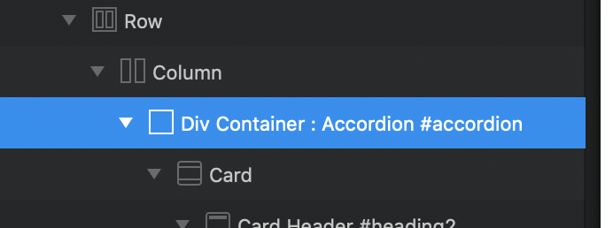
1. Get the ID of your accordion, you will need that. (in my example #accordion-34328)
2. Add the switch. Put a code bric somewhere and paste this code. (sorry had trouble getting the built in CheckBox to work properly, so its code sorry)
	<div class="custom-control custom-switch">
	  <input type="checkbox" class="custom-control-input" id="contentSwitch" onclick="triggerAccordion()">
	  <label class="custom-control-label" for="contentSwitch"></label>
</div>3. Add this code to the page footer. (replace #accordion-34328 with you accordion ID)
<script>
// Trigger
function triggerAccordion() {
  var checkBoxTop = document.getElementById("contentSwitch");
  if (checkBoxTop.checked == true){
     $('#accordion-34328 .collapse').removeAttr("data-parent");
     $('#accordion-34328 .collapse').collapse('show');
  } else {
     $('#accordion-34328 .collapse').attr("data-parent","#accordion");
     $('#accordion-34328 .collapse').collapse('hide');
    }
}
</script>
Here is the example Project file
Blocs_Accordion_Toggle_All-2.bloc (1.4 MB)
@Flashman, I managed to get the code working to use the collapsing transition. Remember it opened straight away before.
To add plus and minus icons use the following CSS in the page header. Replace the #id to suit your accordion.
<style>
#accordion-34328 .card-header a:before{
   font-family: FontAwesome;
   content: "\f068"
   display: inline-block;
   padding-right: 10px;
   vertical-align: middle;
}
#accordion-34328 .card-header a[aria-expanded="true"]:before{
   font-family: FontAwesome;
   content: "\f068"
}
#accordion-34328 .card-header a[aria-expanded="false"]:before{
   font-family: FontAwesome;
   content: "\f067"
}
</style>Nice. But can you move + and - to the right side, instead of left side? 
Yes. Change the “before” to “after”
Gotcha,
Just change the first class too this…
#accordion-34328 .card-header a:after{
   font-family: FontAwesome;
   content: "\f068"
   display: inline-block;
   float: right;  // << Just adding this bit here
   padding-right: 10px;  // set this to what ever you want
   vertical-align: middle;
}It works!!! Thanks a lot…