I’ve spent this afternoon searching this forum and elsewhere to try and find a solution to reducing the amount of white space above and below the carousel images when viewed on mobile.
I’ve tried creating a media query on .carousel-inner and adding as a style in the page header but couldn’t get it to work.
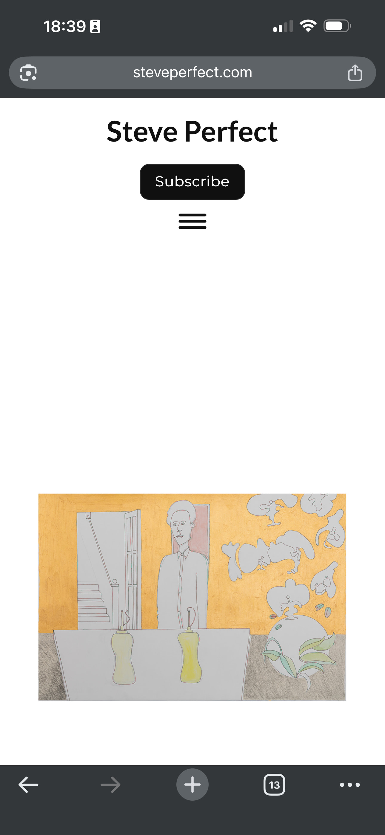
See image below. The carousel code added in additional css works fine at all other breakpoints except mobile and I’m wary of changing anything without checking first.
Do you have a live link we can take a look at to see what is happening? I’m not sure what is causing the white space, the carousel typically doesn’t show this addition space.
Thanks Norm. My client site is https://www.steveperfect.com/. The screenshot is taken when the home page is viewed on a mobile device. The flexyfoot2 is set to classic. The goal is to reduce the height of the container/whitespace top and bottom of the carousel image.
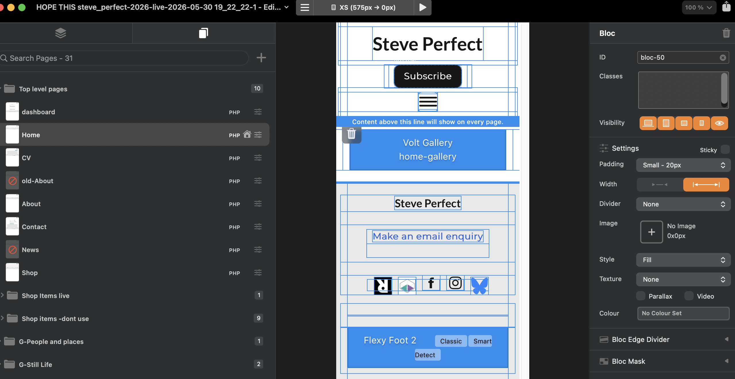
In the Blocs editor view your page at the smallest display size (top of screen center, mine is set to large for this example) and adjust the element padding (Bloc) to “none” as seen below as it is probably defaulted to large 100.
I’ve been looking at this issue again this evening.
I tried resolving by adding the following code to Project Header wrapped as a style
@media (max-width: 575px) {
.carousel-item img {
height: 200px;
width: 100%;
}
}
I’ve tried different height values but not seeing any change. Is the media query correct and in the right place?
Hi Norm, thanks. I’ll test both these suggestions again to work out the best solution. If my client is adding images with white space then that is of course another issue! Thanks for looking into.