Hi,
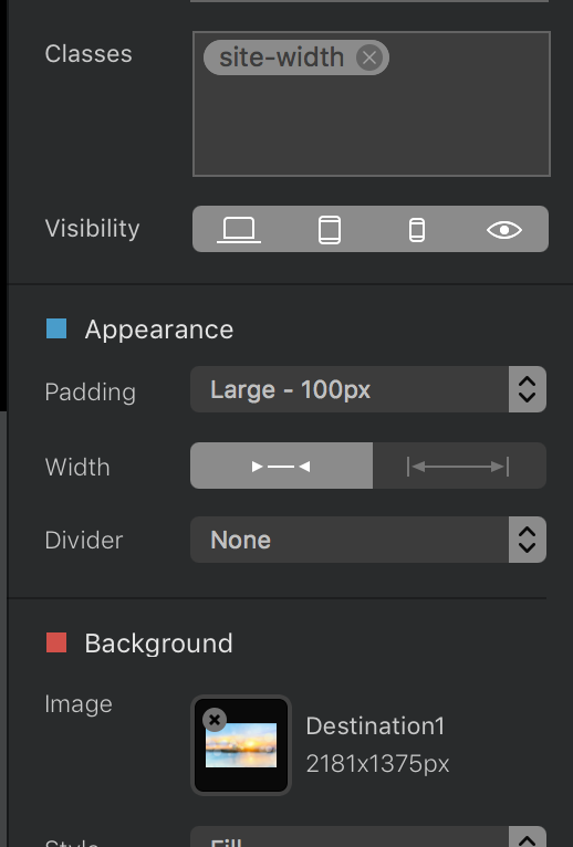
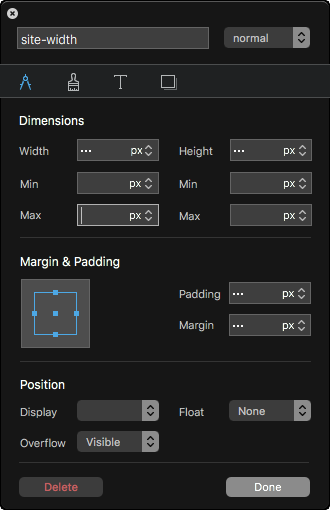
I’ve setted max. width of the block to particular width in px (1920). Well, when the page is opened on e.g. 2k resolution or more, the block is keeping it’s size of 1920px BUT it does align to the left site of the page:
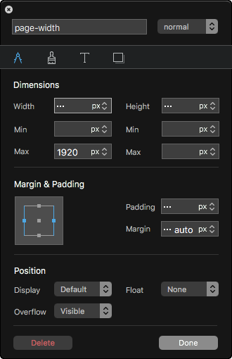
I confess to being confused, loaded your file and see exactly what you mean. So, I added a new page, two columns, used 1920px image as the background with the same 1920 image in foreground then viewed in browser on a 5k monitor full screen and it centred for me! The only thing I had to do was set padding to fullscreen and that only to stop the image being cropped off at the top and bottom and nothing to do with the issue at hand.
I also spotted that the footer detail does use the full screen on your page, even though the nav and body doesn’t. That said on the page I added the Nav did use the full page, along with the body too.
actually that’s what I want to set, max. width of 1920px. But when I open this site on 2k< monitor I want that 1920px site be centralised with empty (white) borders on left and right site.
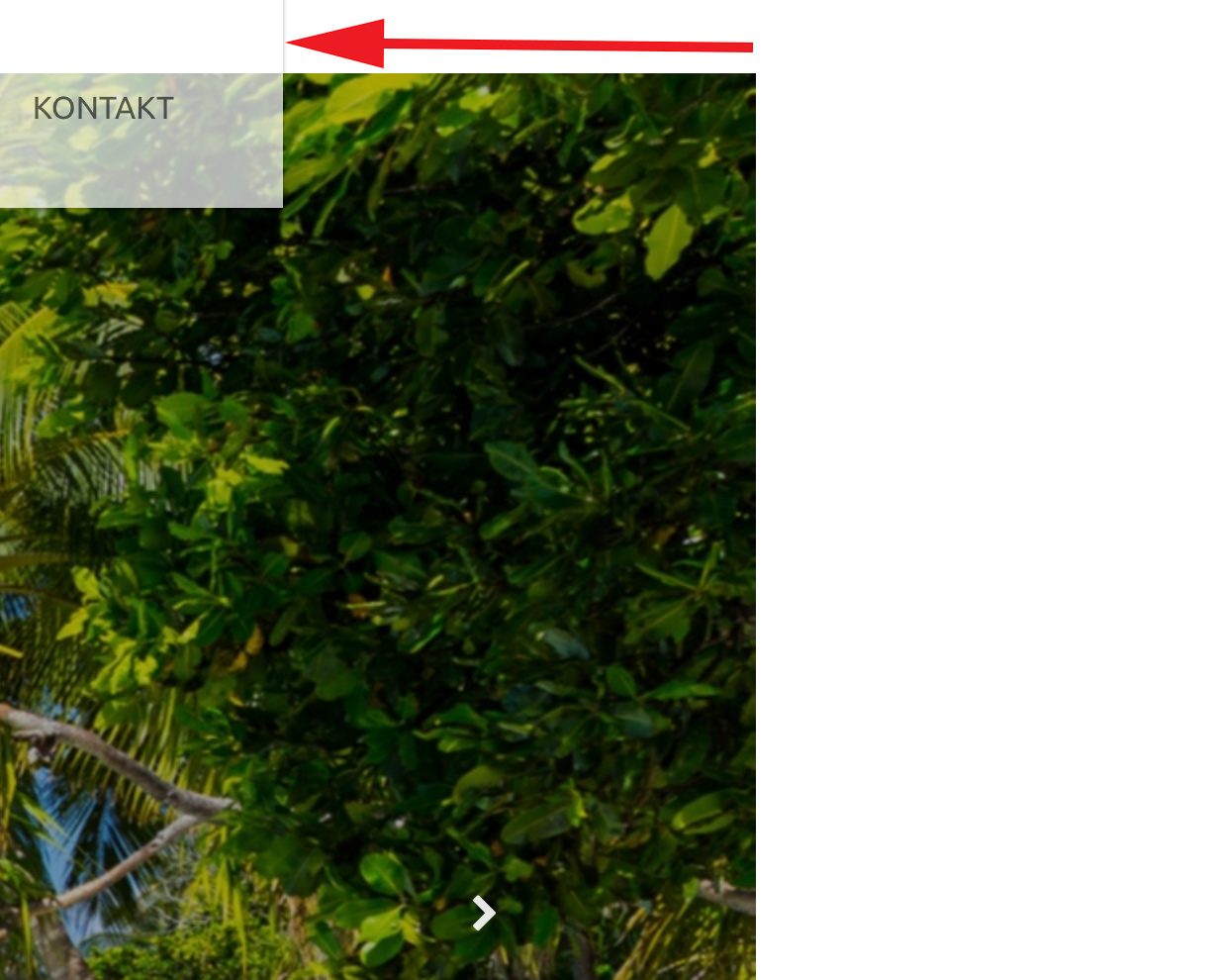
I tried to start new project but as soon I set just single class with max width set to 1920px only, the alignment stays on the left.
Except one thing - sticky navigation bloc in global area is moving to the left site when I scroll the page down… However, when I scroll back to the top of the page, it moves to the middle as the rest of the objects.
Quick video tutorial
I think it’s how you describe how you wanted it… or?
In this example i used 1000px width just to show that it kept it centered and all that.


