I could see the entire image and the name of the file.
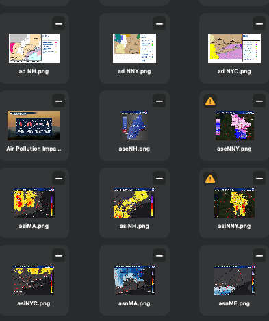
One of the folders I use daily is my daily weather images. These are the most used images since they change all the time. Before the update the images in those folders looked just like the image above.
Now in the latest Blocs version, they look like this:
I can see the file name, but I can no longer see the entire image. Adjusting the view does not change this. These files are all .png images. Other folders that contain .png images DO NOT behave this way, only these “Daily” image folders.
Is there anything I can do to get these images back to the view that I had before?
This is how assets are handled now, especially square images (with no transparency ). They take up as much space as possible, this was a request by a user helping to test Blocs 6.4.
If you scale down the name portion will be hidden.
I may add a feature to force hide the name or customise the tile style in future.
But filling up as much space as possible makes sense, unfortunately when the asset is square (or close too) it takes up height as well.
Well, this is unfortunate. Had I realized this update would have changed the Asset Manager view this drastically, I might not have updated at all and stayed with previous version.
My need is to quickly scale through, literally, 100 images, to find the correct one. I was doing that visually, and it was going quite well.
This version has taken that ability away which now adds into the time it takes me to make site updates.
Your comment, “filling up as much space as possible makes sense” makes little sense to me. I would want the asset space filled with the entire image, and frankly it is not, since I can no longer see the entire asset.
I guess I will have to “make do.'“ However, I am disappointed.
I understand the frustration, our goal is to always improve Blocs, but we also know we can’t get results that please everyone first time.
I think it’s also worth noting, not all images are impacted by this cropping. However, I always like the challenge of making Blocs better, so stay tuned, I will revisit this and see if I can improve the handling of square images in a better way.
Btw you can easily revert back to an earlier version Blocs, by downloading it from our release notes page.
This is truly a huge issue for me since my sites are image heavy.
Frankly, the main reason I updated was to gain use of the new carousel options.
I saved/backed up my last version of Blocs in case I needed to go back, so I could, but then I lose the newer features.
Frankly Norm, not being able to see the entire image is a killer. I see Trevor agrees, and if others agree, please respond to this thread so Norm can see the support for this.
Yes, apart from the square format looking clean and tidy on screen, I can’t see why anyone would want anything other than to see the full picture.
It could still give a similar clean look if the square ‘picture box’ had a slight outline, but still showed the full image inside of it (with whatever colour blank space taking up the area to the outline - if that makes sense?)
The problem is only really there at a very particular tile size, if you scale the tiles up the label takes up way less space. If you scale down the labels are hidden.
I think if the text background blur effect was less and you could see the image greyed slightly behind, it would be less jarring, feel less cropped and more like an overlay.
I’ll tweak the styling for small square images, but let’s also remember for landscape images, the new scaling is way better.