I want to get full screen images to work by default, without having to constantly chase class breaks at each of the 4 sizes. I’d like it to work in background images and Carousels.
The need is simple and typical. If you have a product in a stage setting, you can crop out the sides up to a point, at which you must preserve the viewable area, and scale the image down as the window gets narrower. This require the ability to set:
- A max window size above which, the image scales
- A min window size below which, the image scales
- Between min/max the sides of the image should crop, keeping the image centered
But In Blocs:
- Max size, works by default, once the image width is met
- But if I set a min width, it starts cropping from the right, left justified, no matter what I try
- And I can’t get min size at which it will start scaling again.
If you want a scalable image, you’re going to have to create a pseudo background image. This means using a single column structure bloc with no padding, no gutters and setting it to full width. Place an image bric in the bloc and select the image. You will now have an image that scales to suit the device screen.
The next step is if you wish to add content over the image. To do this, create another bloc immediately below the image block. Add content (typically text or headings). With the content selected, create a custom class and apply a negative top margin to move the content over the image. You will have to adjust the position for each device variant.
As far as I know, carousel images do scale responsively.
1 Like
Carousels are fully responsive. I need the ability to control the image width at which the window width switches from side cropping to scaling. All of the image controls I’ve found in Blocs (%, VW, etc) are view-centric, instead of image-centric… what as I missing?
The problem is the largest break point in Blocs is about half-screen viewing width (approx. normal view for most people). But when a user goes full screen things are disproportional, bottom of the image, and text titles go off screen. If I correct everything to work full screen, then product is out of focus at mid screen, where 90% of users will view it. To solve this lack of a full-screen breakpoint, I need cropping from full-screen to the first break point, then responsive scaling below at 70% percent image width.
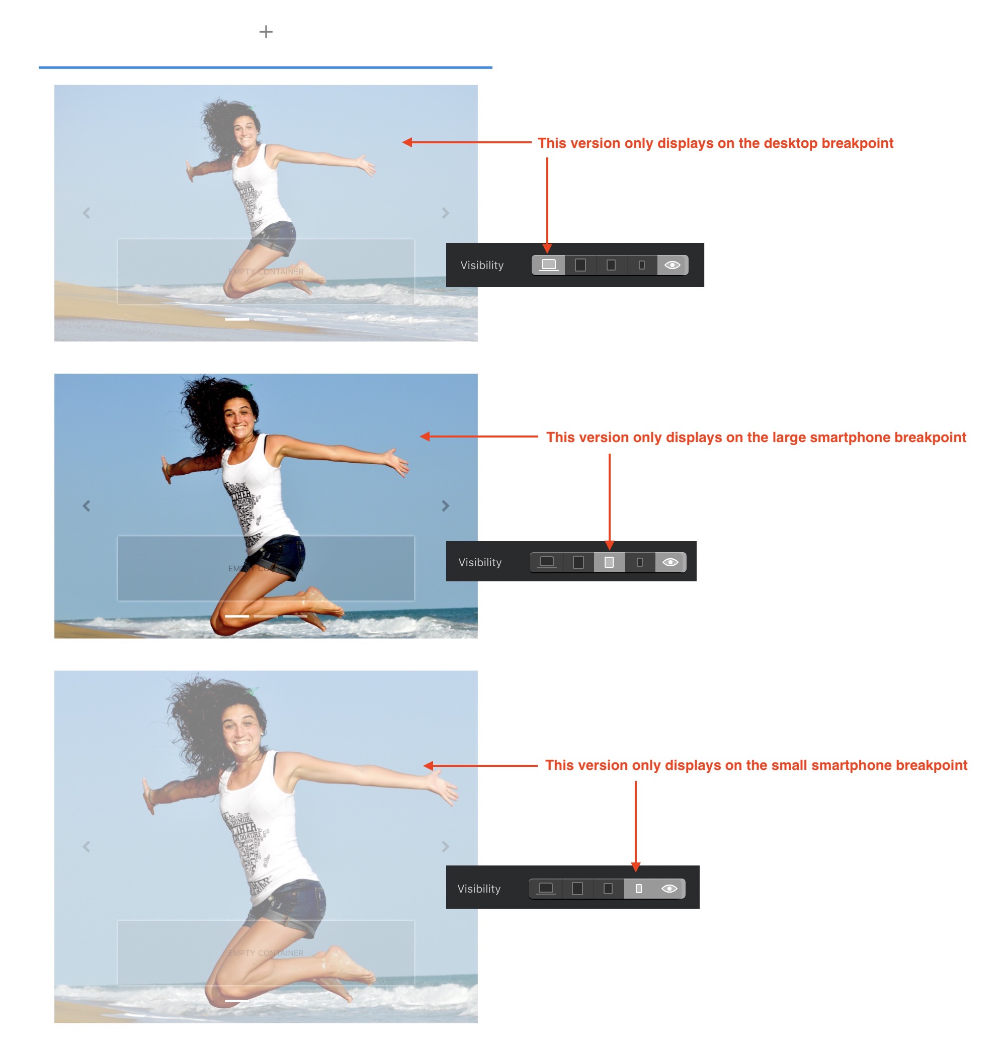
This is a simple example, where you want the users focus on the product. The middle view is mid window width, but the product is small. While and the full screen is missing the text title, and bottom of the image. On the mobile views, the product just gets smaller and smaller.
What I need is the the full screen view to show the full image width, so that the product and text is in focus, and then crop the sides of the image down as the window gets narrower to the mid-screen break point focusing on the product. At that point it should stops cropping, and start scaling at the minimum view where product and text are most in focus, as it scales down.
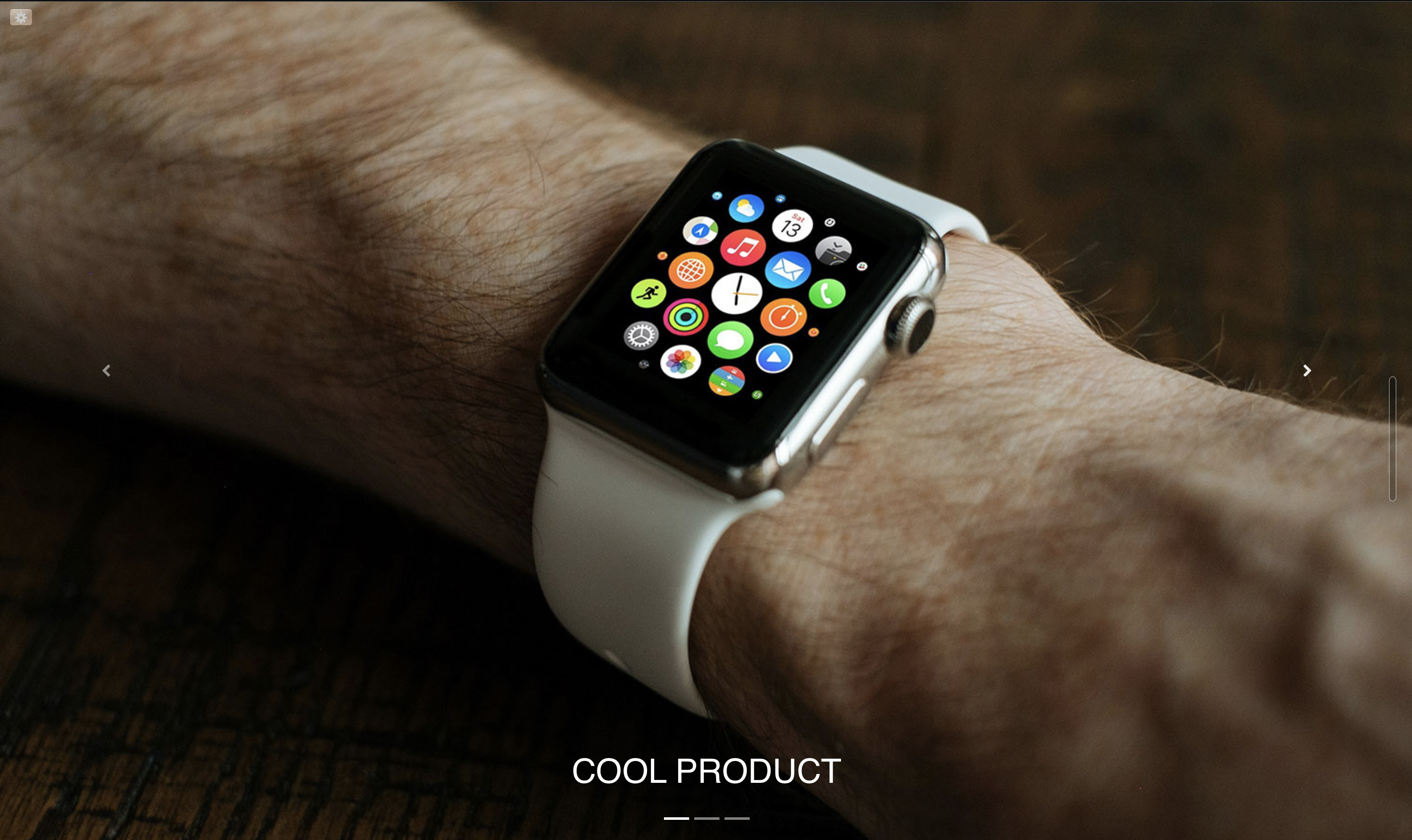
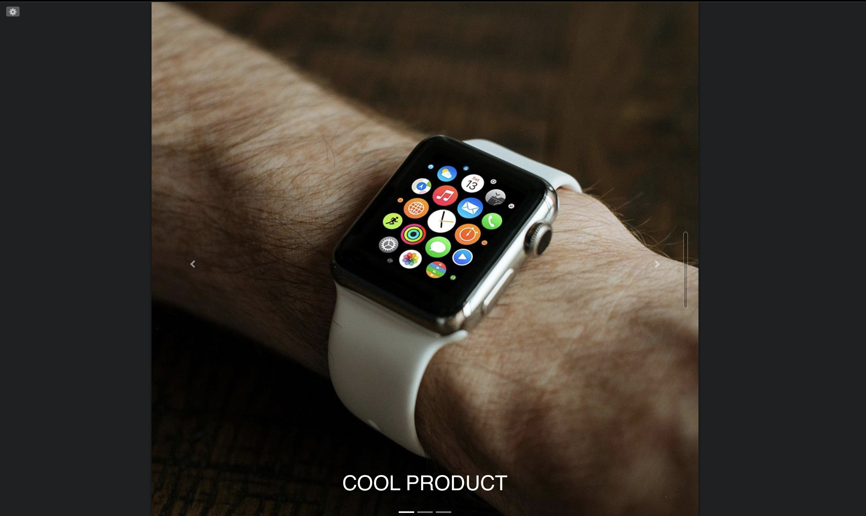
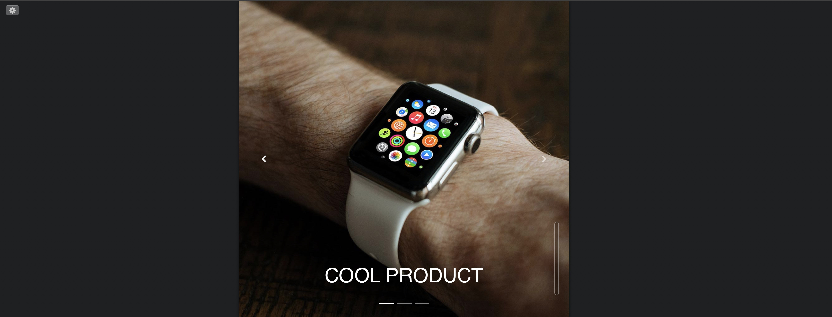
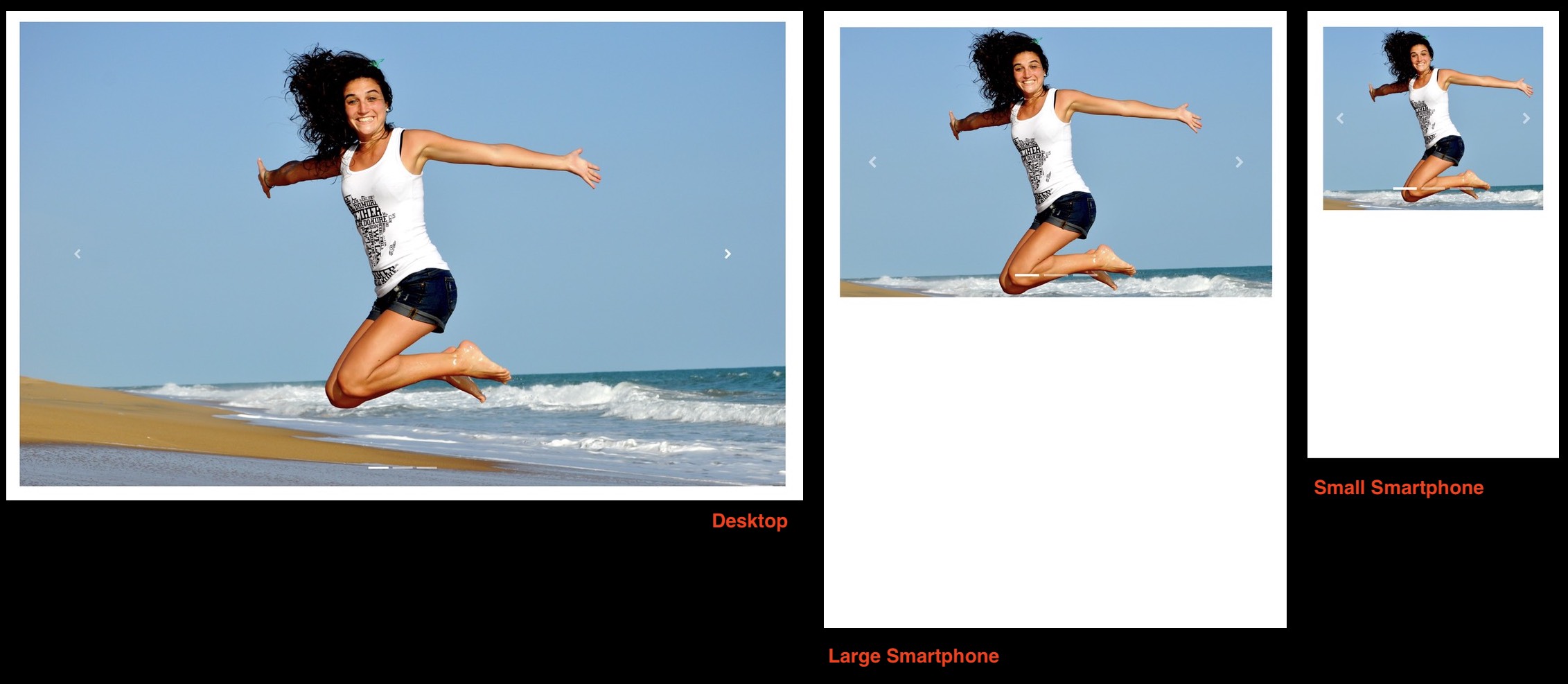
Ok, I’ve got the general idea now. The only way you are going to achieve this is by creating three carousels, each containing images specifically cropped to suit the viewing device. These can be stacked one above the other on your page. The only difference will be the images used in each carousel. Prepare the images as you want them to appear at the various breakpoints in any image editing application. You would then use the visibility options to allocate one carousel to each breakpoint. Here is how the three carousels look in the page work area with their associated visibility settings:
Note: You should create one carousel in each of three separate blocs. You then select the whole bloc when assigning visibility options.
And this is how the carousels will appear on actual device screens:
In the above examples, I’ve only created three variants - you may wish to create four - one for every breakpoint.
To understand why it has to be done this way, you have to appreciate how a carousel is constructed. When you place a carousel on your page it automatically adjusts its width to the width of the column you place it in. When you add images into the carousel, they adjust to the width of the carousel. The height of the carousel is determined by the aspect ratio of the images it contains. This creates a single object that scales proportionately at each breakpoint. This ensures that the whole image is seen at the same aspect ratio on each device. There is no way to have the images scale or crop independently of the carousel itself. Therefore, if you want different aspect ratios at different break points, you have to create several versions of the carousel that are suited to each of the breakpoints.
1 Like
ah, another chapter for the Blocs Book @hendon52. 
Well, there is no book in the making yet (although I have written a number of books on various topics in the past), but I am in the process of writing an extensive beginners tutorial. The idea is to create a tutorial that walks the complete novice through various options Blocs offers. It will do it in a real hands-on kind of way that introduces features as the demo project progress. I think this is how most people tend to work when they get a new piece of software. I’m sure you know the scenario - you start working with the app and then get stuck on something, so you have to then seek help to overcome the issue before moving on until the next problem occurs. The tutorial I’m working on will hopefully get new users much further down the line before they start needing help with some of the more advanced features. Anyway, it will be posted as a freebie in this forum in the not too distant future, so I’ll be sure to let you know when it’s posted.
1 Like
Excellent news, look forward to reading it.