I am currently working on transferring an old website I made back in 2011 with Rapidweaver to Blocs. The client would like to keep the overall layout of the old website.
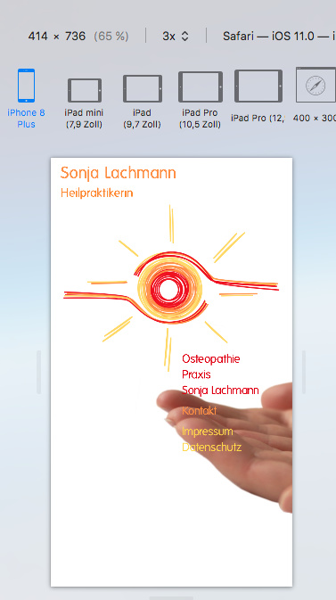
So far I am happy with the result In desktop and tablet view but phone view (767 px and below) is giving me headaches.
In portrait it is looking okayish.
I prefer the version where the background image is set to right bottom to the version where the image is set to fill.
Is there, maybe, a way to assign different background images for portrait and landscape?
Another issue, is there a way to assign an even smaller image size for the logo, when in landscape view? Currently I limited the size to 400px. Which means pretty much full width in portrait and about half width in landscape. I would like to have it even smaller in landscape, so you don’t have to scroll.
I am a bit stuck here and would need a push in the right direction.
The best way to handle this in blocs is to create different layouts for each device. You do this by making the bloc visible on one device and invisible on the others. This way, you can set up multiple header blocs for each device variant. Remember also that you only have three breakpoints in Blocs, one for desktop, one for portrait tablets and one for portrait smartphones. It isn’t really worth trying to specifically cater for landscape smartphone and tablet views. Tablets in landscape will generally display a scaled down version of the desktop site, whist landscape smartphones will have a tendency to display the tablet portrait site.
Within each viewport, you can set custom classes to things like logos so that they display at different sizes on different versions of the site. Changing things through a custom class is simple enough - just add a custom class to whatever it is that will change on other viewports. When you switch to another viewport, you can edit the custom class without it affecting the other viewports.
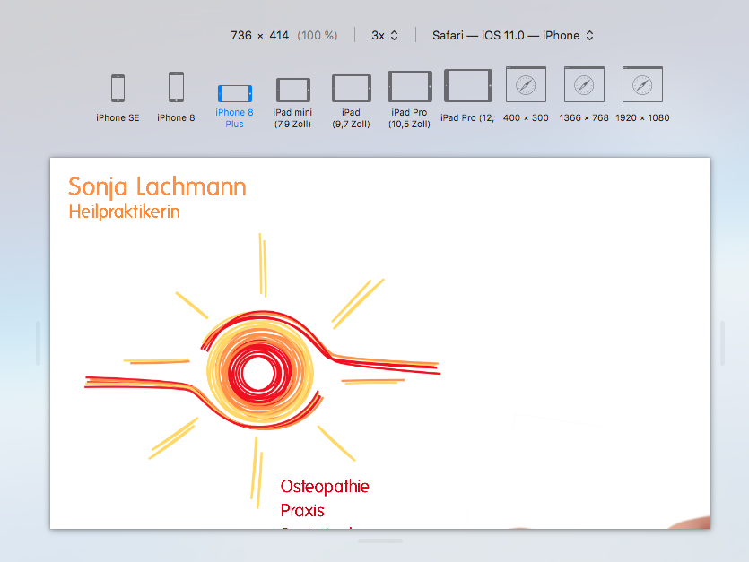
The procedure you describe is exactly how I did it for this project.
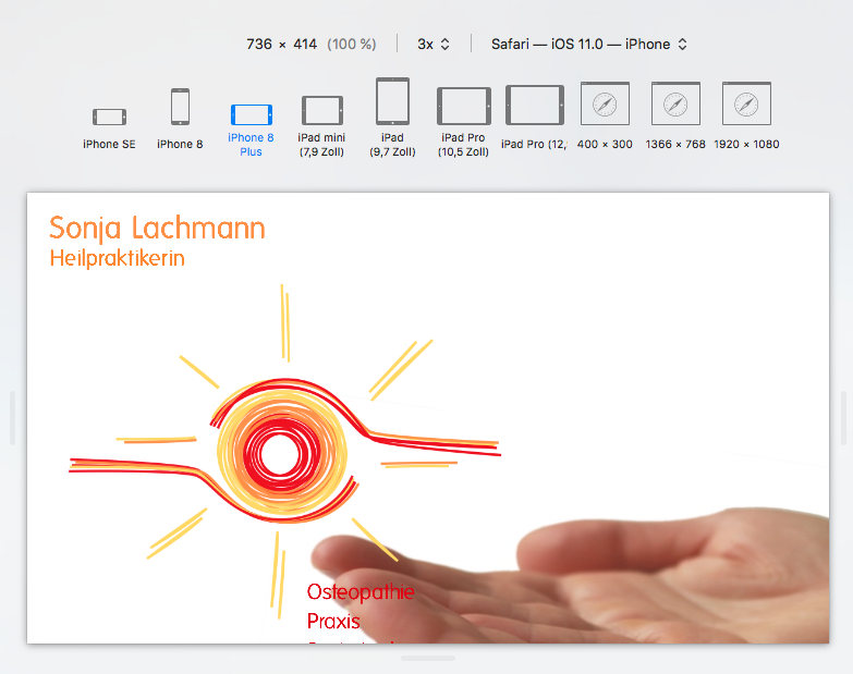
I agree with you, for desktop and tablet view it is working (reasonably) well.
For mobile view however, at least in my eyes, it does not.
Mobile view affects all screen sizes (width) of 767px and below, regardless of the screen orientation. As you have pointed out, absolutely correct, most tablets nowadays display the desktop version when in landscape (my iPad does, my Kindle does not), but I don’t see a lot of mobiles displaying the tablet version when in landscape orientation.
In other words, that is nearly a third of all internet users.
Hence my question.
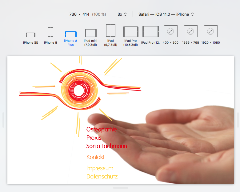
After long tinkering I now finally came up with a version for mobile view I can (just barely) tolerate.
@Norm: I would love to have a media query for mobile view where you could display two different versions, depending whether the device is in portrait or landscape.
As @hendon52 hendron52 says you can create a custom css file for different views. I did that on our site. Because i needed background to shift on smaller screens.
You can define for each view same class just with different css properties
Right now I have different Blocs for different views. Desktop, Tablet and Mobile with the appropriate visibility settings.
For each of these Blocs I have assigned a custom class (.bloc-desktop, .bloc-tablet and .bloc-mobile) and then added the background images optimised for each view. Call me Captain Obvious (I suppose one custom class would have been sufficient), but I like to set up things in such a way that it helps me to remember what I did, when making changes to a project in years to come.
This means, I have three different background images. So far so good!
What I would like is a total of four background images, if feasible.
One for desktop, one for tablet and two (!) for mobile.
Two for mobile view, because one image for portrait and one for landscape orientation.
I don’t see how this can be done in Blocs and was wondering whether somebody else had found a solution for this.
One way that Ive used to solve this issue is to use an external application to make the various views for different devices. For example, I use Temult Hype, specifically for making header blocs. Although hype is an animation application, I also use it for making static headers that I can then include in blocs. Hype allows me to create as many breakpoints as needed and to create a different layout for each viewport. When the hype file is added to blocs via an HTML bric it responds perfectly at the varying device sizes.
It has been a while since I played around with Hype… but I suppose this could be a smart solution for this problem. Not so much that Hype allows for more break points, I know Norm will sooner or later add this to Blocs, but I read on the Hype forum that you can add a media query whether the screen is in landscape or portrait.
Thank you for reminding me of Hype!
Time, give me more time, so I can play around more with all the interesting toys and see how they all play together…
You don’t even have to worry too much about media queries as such. Just create all the breakpoints that you’re likely to need for portrait and landscape modes, and the hype file does the rest automatically. Basically, the Hype element within a Blocs page will respond independently of the Blocs breakpoints, so when reducing the screen width, you can see changes to the Hype element when none are observed in the blocs page. It could be well worth re-visiting your Hype app - it’s very useful in so many ways.