I have a slider on my site, and when I select Width by page width - the photo does not fit on the screen and a piece of it is not visible.
When you select a different Width mode - then there are black bars on the right and left.
Is there any solution to this problem other than trimming the photo?
What can be done with these stripes on the right and left to make them look more decent?
Just if you cut the picture, a lot is lost, they are not so cool.
And if you do nothing, it cuts the photo when you view it. It doesn’t fit on the screen.
If you use a slide version, all images must be the same size. If the top picture is not the same size as the bottom picture you will get this difference in appearance. If the 1st photo should be the size of the photo below, your photo will be truncated. There is no quick fix or take a wider photo and truncate what you need, i.e. when taking the photo you need to take a wider photo than you want to in order to be able to adapt in this kind of situation.
All the photos have the same size. And the same aspect ratio.
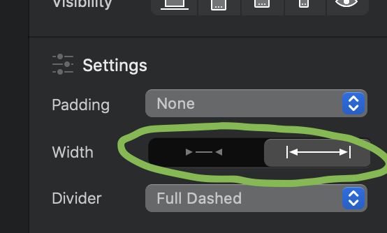
All I can change, if I understand correctly, is this setting:
Now the site is set to wi as shown in the photo. As a result, the photos do not fit in the screen.
If you change this setting to the opposite - then there are stripes on the sides as above in the photo.
The following question - is it possible to do something without changing the aspect ratio of the photos that it would look good?
This button means that the selected element either fits the canvas you defined in your block settings when you created your project, and the second button you selected means that the selected element will be on the whole screen width. A computer is horizontal, a tablet and mobile is horizontal or vertical. In fact the ratio is not the same for tablet or mobile. I advise you to create images adapted to mobile or tablet and say that the 1st block will be visible on computer so you deselect the other devices and you create the same adapted for mobile but visible only mobile and tablet or mobile