Hi -
Can each bloc’s padding be different per breakpoint (device size)?
Using the right-side panel ‘Appearance / Padding’ options, it seems to me that this is not the case.
Is there a work around?
I’m discovering that at smaller screen sizes the bloc-level padding set for large screen is not pleasing on the smallest screen size.
Thanks!
Nope, the right-side panel defaults are for all breakpoint.
You have to set the right-panel to none and then create a custom class for the Bloc. Then you can adjust the padding for each breakpoint.
I make custom blocs and save them, then when I add a standard bloc it already has the classes and padding adjusted to each breakpoint.
Casey
2 Likes
oh darn, but great work around idea…Thanks once again Casey!
1 Like
Eldar
4
Hi @DanielF
What @casey1823 said  I have a video about it here:
6 Likes
Eldar – Thanks so much, now it makes sense.
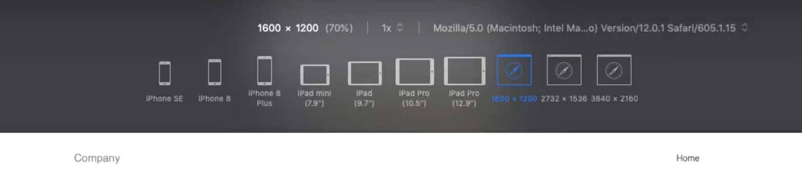
Question: what is the ‘device selection’ page you are using in the video?
Eldar
6
It’s the Responsive Design Mode in Safari browser.
2 Likes
brilliant…didn’t know that existed…thanks
1 Like