Trying out the Blocs 6 iPhone 15 Pro Max PREVIEW for the very first time. Although WIDTH is an accurate representation of what you see on a real device, the amount of vertical web page content is not entirely accurate due to Safari header/footer overlays that take up vertical screen space on a real device:
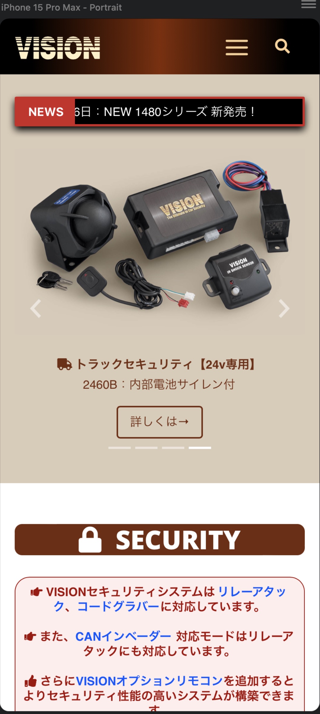

Of course, if I scroll down a bit on my iPhone, it collapses the bottom controls a bit, but as you can see from the comparison below, it still doesn’t accurately show the amount of vertical content you get on the actual iPhone…


That can matter if you are designing a page to display a minimum amount of content prior to the user needing to scroll the page.
Another interesting thing I noticed is that when I put my finger and scroll down the page very slightly, the “NEWS” badge in my ticker vanishes, whereas in the Blocs Preview it does not. This means that Blocs is not really simulating an actual iPhone. It’s just a semi size accurate porthole view of the webpage, viewing the content as a computer would see it (not iOS).
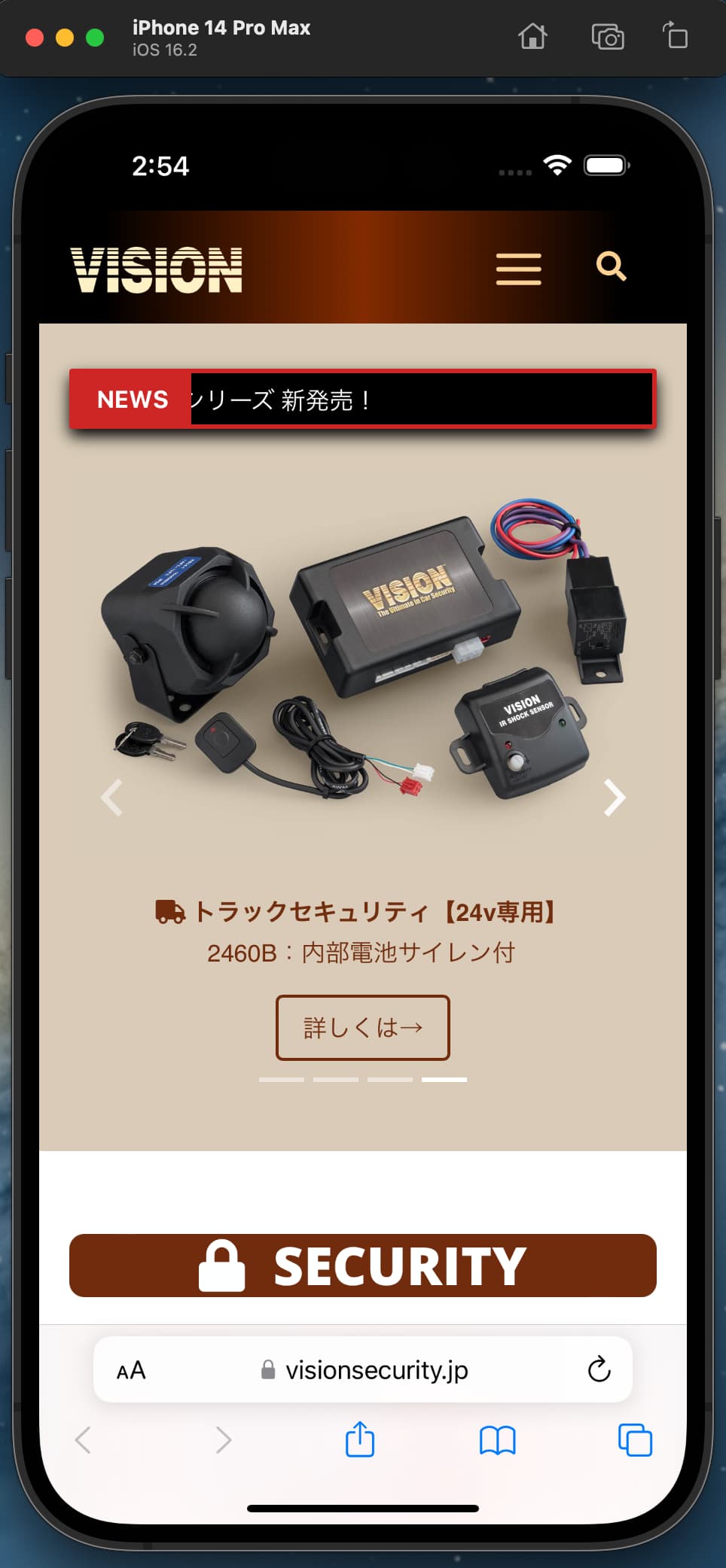
To get an extremely accurate view of the displayable web page content on iOS without using a real device, we will still need to use the XCode Simulator app (showing iPhone 14 Pro Max below because I’m still on macOS Monterey):
This isn’t a slight against Blocs 6, mind you. These are just my observations while testing the new Preview for the first time today.