Blocs preview only has LG (1200 to 992) down to XS (576 to 0)
Surely this cannot be an oversight?
What’s the point in adding Bootstrap 5 support if none of its previews, settings, or else actually do offer or respect the new Bootstrap breakpoints?
+1. I’ve submitted wish list for the larger breakpoints that are in Bootstrap. We have a lot of larger viewports out there now. And if you use the display utility classes we don’t see in Blocs how messed up it is on larger displays. Which is a problem I had with a website as I had used the display classes. I had to make my own media query.
I started with a col-4
I discovered that for some to me unknown reason, you have to set the preview to MD, then set a col-md-4 class, then remove that class.
Then it works.
I also just discovered that “Use bootstrap 5” and then adding and icon does not include the … Bootstrap Icons.
Another bummer
Not sure why I would use any other icon library when using bootstrap (of course I can enqueue it, or use the SVG… but yeah - “use Bootstrap” means something else to me entirely)
And then I add a button, consciously choose “no style” and add classic BS button classes (btn, btn-lg btn-primary) and get some mess without color in the button, STILL affected by the corners and size settings of blocs, no bootstrap main primary color, no bootstrap LG size or anyway at all, a button as per BS
I see:
the issues that have been reported in this forum since day one when I bought it have not been addressed, but a lot of fancy, semi-working (only on very expensive computers, probably) have been added.
I think I save myself this pain this time.
The garbage added by blocs (such as the class “btn-style-none” or “btn-sq” or “btn-d” are really giving me the rest)
This is _not a bootstrap ready page builder and for sure no theme builder, I am sorry to say this and to be a litte upset because it is something I have been reporting here since meanwhile over 2 years)
Adding style none and then the bootstrap classes defeats the point. Nuts ads all of the bootstrap classes for you, but does not list them in the class token field.
Just add a section with buttons, hit preview and then inspect. You see all the stuff you are adding manually is already present.
There is obviously a lot of frustration for you here, this can sometimes be the case when revisiting software after not using it for a while. I’ll look into all of the points you made and see if I can track crashes.
Regarding Apple silicon, we simple compile the same code for both versions of the app on intel or AS and not of the current Blocs features require Apple Silicon.
The thing is I don’t want a “large radius” or “no radius” or “glossy” style
None of those are bootstrap 5 button styles.
The bootstrap button styles are:
What do you expect us to do if we cannot even set a btn-primary, as it is in all and every case overwritten no matter what we choose? no-style is what you recommended back when I reported this issue the first time.
You said it to be “obvious” that if we want not Blocs styles, we have to choose “no style” and then add our own.
Well, now it seems the opposed.
I have now chosen to add a simple “link” and add my classes there.
Yet, stunningly after reloading the app few times, that link is now suddenly offering me again the Blocs options for buttons. And needless to say, that if I so much as touch one of those options, all the BS rules added by classes are overwritten by “glossy” or “flat” or whatever non-bootstrap things that blocs adds.
I do not understand it. If this is a bootstrap compatible tool there’s no “glossy” added to a button, really not.
In the entire bootstrap world there is no such thing as a “glossy” button, nor a “flat” one
What is truly upsetting thou is that I can not seem to choose “no style” to use my own style
No: no style really means “some style, just not something visible at first, but there’ll be css added”
I do get that using a tool not every day does not make a master
But, in all honesty, if a dumbo like me runs onto the exact same mess every time he uses the tool, and each time the solution is different… then it cant’ be the users fault, I am sorry. Specially not if I have to learn a new “bootstrap” to even use it, and have to accept that there will be some strange, new classes and styles that do not exist anywhere in the bootstrap world.
That to me fells almost like the tool wants to mock me.
Sorry my mistake, it wasn’t a display utility class, but a typography class
.display-1
I had it all styled up on the site, but it was stock on XXL and broke the design. This was back in Bootstrap 4 mind you.
I have to say though, I appreciate a lot of new BS functions being added in like margin and padding. I often would just add these classes to the class field on an element as to saved making custom classes if I didn’t need them.
I think the confusion here is that Blocs uses classes to automatically set the colour of items within a Bloc based on the background colour of the Bloc. If you set the background of a Bloc to black (or a dark colour) the text will automatically become light along with the buttons etc.
The problem with this is when you add bootstrap styles or classes such as btn-primary it will not take effect as there is a parent class overriding its colour. To set a buttons colour requires using the colour well in the inspector or a custom class.
The solution would be to add a way to turn off the automated colour classes from un-styled content within a Bloc. Which I think would address this issue.
I’ll look to work on this and get an option in the next beta. If you have the patience and time, give the next beta a try and let me know if it helps.
My suggestion is, don’t overthink this
A bootstrap theme builder … shouldn’t add its own styles, or try to be too magic.
It’s really all about the fastness of moving grids around, adding buttons without writing a markup, that kind of stuff.
But I don’t think a developer (not even a user) gains anything from “large paddings” or “glossy buttons”
Those are styles that are so peculiar no site will want to use it in that precise way anyway, I fear, and thus only add a lot of love and work spent on the app, but the “core” (controlling the thing with bootstrap) kind of gets lost.
I revisited the way colours are managed inside of Blocs and have made some adjustments ready for V5.0.6 beta build 2 that should improve things for anyone wanting to use the bootstrap button themes.
The Current Situation
By default all buttons have a class btn-d applied to them so they have a background colour. Otherwise they would require one of the bootstrap button theme classes, it’s been this way since Blocs V1. This stops BS classes such as btn-primary from working fully.
The Solution
In Blocs 5.0.6 (beta 2), Blocs will identify when one of these “theme” classes is applied to a button and will automatically remove the btn-d class behind the scenes. If later the theme class is removed from the button it will return it to its default state and add the btn-d class back to prevent it being transparent.
To take effect, this will require the reapplication of the BS theme class (btn-primary) to the button within this new beta build. As you can see in the gif below, when the class is applied it now shows the full styling, not just the border.
So that is a solution that will be implemented within 24hrs of the bug report.
Thanks @Norm , this IMO is how it should work, so it makes sense to me, no doubt.
Will this also apply to things like btn-lg (so basically when I set a bootstrap class, that class will overwrite whatever had been set or added by the blocs app, since it also comes with settings for size, radius, etc)?
Will the conversion from link to button (this is what happens to me: I insert a link, add all classes for a button and at some point suddenly all bloc app controls change to those of a button) be resolved too with this update, or only at a later moment?
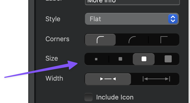
No, use this control to set those classes to a button. This will toggle the Bootstrap button size classes on and off for you when you select a size.
I could prevent this happening, however, I have a feeling some may be used to the current behaviour. I will however prevent the element showing in the layer tree as a button if it simply has the btn class applied.
In which case, IMO it would be very helpful to see the BS classes applied by blocs in the “Classes” text-area
It is basically impossible to be sure that selecting a certain “size” option (or anything else) is the actual class we intend to use, if it doesn’t appear in the “Classes” text-area.
I mean, how can we “remember” that in “this case use controls” but in the “other case, use classes”
As a matter of facts, in this very forum I have repeatedly been recommended “never use options, always use classes”.
So having something that is consistent would help a lot to avoid total confusion and failure, I feel.
 as to saved making custom classes if I didn’t need them.