Here Jerry. Some virtual relief for you ![]()

1 Like
I often find the same attachments in project settings AND in page settings.
Is that correct?
If you add a bric to a global area any attachments should show under project attachments.
Non global areas the attachments should show in page attachments.
Or that’s how it makes sense to me ![]()
1 Like
Hey Jerry, you’re far from that. We all know that mistake wasn’t because of you. You’re just a victim of poor UX. ![]()
Aside of the unknown attachment, the “Delete” button should be clear as to what it does, but it doesn’t. It should perhaps say “Delete Page” as well as include a tool tip. Currently there is no tool tip, and there’s also no way for a user to know this will delete the page when in layer view in a multi-page project. I’ve come across several similar situations before and I’m sure others have as well. Others might not have mentioned it because they might have thought it was their fault, just like what you experienced.
And in this particular situation, although users get a modal popup informing them the page will be deleted, it causes the user to pause and think about what just happened. Situations like this can quickly become very frustrating and lead users to feel they’re the problem.
Also, though it can be argued that it’s a minor inconvenience and that the user would eventually learn how to navigate this afterwards, but when there are multiple situations like this within the app these minor inconveniences can add up and increase the product’s learning curve for those less savvy of web development trying to advance their skill level.
Just my two cents worth… ![]()
3 Likes
I agree, this button label was changed from (Delete Page) when Blocs was localised into different languages due to cropping of the translation being too long.
I’ll get it fixed up.
3 Likes
Lost in translation.
“For relaxing times, make it Suntory time.”
![]()
3 Likes
That’s an excellent observation. The color is another thing that may inadvertently cause users to think they need to click on it… due to the intensity of the color. To put it another way, it implies that the user should want to click this in order to proceed, instead of anything else.
…another cent’s worth.
1 Like
Anyone else having this issue? When clicking on certain elements, the toolbar on the right glitches, not just with forms, had it with hyperlinks etc too.
2 Likes
The list box was also more defined with borders. The newer version has none. Which I like, but it’s obviously easy to click the wrong button.
Must have been something in that coconut too, I’m sure you have removed attachments many, many times with no issues. ![]()
Can we get :focus-visible added to the pseudo options in the class editor please. (I would love outline options too ![]() )
)
It’s becoming more used now, especially with assistive technologies. Also better UX. ![]()
Kevin Powell does a great job explaining it here.
2 Likes
Also wondering about a solution for images that are turned to links. No way to add things like attributes to the link itself. The custom attribute options only add it to the image.
Eg. I have a series of images with links but I want to be able to add tabindex=“-1” to the link. Unfortunately it applies it to the image and so is pointless.
My only solution is to create JavaScript to modify it. ![]()
Maybe the structure can appear in the layer tree to select?
Any chance you can share this project with me?
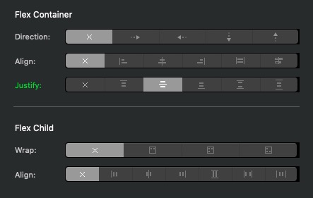
I notice there appears to be an issue with tooltips displaying. E.g. in the Class Editor, CSS Grid controls, when trying to understand what the Justify and Align options do by exploring the tooltips, the tooltips don’t always appear for me and if the tooltip does appear and you move the mouse even a tiny amount, yet still hover on the same setting, the tooltip may not appear again. Looks like you only get 1 shot at using a smooth movement that must stop dead on the icon for the tooltip to appear.
I’m seeing some UI drawing issues on the CSS Grid and Flex Class Manager views. On the right hand side where the rounded button groups are drawn smaller in width and/or height than the containing black rectangular elements.
Which version of MacOS are you using?
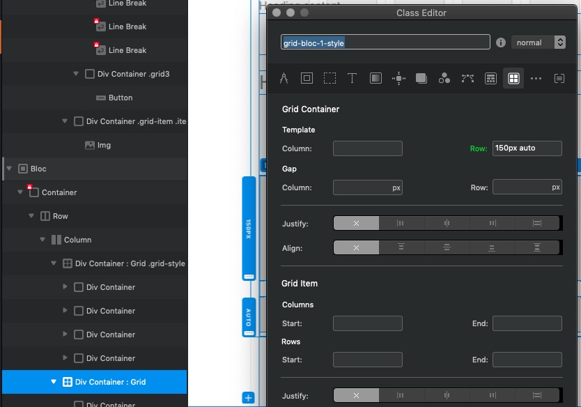
Not sure if this is specific to B2, but if I create 2 grids using the grid bric, the first grid (container) gets an auto generated Class called grid-style that appears in the tree. The second grid (container) does not display an auto generated Class in the tree, but on further examination of the list of classes, one is created called grid-bloc-1-style.
Regarding this issue, do you have a project resource API call in your Brics init function?
This call is triggered when you click on a custom Bric so if your Bric adds a resource here then thats when it shows up once its refreshed.
So true. ![]() It would be really nice to be able to see that display of help last little longer, due to the fact that it disappears rather quickly.
It would be really nice to be able to see that display of help last little longer, due to the fact that it disappears rather quickly.
How long does it take to trigger the help to pop-up, in other words what’s the default?
Also what is the default for how long it actually stays on screen so you can read?
This is fixed in tomorrows beta.
1 Like
Found and fixed this up ready fro tomorrows beta.