I have to ask, why it is still so frequently difficult to select a single class?
I have to ask, why it is still so frequently difficult to select a single class?
Just an idea. Would it be better if the classes stacked rather than wrapped?
I get that same highlighting issue from time to time.
It’s a fiddly bit of custom UI and Apple don’t offer anything that could replace it out the box.
I assume you want to highlight a particular class for selection to copy and paste?
I’d considered this, even moving them into a table but a new line for each class is a poor use of space.
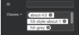
Well Flashman is showing 3 classes taking up 3 lines ![]()
![]() (looks like more there too).
(looks like more there too).
The container could remain similar size. I don’t know what you’re working with on an OS level though. So yeah ![]()
Yes that is the reason, so I can select a single class to copy paste it to another object, however this has been a frequent frustration right through every version of Blocs. The classes window is tricky to work with in various scenarios and that is bewildering when it is the central location for accessing practically every customisable aspect of Blocs.
Aside from the selection issue, what other things do you find frustrating about this part of the UI?
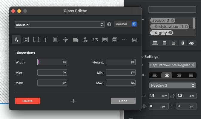
For starters the window itself is far too contained with no option to change the dimensions. It is crying out for an option to extend both the width and height of that window, so it is easier to read and manage individual classes. If that is not possible, how about a larger pop up classes window, so there is space to breath.
I know we have the Classes text with the downward arrow that will allow a user to select a class, however that is far too subtle and I’d wager most Blocs users don’t even know that feature exists. Leaving that aside, most users will still want to work more visually, selecting the visible classes in the window.
Sometimes I might have two classes that are similarly named and find it impossible to identify the one I want because the text is cropped; again due to the small window. Yes we can hover over the top and wait for tooltips, but in a world of AI that feels very antiquated. The small vertical scroll bar really doesn’t cut it either.
If a class is selected and I scroll up, then click to select another class, the clicked on class opens, however the previously selected class is still highlighted, as though it is active. In the parlance of my millennial daughter, it’s all a bit random.
At times when it is not possible to select a single class, it also becomes impossible to determine which class will open if clicking on one, or if I do end up selecting all three to copy it will paste all three to another window.
I am sure there are other things that will come to mind but the classes window hasn’t changed significantly in 5+ years and needs a major overhaul.
Thanks some interesting points here. Would you consider adding (text input) and removing classes reliable in class token field?
Also do you ever use auto complete rather than copy and paste when adding already existing class items?
There is also a random bug I see periodically where I copy a class and when I go to paste on another item it applies something completely unrelated with no rhyme or reason. When this happens I can try 10 times, only to find a different class pasted each time. Those are the occasions I generally go for a cup of tea and just hope it will sort itself out the next day.
Not really. Sometimes they can be downright difficult to even select.
Yes I do use autocomplete at times or even frequently, however sometimes I might want to apply a class to multiple items on a page or even several pages, in which case cmd+v is a lot faster.
I’m not sure I follow. To add and remove classes why would you need to select them? Do you mean it becomes difficult to select into the empty space in the class token field in order to type in?
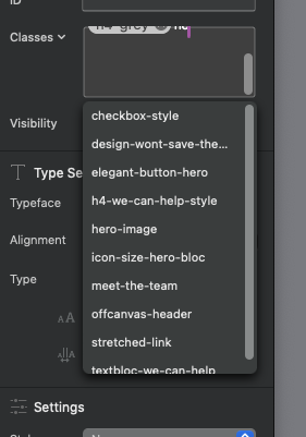
Yes the empty space can be tricky to navigate. Also I can start typing to create a class, but then the list of options opens and all my classes in the window fly to the top where they cannot be seen.
I would also like to scroll up or down to view classes with the keyboard arrow keys, rather than having to use the scroll bar. A larger window and greater separation between classes would solve an awful lot of problems though.
The classes window has consistently been the most tricky part of Blocs to navigate and work with and it really needs to be the most perfect part of the app.
I can do that with the keys, and also scroll wheel on my mouse. Both work for me.
I think a visual clue for pseudo elements being assigned to a class would be good.
Along similar lines, is other apps will often give you the option of forcing a state. Which makes sense for a visual builder.
Well it’s not a window in its own space, the entire sidebar needs to be resized in that case, which has various implications on all controls in that area and the canvas which it will take real estate from.
I don’t disagree with any of the comments put forward, but there is a little more to it than making the window resizable for classes.
I’ll start by addressing the flaws we have right now with selection and states and go from there.
Thinking about the class window, I agree with @Jerry description it is “tiny” and that makes no sense when it is the portal to understanding and setting every aspect of the website’s appearance through custom classes.
I know a lot of potential users have tried Blocs and struggled after coming over from something like Rapidweaver, where they don’t really understand the concept of a custom class at all, since they have all the information visible in the side bar. I would wager that small window is adding considerably to their frustrations.
There might be times when building a car where you try to save money in certain areas, but you don’t want to do that with the brakes, because they are too important. That small window in Blocs is the wrong area to be saving space if you are doing anything more than building a website for your cat with a single class.
@Norm yes that whole sidebar does need the option to be resized. In the meantime maybe some means to expand that classes window via pop up to sort out the workflow frustrations through space limitations would go a long way. That whole process of class management needs to be seamless and bug free.
I absolutely agree. I find the Class window works fine when there are no more than 3 short named classes but when you create anything with more complexity it soon becomes somewhat unmanageable and hinders creativity and debugging.
The right side panel remains mostly unused whereas that’s where Imho the main Bric and Bloc settings should be where you can see them without selecting a class and then examining the class tabs one by one. That’s a lot of clicks for something that would work better if visible.
Using CSS Grid is a good example of where this becomes apparent and I just find too difficult. A Grid with 10 items needs a lot of wading through the settings. Each Grid Item should have all grid setting available for view in the sidebar just by selecting the grid item.
Im not able to replicate this issue on Either MacOS 13 or 14. Are you able to repeat this every time?
Sorry the crash when right cicking