Hello,
Excuse my slightly naive (as usual) question, I am a bit of an amateur. I am trying to design a complicated carousel which has various moving elements and also a button on one of them. I have found Tumult Hype to be perfect for what I need and have designed my carousel which I am happy with.
However when I import it to Blocs, I am finding that the Hype carousel is much smaller than the width of the page. I am wondering if it is because the device breakpoints are different - How do I find out what the Blocs breakpoints are?
Also, the carousel is aligning to the left, is there a way to align it centrally?
I have attached a section of my Hype project showing what I think are breakpoints, although it seems that these can be changed if needed.
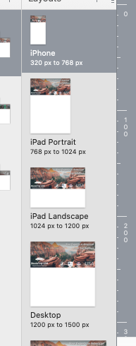
Bottom left of the Blocs project window:
1200
991
768
576 px
1 Like
Thank you. Do you think I should make them the same?
Those are the standard breakpoints for Bootstrap (as mentioned by @TrevReav) , the advantage of keeping to the same breakpoints means no surprises.
1 Like
Ok. I have a new problem. I have found that I can make the carousel banner responsive by adjusting the “flexible layout” settings, “pins” and “shrink to fit” options which works perfectly on the preview in Hype. Everything reduces down nicely as required.
However when I import it into Blocs, it won’t show, there is just a blank space. I have double checked and my non responsive banner works so it seems to be a problem with the “flexible layout” in Hype.
Is this a known problem, is there any work around? Any help is gratefully appreciated.
There isn’t any real point in having a flexible/responsive layout in your Hype project because Blocs uses fixed breakpoints. Essentially, the hype file will just display the appropriate size animation until the next breakpoint is reached. It will then jump to the next size variant for that breakpoint. Best to simply create a variant for each breakpoint. Remember, once you get to smartphone and tablet versions, there are no browser adjustment available that would require further responsiveness. Your animation/graphic or whatever will simply display at whatever size the device screen is. If you do need a fully responsive layout for some reason, then it’s probably best to get answers on the Hype forum directly as this isn’t really a Blocs issue.
Edit: If it isn’t displaying in Blocs at all (at any breakpoint), make sure you don’t have lazy load enabled on export. This can sometimes affect elements other than plain images. If it’s any help, you can download a slider created in Hype 3 from THIS LINK (bottom of page). This will open in Hype 3 or 4 so you can see how it was created to be responsive. The demo page contains two versions of the same slider. One is set in a page width bloc whilst the other is set in a browser (full width) bloc. Centering is just a question of placing the code inside a Div container set to centre content. Note that the demo only contains 3 size variants.
Thank you for your reply. I managed to get it sorted through the Hype forums.