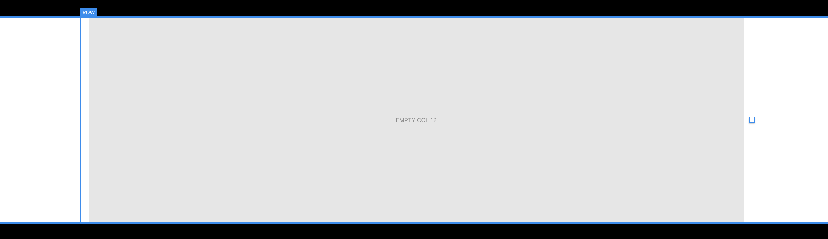
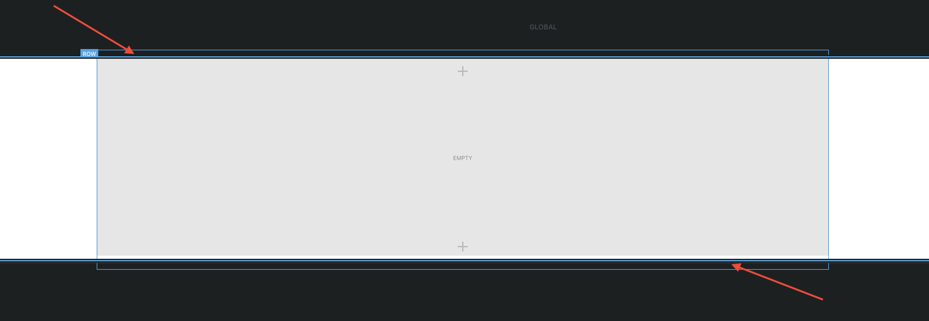
There are spacings on the top and bottom of rows. See here.
Is there a way to set those to 0 without setting the bloc position overflow to hidden?
There are spacings on the top and bottom of rows. See here.
Is there a way to set those to 0 without setting the bloc position overflow to hidden?
I would like to know also.
Ticked the “Bottom Row” checkbox in the bloc
The only time I see the option of “bottom” or “top” row checkboxes is if I choose the padding option of full screen. Even then, the top or bottom row still stays within the bounds of the bloc. If I then change the padding option to something else, Blocs removes the top or bottom areas. Are you using Blocs 3 or, maybe you are using an earlier version?
If you are using version 3, maybe you could let us know which bloc in particular you’re using.
Blocs 3.3.0
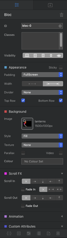
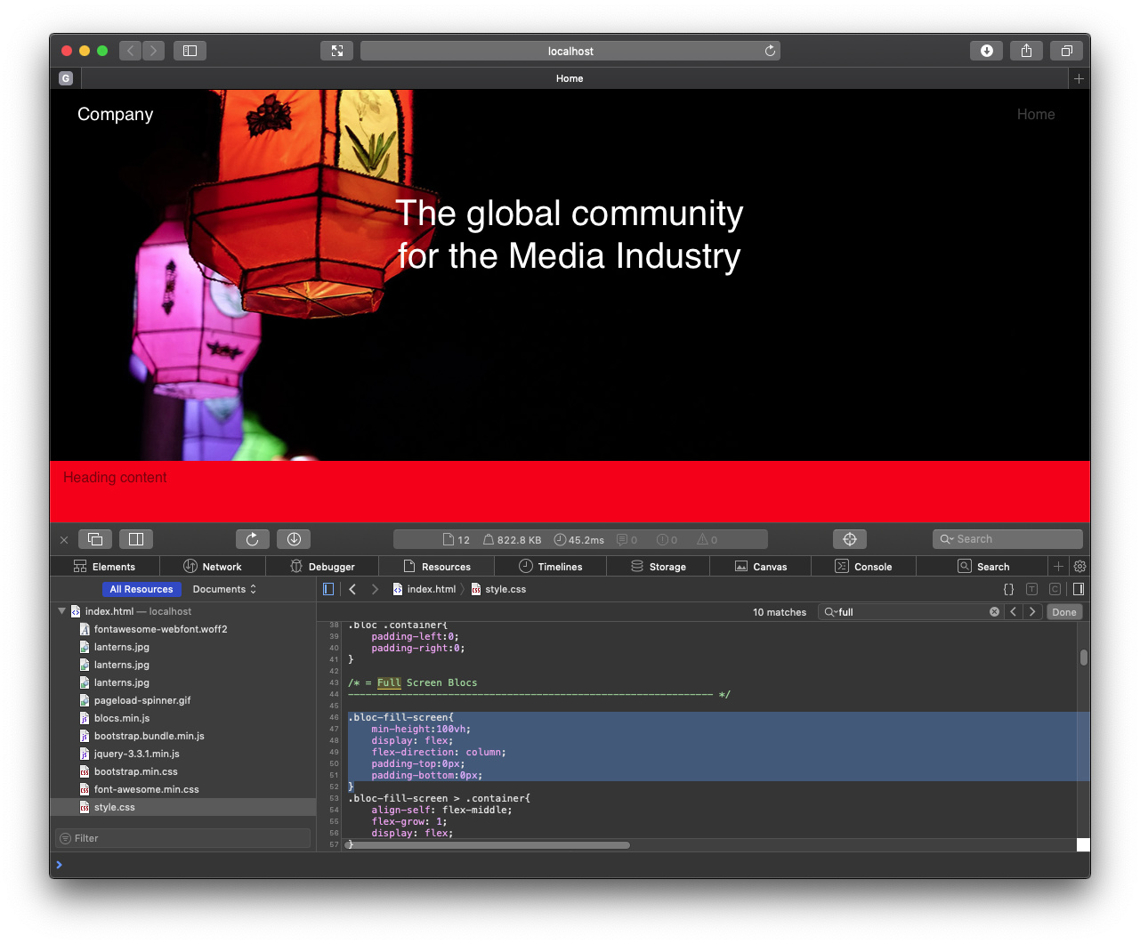
Container full screen
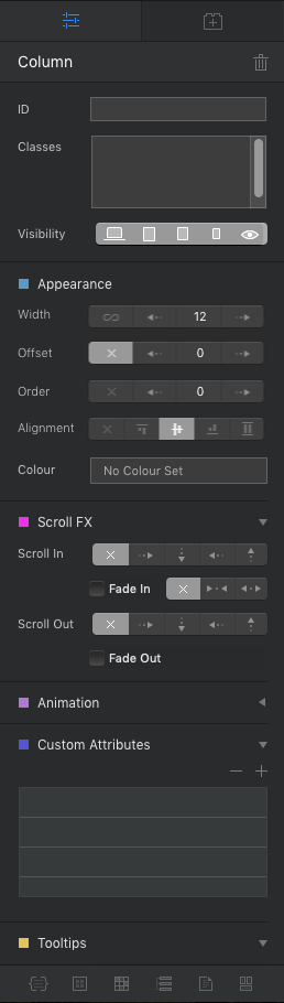
Where is the padding option for the container? The row appearance is this
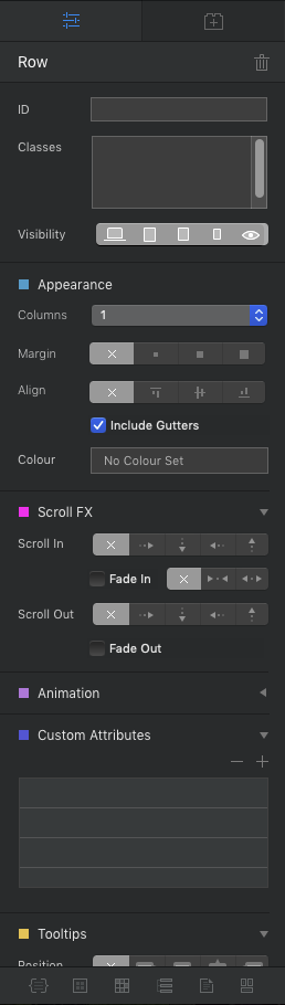
The top column appearance is this
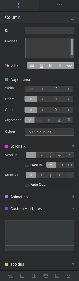
The bottom row appearance is this
The bottom column appearance is this
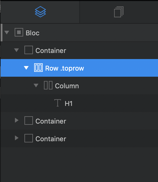
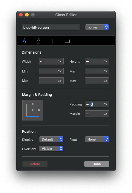
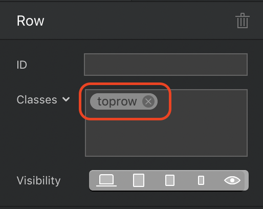
Padding options for individual brics are set via a custom class. First, select the object (in my example the top row element) from the tree structure at the left of the screen.
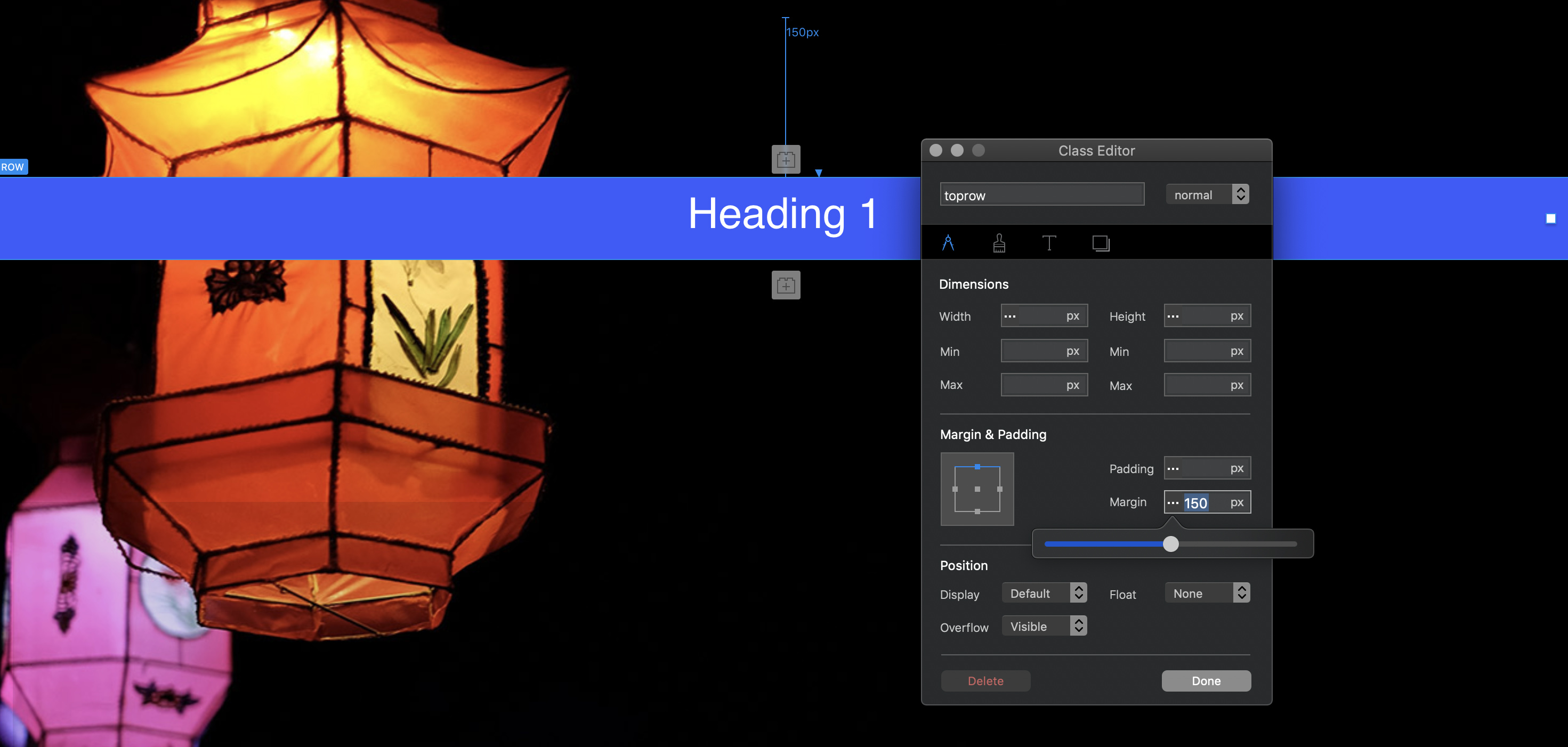
Create a custom class (I named mine toprow) The class name will appear next to the row element in the tree structure so that you know it has been applied. Now, open the class editor by clicking on the class name in the properties panel.
You can now apply any styling you like to the object, including padding and margins. In my examples below, I show top margin being being set at 150px in the first example, and -20 in the second example. You can set positive or negative margin to any or all margins through this class manager.
Using the class manager you are effectively editing the css code within the app itself. Once a custom class has been created, you can adjust the setting for each breakpoint by selecting a device from the top centre of the interface, then clicking on the SAME custom class. Make your changes, then go to the next device variant.