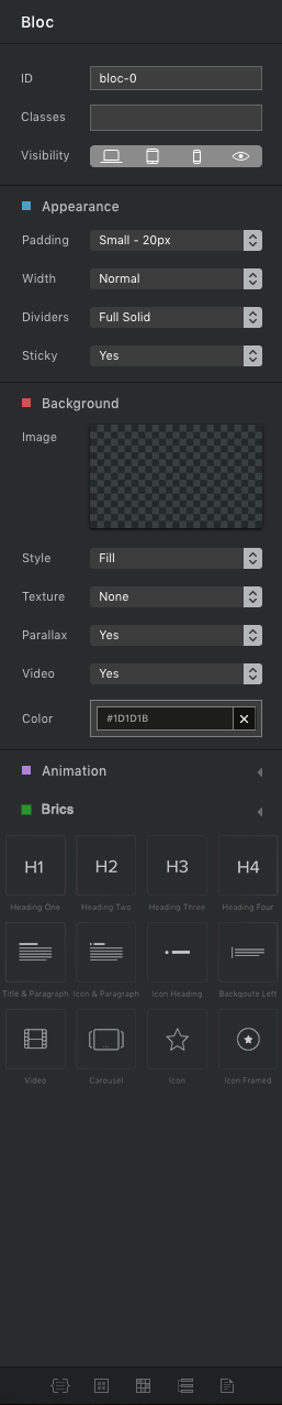
The Bric display uses an 8 column grid to display the available Brics. I think it would be useful to have an option to increase the number of 8 columns to the maximum that will fit in the available space. On anything other than a tiny display there is a lot of unused space when the 8 Brics are displayed.
By using more than 8 column it would allow for more than 8 currently used Brics to be displayed which would speed things up. I would rather have 16 or 20 Brics shown on my large monitor rather than the restricted 8.
Also it would be good to extend the height of the Bric expanded view to fill the screen and this would avoid the need to scroll.
One more thing. Some tool tip identification giving the name of Brics on hover would be really useful for new users. There is a lot of Brics to remember and building that memory just on icon recognition will take some time.
And perhaps a way to toggle the minimised Brics (8 showing) and Full (all Brics) maximised Brics window. The current implementation has the Open Brics in the bottom right corner and the Close in the opposite corner. For me that is only 24" inches away but for some it’s 27" away:)
Agreed - I too have been thinking the same for some time.
I agree, having the Active Brics in the Bric Bar labeled under (like the library) or using a “fast appearing, center top” tool-tip would benefit users, especially new ones considerably.
Having a greater number of Active Brics showing may be good as well for larger monitors, I don’t really mind that current aspect however of 8, even 10-12 would probably fit most monitors comfortably. I guess I would be more inclined to instead or also, fill the actual Bric Library window when it is open. Showing more from side to side, for less scrolling. But it’s my hope scrolling will eventually still be needed regardless as more Brics and features are added to the app.
I agree the open / close being cross corner is an issue (FYI: you can use the ESC key to close when open).
I would like to propose another idea. Cleaner and much more preferred from a UI standpoint is to have a basic tab on the top center that is clickable to toggle open / close. You could I guess instead maybe have the Bric Library open with rollover areas on the left and right side if a tab is undesired. Regardless which ever approach is used you could stop the Bric Library window at the top leaving space, so if rolled off it collapses (with rollover approach) or when the tab is clicked. But again, it would be better from a UI/UX standpoint just using a tab, click and it opens / closes.
Press “D” enter Bric Mode, Bric Bar appears with tab on top, click toggle open / close the Bric Library. With no effect if passed over so it does not interrupt the Bric section in the Bric Bar. Seems clean and effective.
Since the image was truncated I was like what is he talking about, then I clicked it.
That would certainly make it more up front, accessible and readily available all the time. It would still need to be searchable and scrollable. Would there still be a Bric Bar with this approach, and the selection of ready to use Brics like now (8). Or would you just select them as you need them from the side bar and no Bric Bar?
Might be restrictive however due to space, you would perhaps be scrolling and searching more.
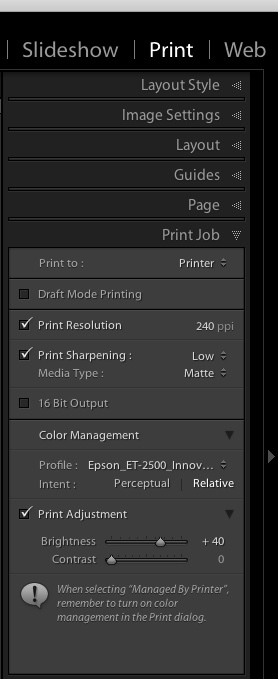
I like the sound of this suggestion from @Chris even if it might involve a bit of scrolling. At least it’s always next to the main controls. When I use Lightroom (shown below) it contains a solo mode option, so when you click on an area like animation or background the other areas would automatically close. That would negate the need for scrolling and keep your attention focussed.
Could be collapsable panels like most apps and it would be open instead of pressing D, maybe a floating detachable strip,giving the user more real estate to play with,only a suggestion.
It may be too much for the sidebar based upon this comment (see below) yesterday by @norm. Which I would have to agree with from that standpoint. I think the current approach just needs some tweaking and improvements (as discussed above), Brics do in fact warrant their own location and access such as they are now.
Some nice suggestion, force touch trackpads can open the bric library by just force touching the bar anywhere, not sure if you knew that, they can also close it the same way.
I think this area could use a little fine tuning in general but its not a the top of my list right now.
@Blocs_User We will sending out a little round up email at the end of the year with some news on what to expect in 2017. So you should be a little more in the loop.
Rest assured, I agree with a lot of what I see and read here in the forum