Hi everyone,
I am a blocs user since version 2, so quite a long time on the ride.
This is my first time writing on the forum because I have always found solutions and workarounds already published.
Unfortunately this time is not the case.
I am using Arvo font for most of my projects and, as per subject, Blocs does not respect, once exported the project, the requested font weight (see attachments). I saw many a few entries on this forum but, despite being populated plenty of replies, none provide an actual solution. I tried to host locally the fonts by adding them on the font manager, I tried using google fonts (by simply selecting them on blocs side, so with no extra css code attached) and nothing works.
Any suggestion?
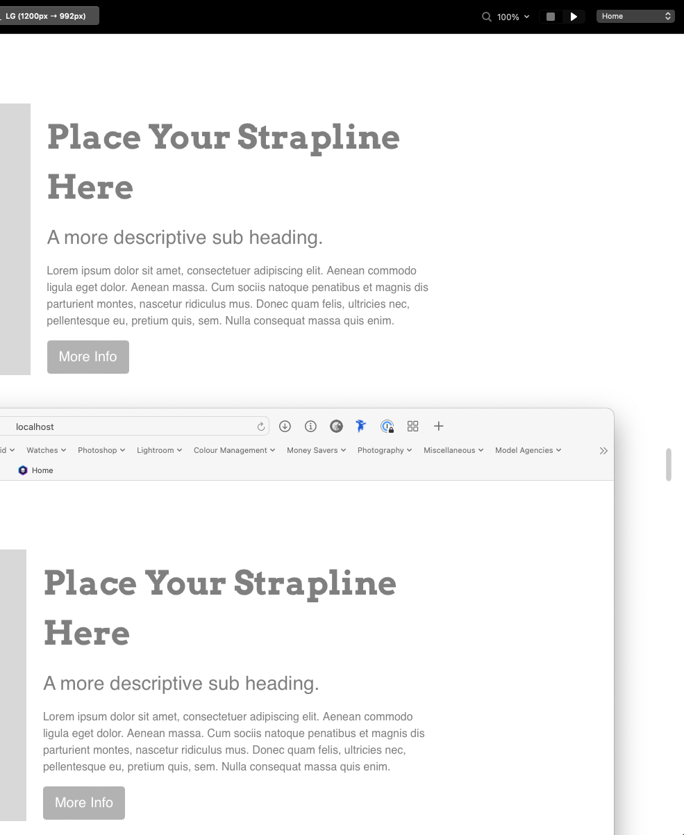
As displayed on every browser:
Is your preview inside Blocs at 100%?
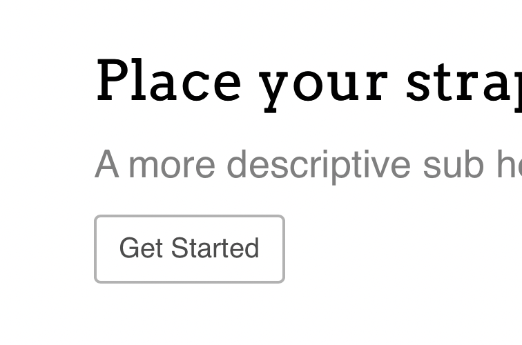
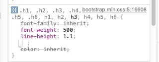
Yes, unfortunately is clearly a font-weight issue.
Even though css says font weight 700, it is much lighter.
I’ve never come across a problem like this with any of the fonts I have used and I have hundreds. I’ll try downloading Arvo to see if I have the same result.
They are identical for me. At the top I have Blocs with the header using Arvo 700. At the bottom is the local preview in Safari.
Hi, thanks for your feedback!
Can you send me the project file? If not, can you share with me the settings you have preferred and the don’t file you have chosen?
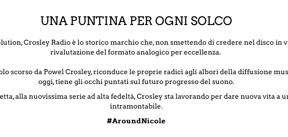
My website is crosley.nicolestore.it, how do you see the fit weight there?
I see it like that:
So much less weight despite being 700.
Thanks a lot for your prompt feedback!
Here is the project file and the fonts I used. I called it bold instead of 700 for the folders but that makes no difference. I have made that header text Arvo bold using a custom class but you can do the same in the project settings.
Francesco.zip (462.8 KB)
The text on your website looks smaller than 700. Inside the developer console it looks like 500.
Ho vissuto a Milano tanti anni fa per lavoro e mia figlia ha la cittadinanza Italiana.
Hi,
thanks a lot for that bundle of files, It helped me focus on finding a working solution.
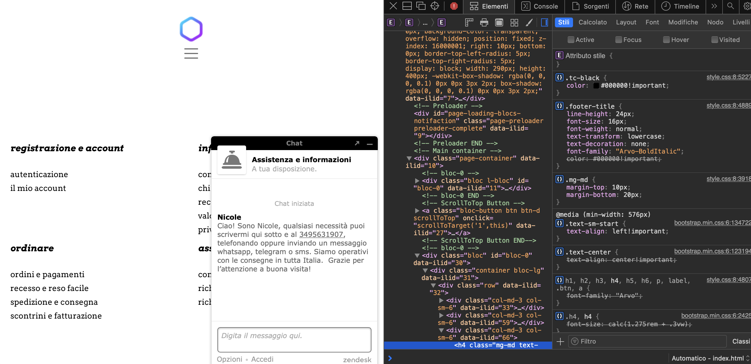
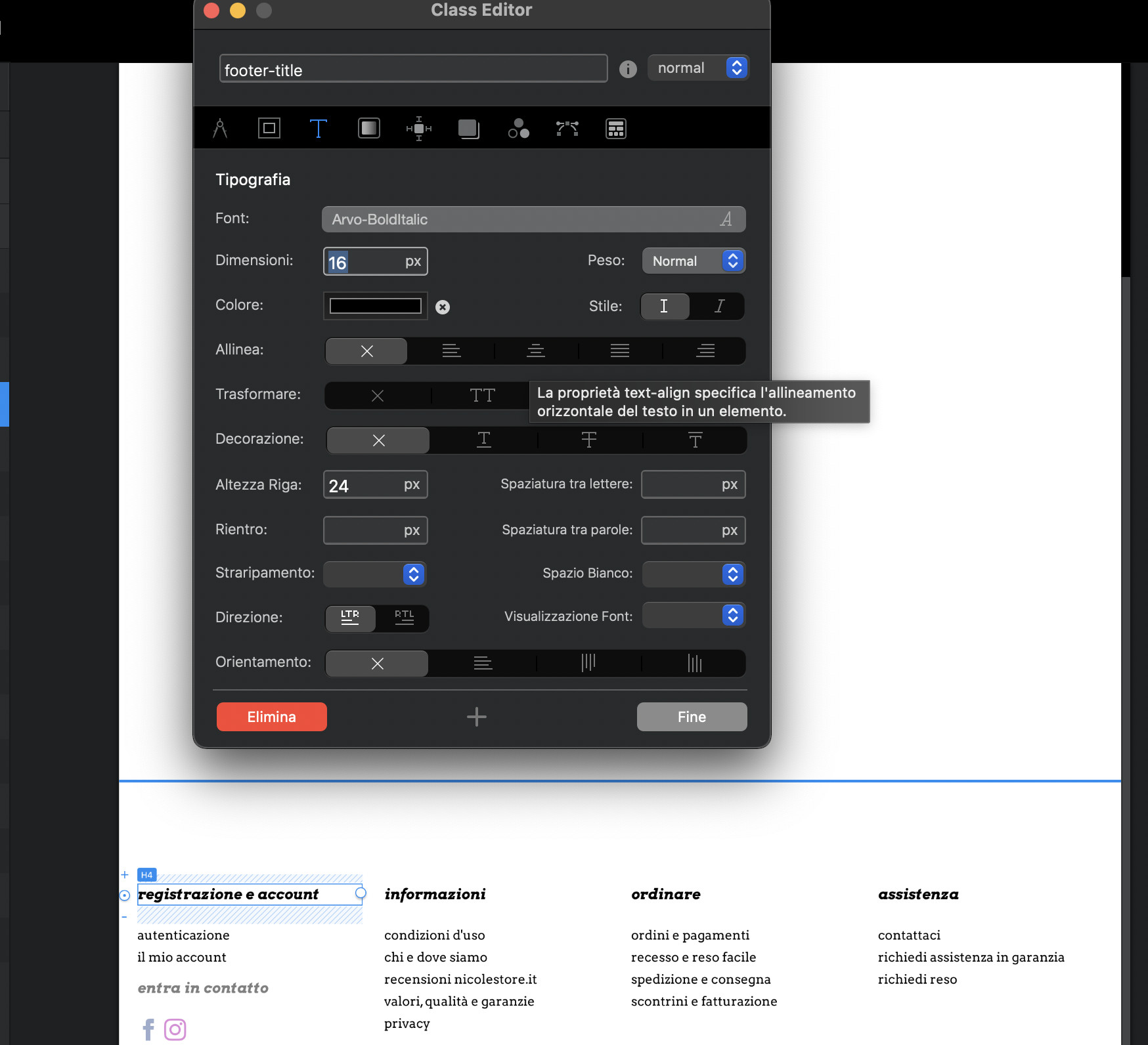
Despite all the efforts, It seems like a standard “Arvo” font selected with a 700 or bold in weight both in custom class or just by the means of the editor does not work. I had to manually select “Arvo-bold” or “Arvo-bold-italic” to actually achieve the desired result.
In fact:
Result and setting of “Arvo” with custom class or editor defined bold and italic manipulation, despite being 700 in the css of the exported result, it looks like a slightly bolder than normal but not as bold as a 700 weight:
Result and setting of an “Arvobold-italic” with no class or editor defined manipulation over Italic or boldness characteristics provide the expected result:
While I’m grateful you presented me this solution, I can’t still understand why it does not simply work by selecting the “arvo-normal” and kick in bold and italic while styled editor or class side without actually having to change the font itself.
E’ bello sentire che un pezzo di cuore sia rimasto in Italia. Io sono a Forlì, a sud di Bologna. Bella zona, ma non energica come Milano.
It’s not a good idea to use the font style options like bold or italic inside Blocs or any other design app, because you end up relying on the CSS rendering of individual browsers and the quality is generally inferior.
For example, if I take a regular font and apply italic styling it is likely it will appear in the browser with jagged edges because it has taken a font intended for one purpose and wrestled it into another position. I very much doubt the font designer would have imagined their font like that and simple bold styling is rather vague.
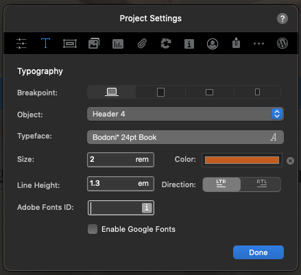
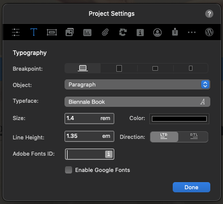
The better way to do this is by choosing a font with a selection of weights and styles that covers what you need to do and apply them directly inside the project settings. In this instance I would say that Arvo is a fairly weak choice, because it has very few options and it looks like 700 is actually 500. I can see that from when I applied the bold font in my own project.
When starting a new website, choosing the right font is one of the key design decisions, not just for the initial look, but also for the range of styles it offers, so I will look for fonts that include options like light, book, regular, medium, semi bold, bold and black, including italic variations.
Having selected a suitable font with a good range of styles I can then apply them in the project site settings of Blocs and they will be applied automatically as paragraphs and headers are used across the project. This is much faster and you can rely on a more consistent appearance across web browsers.
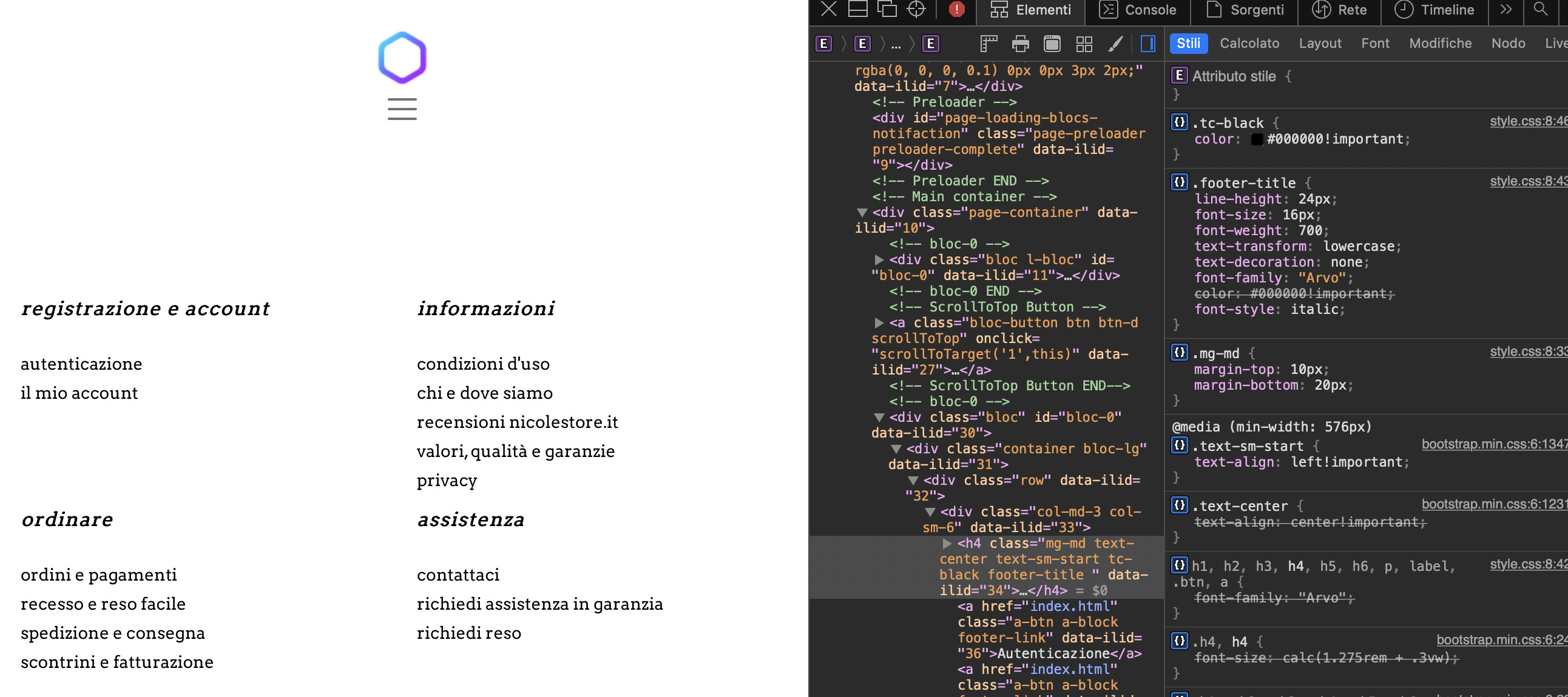
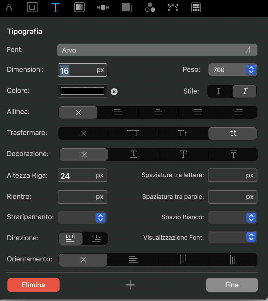
You can see here how I have different font styles, sizes and colours set for H3, H4 and paragraphs.

Sono andato a Bologna un paio di volte, ma avrei voluto vedere più posti in Italia. Milano è sempre stato lavoro, lavoro!!
1 Like