Carousel Caption Area -- Class Control

The Caption Area within a Carousel is a DIV. I want to style it with a Class (move it, make it larger, etc) and find that I must use a large amount of negative margin at left and bottom to create a larger caption area that is centered. Whatever class that controls that Caption Area DIV is bothersome. Can I eliminate that native Caption Area class so my custom class works better? If not, I want to create new DIVs and link them to each Slide, but do you know how to do that? If I create a new DIV it will only go inside the Caption Area. It won’t allow me to put that new DIV inside Carousel Item.

Thanks

James

There shouldn’t be any real need to create a new DIV, The content area is in a DIV already. Just select the content area and create a custom class. Use the metrics tab to increase/decrease the height and width of the DIV and position it wherever you want. The content of the div (presumably text) can be resized however you wish either directly from the properties panel, or through a second custom class applied to the text bric.

If I’ve missed something in your question, please clarify so I can provide another solution.

hendon52 – This is similar issue in the other post you’ve kindly responded to, and I’m following to learn more about this particular issue.

AND, your reply here raises another question for me that I’ve been a bit in the dark about.

What is the relationship between settings made in the ‘properties panel’ to those made in a ‘Custom Classes’ for the same element?

My guess is that Custom Classes would override settings in the ‘properties panel’ for any element, but if you use a Custom Class and the settings appear in the ‘properties panel’ can you change the settings in the ‘properties panel’ and have that propagate into the associated Custom Class for that element?

In sum, how do these two CSS methods work together, overlap, override, or conflict??

Hope that makes sense…

But why is it that my Custom Class isn’t perfectly overriding the primary controlling class of that DIV inside the Carousel? Like I said in my opening post, when I create a Custom Class and apply that Class to the DIV inside the Caption Area, I am forced to use NEGATIVE margin at Left and Bottom in order to position it.

In other words, if my Custom Class truly overrided whatever class Carousel uses by default on that DIV, I would expect that I could just type “0” for the left margin and the DIV would sit flush at left with the leftmost edge of the Carousel, but that is not the case. The only way for me to move that DIV to the leftmost edge of the Carousel item is for me to use fiddly NEGATIVE MARGIN for the left side in my Custom Class. That seems to suggest that my Custom Class is fighting with the parent/controlling class; hence my desire to either eliminate that parent class completely or create an all new DIV which isn’t chained to that bothersome parent class in Carousel.

Thanks.

Any text element can be changed in the properties panel - in most cases, with text, changing the style (font, size) will automatically create a new class. Try it - add an H3 brick to your project. You will see that there is no class in the class list. Now make some changes to the text. You will see that a class is created. That class can now be applied to other project text elements. Furthermore, if you add a second H3 element within the block, it will retain the styles associated with the default H3 (no custom class).

In the previous versions of blocs, changing the style of say an H3 or paragraph element would automatically change the other elements of the same type. To overcome this issue, you would be faced with having to manually create a custom class and apply it to one or other of the blocks. In version 3, that custom class is created for you, its name can be changed to something more meaningful if required.

In all cases, changing a standard element in the properties panel no longer overwrites all elements of the same type - it simply creates a new class that you are then free to apply anywhere you like.

The primary difference between the modifications you make directly in the properties panel and those that you make in the class manager, is simply greater choice over what can be modified. There are significantly more customisation options available to you in the class manager than you will find in the properties panel. Because of this automated class creation, nothing takes priority, because the element you change will no longer have the default class associated with it. However, if you subsequently remove the automatically created class, the element will go back to its default settings.

1 Like

You shouldn’t have to add negative margins on a div in the carousel. By default, the div will occupy a percentage of the slider width. If you need to move it up, create a custom class and use the bottom margin slider to move it up the carousel as shown below.

If you need to reduce the width of the carousel, set the width in the class editor. The div will automatically stay in its leftmost position. If you need to move it away from its leftmost position, add some left margin as shown below.


If you want to move the caption outside of the designated div area (further to the left of the screen) you will have to select the text container in the div and apply that dreaded negative margin to the left.

What you want to try and avoid is changing the default class associated with the caption div, as this may apply to all carousels you may add. I don’t know what the actual class is (I guess someone will come along and tell us), but you could, I think, add a sub-class with the setting you want.

Thanks. Yes, I have noticed an auto-created class (with a default name) when making adjustments in the properties sidebar for text elements, but thanks for clarifying further.

My take away from your reply, is that all elements have a default CSS, and when you make a change any available property found in the properties panel, this creates something equivalent to what occurs when moving an element using ‘freehand’ controls, in that it creates a class for this action.

But, when you select an element, let’s say some text, which has a Custom Class already applied, does the elements Custom Class settings also show up in the properties panel, and if so, can you change those settings in the properties panel and have it propagate to the Custom Class as viewable in its Class Editor?

Is it a bi-directional change??

Yes, it’s bi-directional. If you select a text element for example that has a custom class that sets the font to say 18pt Helvetica, and then change the font and size in the properties panel, it will update the class. If you didn’t want to update the class, you could simply remove the class from the element and update the style in the properties panel so that it creates a new class with your new settings.

:+1:

essentially, then, the properties panel (PP) is a short cut to making a Custom Class, but then an additional step would be needed to change the auto-generated class’s name, to something more meaningful to the project or bloc the element is within.

This raises a question: what is the benefit of using space in the UI for a PP that has the same settings found in the Custom Class Editor? Eventually, the custom classes auto-generated become so abundant if you rely on the PP, that Class Management because unwieldy,

It seems to me that this raises the kinds of confusion I’m sorting out with your assistance, and I’ve been using Blocs for a bit of time by now.

I know that the the PP does more than creates editable Custom Classes, as many settings in the PP is as deep as you can go with editing or altering certain options & defaults, for example ‘interactions’ or vertical alignments.

Just wondering if I’m missing something here…so thanks for the dialogue.

The creation of classes shouldn’t become that unwieldy if the project is set up correctly. This is done through the global settings where you can set up default text styles for each of the standard text elements, links, buttons and logo text. These are the things that will give your project a consistent look and feel. When you create custom classes, you’re trying to create an exception to the defaults. For example, if I have a block that contains two paragraph brics, and I style one with default text, but I want the other styled with a different font or text size, ideally, I don’t want all paragraph brics within the same bloc changing (as used to be the case in earlier blocs versions). So, in version 3, using the Properties panel allows me to make quick adjustments AND ensures that a custom class is created so that my changes do not reflect in other paragraph brics. It’s simply a convenience. If I DID want to make the changes to all my paragraph brics, I would change the default settings in the global settings of the project.

Changing the name of the class isn’t too much of an additional step. Simply click on the generated class name and then change its title if required. If this is only a one-off exception, you don’t have to change the name at all. This is only required if you may wish to add that style to other text elements further on in the project - a change of name will usually give you an indication of what the style is.

In the normal scheme of things, it shouldn’t matter if you just modify the style and ignore the class that is created. However, where this feature does save time is where you design your desktop site with just the standard styling options set up in the global settings. when you switch to say the mobile view, you may decide your default text elements are too large. You can just quickly change the styling options in the properties panel while you are viewing the mobile variant. This creates the custom class that is required for device-specific changes automatically. You can then switch to other device variants and leave them at the default styling or, make changes in the properties panel which will update the custom class for each device variant automatically. As you switch between each device, you will see that each one has its own unique styling options applied even though it has been allocated the same class name.

Well stated, well argued (meaning logical) and likely how working with Blocs is best approached and makes most efficient use of the logic of the UI.

That, said, I have yet to be so disciplined, nor have this much forethought in my process of figuring stuff out, as I still use a method of trial-an-error directly on the canvas, which tends to be a quicker and less reflective process (i.e. aware of the down the road implications of making any one specific move) where instant feedback of structure or CSS changes loops back into the a creative and decision-making process, mostly spontaneous, and through iterations, and more iterations, the desired visual result is achieved…however, a cloud of dust does get created in this method, as the last thing in mind is managing all the classes or style adjustments being explored.

But, I think I can appreciate your description as a best-practices approach! Thanks.

@DanielF I have full empathy with you regarding your design approach. I came from a background of WYSIWYG web design (not the best option in today’s world of the Internet) so the move to Blocs was a little alien to say the least. However, I found the best way to learn the app and fully appreciate its features was to use the following workflow:

  1. Lay out the basic website using standard blocs supplied in the app. This is like wire-framing the basic layout of the pages - something that is very quick and effective in Blocs. It also gives you something more than a blank canvas when first embarking on a project.
  2. Once the basic layout is how I like it, I start to prepare my assets (images, videos etc. and and add them to the asset manager.
  3. Next, add the content to the layout and get typing all that text you need. Style with colour and background images where required - try not to add any classes at this stage.
  4. Now take a long hard look at what you’ve created. It will clearly function as a web page and it will be responsive, but what you’re looking for is things like white space (margins and Padding). If it looks too open, start by reducing bloc padding where its needed.
  5. Next, start playing with additional brics where needed - do you need an extra text box here and there? - do you need to add some extra images? If so, start dropping them into the layout. Don’t worry about how they look at the moment, you will be able to position them later.
  6. When everything is in its place, look again at the overall design. If there are things that may require custom classes, don’t make changes on the desktop version at this time. Instead, take a look at the mobile device variant of your pages. This is where the real test of layout placement really begins. Are your headings or text too large? are your images not aligned with adjacent elements correctly? are your buttons not looking to good? Decide what needs to be changed and make changes to elements using the mobile view FIRST. Do the changes in the properties panel as much as possible. This will create the custom classes that you will need for adjusting other device variants.
  7. Once the mobile version is looking clean and well laid out, move to the next device variant and start making adjustment where needed - remember, it won’t change any of the adjustments you made in the mobile variant because the custom classes have already been added.
  8. Finally, take a look at all the other elements and decide if you need to make more extensive adjustments within the class editor.

If you follow this workflow, you may find that you need to do little more to make a nice, attractive and functional website. Once you’ve mastered this workflow, you can go on to examine the creation of custom blocs and all the other features that Blocs has.

When I first started with exploring the customisation options, I looked at web pages on the internet and attempted to re-create page sections as if they were self contained blocs. This really forced me into better understanding how everything fits together in a blocs site.It also gave me the opportunity of saving my creations as custom blocs that I could use over and again.

Anyway, don’t get disheartened if it all doesn’t drop into place at the first attempt. Set aside some time and go through the features until you have mastered the concepts. Create a learning project where all your knowledge becomes reality and save it so you can add to it as time goes by.

Good luck - nice chatting with you.

1 Like

Absolutely! And all the more reason it is a crying shame that I do in fact have to use negative margin. All I did was add my Paragraph into the caption area, and then in the left sidebar it shows me the DIV which contains my paragraph. I added my Custom Class to that DIV in the right sidebar in order to move the DIV to the left such that I could make it span the entire width of the Carousel item. But to force the DIV (containing my paragraph) to the left, I had to use negative margin. And since it was also too high, I needed to use more negative margin at the bottom to force it downward.

My Blocs document is at the office and I am away for the weekend, but on Monday I am more than happy to show you a screencast of why my eyes are seeing. I assure you, it is impossible for me to move that DIV around in the normal way. Something is controlling it, forcing my custom class to resort to negative margin in order to make the DIV move where I want it to go.

@JDW look forward to seeing the screenshots.

hendon52 –

So generous of you to provide this outline and methodology.

I actually think this is an amazing opportunity to create a space, perhaps a dedicated separate forum topic, where other blocs users describe their workflow and design process using Blocs.

A space where newbies and learners can visit to get a deeper view into using Blocs.

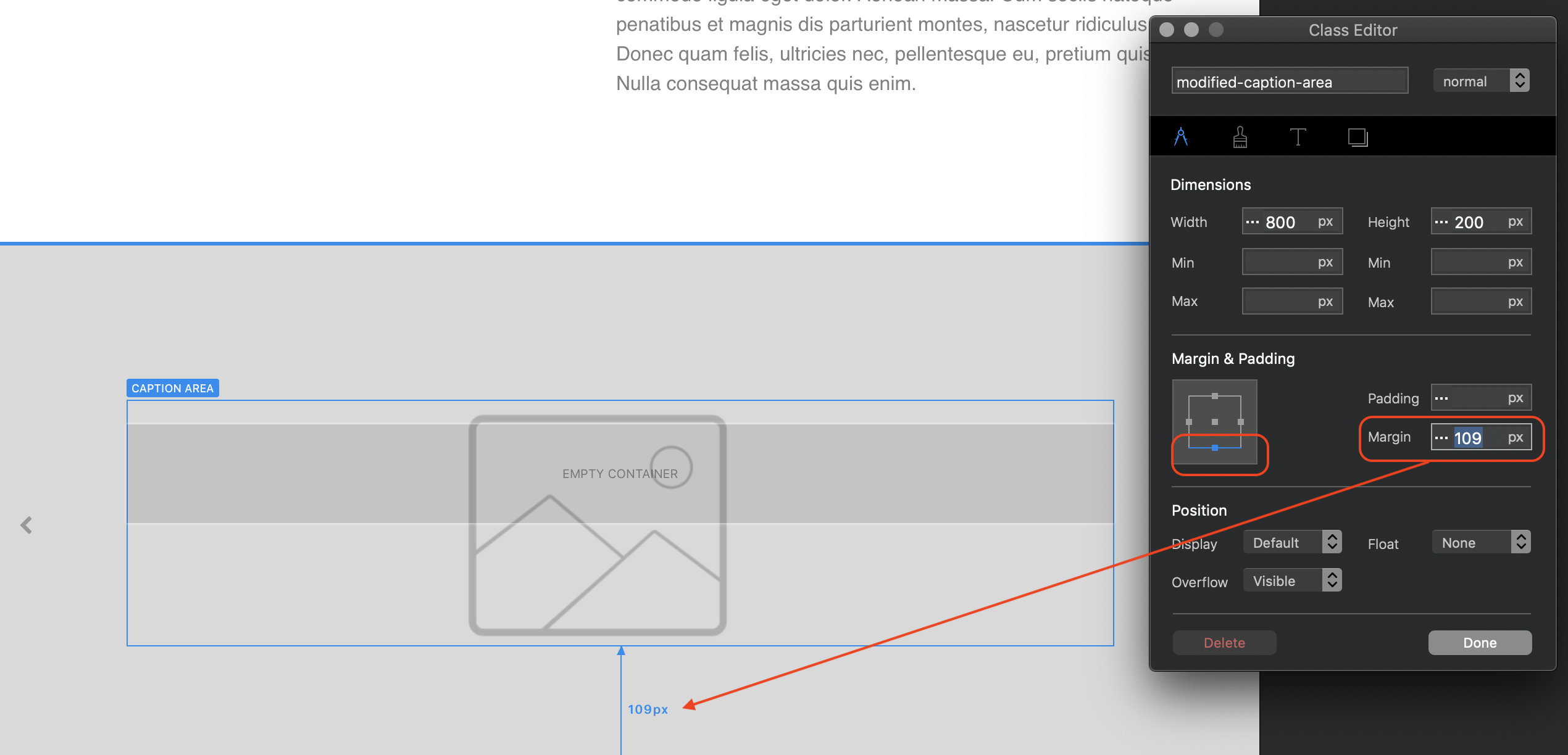
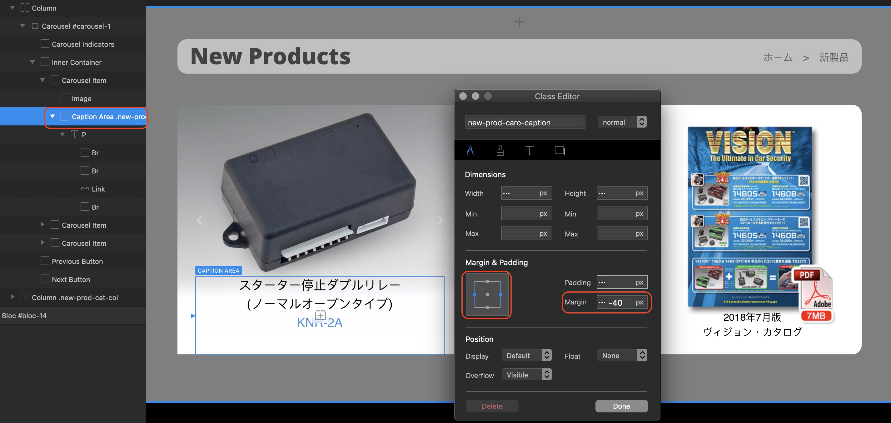
A next useful contribution, would be someone creating a Blocs Book, where each component is broken down into its parts, with all pre-packaged classes or other controlling attributes (bootstrap based, or added by Norm) is clearly and fully and visually conveyed so that when using any element in blocs the under the hood stuff is revealed and therefor decisions can be made by the user on how to deploy and modify them.

Finally, I, as a former architect, and art maker, who has used a diverse set of tools, from real media to an array of CAD and other creative software(s), the process of design & creation is a very personal process, from body/mind into media. And so I, too, have a diverse and seasoned experience with a creative process, and its stages, from inspiration to completion and delivery.

When a tool unduly dictates or influences the earlier stages of a creative process, then it may be that the tool finds its strength in the ‘assembly’ stage of creation rather then the inspiration phase of creation, both of which are part and parcel of an overall design/creation process.

My sense (which is now even further enhanced from reading your very clear and helpful outline), is Blocs due to its very underpinnings and aspirations leans towards the assembly process.

This is not good nor bad, this is not a vote for or against, but simply an observation tied intimately to my experience of learning, using, and coming to understand this tool.

Blocs is working for me, as I have built two completely different iterations of my website (current one here: www.danielfactor.com) both of which required I learn about this tool, and both of which satisfied my vision for my website, and so I will continue to use Blocs. My goal now, is to gain more proficiency and control with it.

Thanks for your excellent guidance and contributions.

I have something even better for you to see precisely what my eyes see – the actual Blocs document:

CarouselCaptionAreaNegativeMargin.zip (868.4 KB)

And here’s the screenshot to further guide your eyes to what my eyes see:

I’m not quite sure what the issue is. When placing the standard carousel on the page, it’s height will be determined by the image you place into it. The particular image in your carousel has a height that is smaller than the height of the contents of adjacent elements, therefore, the background has been set to white so it visually looks like the carousel is the full height of the adjacent columns. This I get.

Next, I looked at the caption position. In it’s standard form, the caption is a little high on the image so you’ve applied a -50 bottom margin. This effectively moves the caption area partially outside of the carousel - effectively covering the bottom indicators (which are turned off so it doesn’t matter).

From here on I’ve got a little lost. The caption is nicely centred within the carousel, so why are you trying to add a negative left margin? - what is the idea behind this?

My understanding of carousels is that the width of the caption area is fixed so that it doesn’t interfere with the navigation arrows on each side if the caption was aligned to the middle. However, you can make the caption area wider if you want to. In your example, it doesn’t seem to need adjustment because the content fits perfectly anyway (maybe I’m missing something). To make it wider, you will have to apply negative margin because you are extending beyond the bounds of the allocated space for the caption. Selecting the right and left margin in the classes manager, and then applying say a -40 margin, increases the width of the caption area by 80px - it doesn’t look any different in preview because the text was already easily accommodated in the default caption area.

So, what am I missing here - maybe you could let me know so I can look again.

Just a small observation: in my system selecting the caption area in the left tree structure shows up on screen as “Caption Area” In you screenshot, its displaying “DIV” - don’t know why that should be!!!

I want it wider than the default because Slide 5 has text that is wider than what is shown in my screenshot, which you can test since I gave you the original document. I want the container box of that text to be wider than the widest line of text I intend to use.

So that’s really it in a nutshell, and you have confirmed that negative margin is indeed the only way to achieve my aim. People who want the caption area to be as wide as the carousel item itself will need to use negative margin, and that also applies when moving the text down, which is required in my case because the default position would cause text to overlap the photo and look terrible.

Again, thank you for the understanding and confirmation about negative margin.