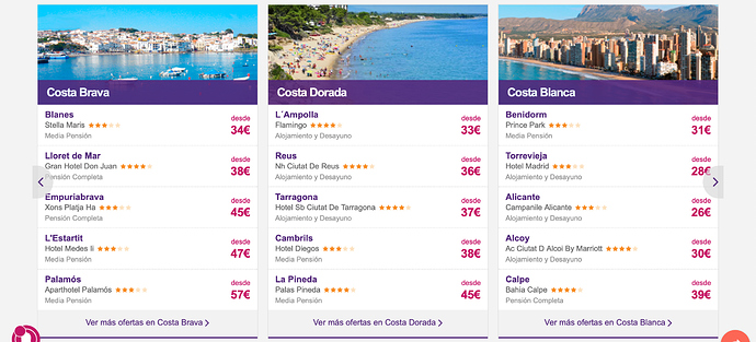
Hello! Does anyone know how to achieve an owl-carousel style slider with items inside?
Here an example!
If you search the forum, pretty sure I’ve posted the code for Owl2 a couple of times.
The issue with Ow2 is its now obsolete and hasn’t been updated in a very long time.
Swiper.js is a very good alternative. Just as easy to use.
Thanks for the tips, swiper.js looks amazing!
what can I add to this code so it shows me 2 slider on LG, DM, SM and only 1 on XS devises?
<script>
    var swiper = new Swiper('.swiper-container', {
      slidesPerView: 2,
      spaceBetween: 30,
      slidesPerGroup: 2,
      loop: true,
      loopFillGroupWithBlank: true,
      pagination: {
        el: '.swiper-pagination',
        clickable: true,
      },
      navigation: {
        nextEl: '.swiper-button-next',
        prevEl: '.swiper-button-prev',
      },
    });
  </script>


 Thank you
Ups but where to add it? Now my slider stop working!
What does your code look like?
<script>
    var swiper = new Swiper('.swiper-container', {
      slidesPerView: 2,
      spaceBetween: 10,
      slidesPerGroup: 2,
      loop: true,
      loopFillGroupWithBlank: true,
      pagination: {
        el: '.swiper-pagination',
        clickable: true,
      },
      navigation: {
        nextEl: '.swiper-button-next',
        prevEl: '.swiper-button-prev',
      },
    });
  </script>
But I want to add a breakpoint for for the XS only 1 slider!
I did this but doesn’t work
    var swiper = new Swiper('.swiper-container', {
      slidesPerView: 2,
      spaceBetween: 10,
      slidesPerGroup: 2,
      loop: true,
      loopFillGroupWithBlank: true,
      pagination: {
        el: '.swiper-pagination',
        clickable: true,
      },
      breakpoints: {
      // when window width is >= 576px
      576: {
      slidesPerView: 1,
      spaceBetween: 10
      },
      navigation: {
        nextEl: '.swiper-button-next',
        prevEl: '.swiper-button-prev',
      },
});You are missing a }, at the end of the breakpoint.
breakpoints: {
 // breakpoints go here
};
eg. Your code should be
breakpoints: {
      // when window width is >= 576px
      576: {
      slidesPerView: 1,
      spaceBetween: 10
      }
},ah yes it works now but the widths are wrong, I guess I have to use theirs right? Cause now on ipad it shows only 1 and it should show 2
No change the numbers to match the BootStrap breakpoints
You can find them on this page, scroll down a little to responsive breakpoints.
What it’s wrong that it keeps showing me 2 on mobile versions?
var swiper = new Swiper('.swiper-container', {
      slidesPerView: 2,
      spaceBetween: 10,
      slidesPerGroup: 2,
      loop: true,
      loopFillGroupWithBlank: true,
      pagination: {
        el: '.swiper-pagination',
        clickable: true,
      },
      breakpoints: {
    // when window width is >= 576px
      576: {
      slidesPerView: 1,
      spaceBetween: 10
    },
    // when window width is >= 768px
      768: {
      slidesPerView: 2,
      spaceBetween: 10
    },
    // when window width is >= 992px
      992: {
      slidesPerView: 2,
      spaceBetween: 10
      }
    },
      navigation: {
        nextEl: '.swiper-button-next',
        prevEl: '.swiper-button-prev',
      },
});Change the slidesPerView to 1 on the second line. Its set to 2 unit the screen size is 576
This one?
/ when window width is >= 768px
768: {
slidesPerView: 2,
spaceBetween: 10
The line after the first line usually. ![]()
Hahahaha ok 
Now it works! Thanks a lot!! Last question!
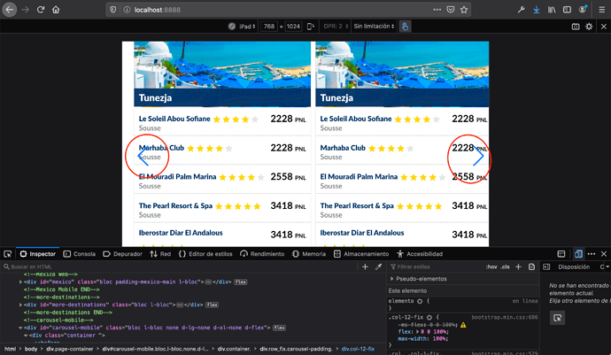
How to move the arrows more on the side? Some how the row is not in the center, what I did was to copy the bloc made by blocs into the slide 1 <div class="swiper-slide">Slide 1</div> .col-12-fix its so doesn’t crash to the one from merlinx
You will have to work on the CSS to style it how you want.

