Hello, my name is Tom. My english is not so good, but I try to explain my problem. In desktop view I use a navigation, an in tablet and mobil it switch into the hamburger menu … great ! But, I want to change the Menu Icon. I know there different icons ( small , thick etc …) But I looking for I icon with the three lines ( or two ) and a short text for example “menu”. So, that some people better know that it is the menu …
Is that possible ?
I am not aware of any way to achieve what you need, but I agree it would be useful and I would like to see that options myself, having used it with another web design app as shown below. Perhaps this could be added as a feature request to @Norm
Flashman is correct. There is no option out of the box. There is another option of creating a menu and using a image that look like what you’re looking for. I’ve made a few of these for my clients that wanted this feature.
Hello,
Thank you for the answers. @Norm is there a way to do this with a class or coding ? @casey1823 wonderful menu in your example. How you do this ?? Tom
It’s made with two blocs in the global area. The top one is a two column bloc. The right side is for the logo and the left is for the menu image.
The bottom menu bloc is three columns, I use the visibility feature to show hide the menu on clicking the menu icon. It will take some classes to align them as needed. You might not need a three column menu,
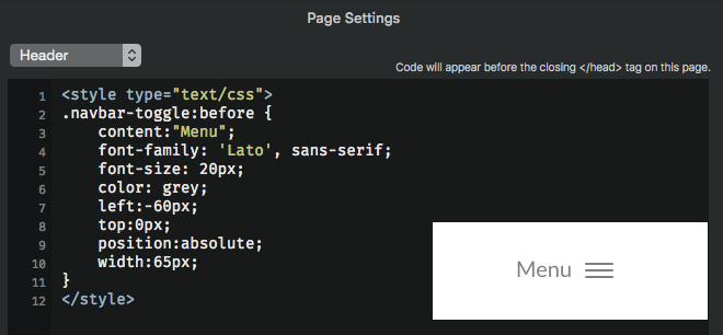
One way – You could use the CSS “: / ::before” psuedo element along with the “content:” property on the “navbar-toggle” class by adding it via the Page Settings > Add Code.
Then adjust the style however you want based upon the hamburger symbol you choose, site design, etc. Here is a quick example when used along side the “standard hamburger” symbol, including some various CSS properties to begin playing around with.
I’m not really saying you need all these properties, you may need others or fewer. Its simply a starting point to begin exploring this method based upon what you want to do with your design. With “:/::before + content:” you can also include icons, images and do many other things.
So explore and have fun. : / :: )
Otherwise I think @norm could probably add something in the app with setting(s) in the sidebar for toggling such a features use and input parameters. The next version of Blocs may already provide opportunities for other more direct approaches also?
Hi @tom2, maybe its best to then proceed with @casey1823’s approach described above so you have complete design freedom yourself of the navbar. Otherwise it would begin to be an ongoing series of requests, adjustments, considerations to take into account, by contrast with his approach you can handle it all yourself from a design standpoint. ;–)
Hi @Blocs_User … yes, I think this is the best way . But ! I have did it like you say and it worked very well. No I understand „before“ and so on. I did it with the „absolute“ position. ( top / left and so on ) really cool , now I understand. Thank you very much
Tom
I can’t help thinking it would be really useful if there was a section on this forum where code could be posted for technical solutions like this. A lot of the time code doesn’t appear, so the only way to show this is via screenshot or uploaded as a zipped text document.
Last question @Blocs_User … I don’t use top and left in the code. But when I try it doesen‘t work. Have I also creat a navbar-toggle class in the class manager ? Or must there be a space between ( for example ) top: 0px;
Like it is at the colour … ?
When I don’t use left and top it works perfekt … when I use doesen‘t change anything …cool feature with the html code …
Tom
in Blocs 2 the Code that @Blocs_User use for the text at top of the hamburger menu work perfect …
But in Blocs 3 not …
Any Ideas how I can fix this problem ??
Thanks a lot
It does not work because it is written for Bootstrap 3 (Blocs 2) whilst Blocs 3 is now built on Bootstrap 4.
Please find the update code for Bloc 3 / Bootstrap 4, as well as Blocs file example. Please note that depending on font and size you will certainly need to tweek right and top margin values.
@mds This is really great! It’s not too hard and if you add the other style for the Hamburg Icon color it’s even better. I do have a question. I add the other style code and then added a custom bloc. It saved it ok but when I went to try it the code was gone. Is there any way to save it and reuse the bloc with the header code?
Casey
Here’s the complete code I used for white menu text and white Hamburg.
I did not want to confuse @tom2 with the svg color change… yet
Indeed, page header code is not retained with adding the bloc to the library nor with the page template which does actually make sense because you would then probably override any existing code you would have set before in the page settings. But only @Norm can clarify.
A workaround is to simply copy paste the code directly in the bloc before adding it to the library. Therefore, once you use your custom bloc, you only need to paste back the code in the page settings.
Good morning, sorry I seemed to miss or overlook your reply and the notification. It looks like @MDS stepped in and has you headed in the right direction to make your adjustments for Blocs 3.
 . But ! I have did it like you say and it worked very well. No I understand „before“ and so on. I did it with the „absolute“ position. ( top / left and so on ) really cool , now I understand. Thank you very much
