1 day in with Blocs… Although I’m delving in to all aspects of the Blocs demo, I get a load of the more complex stuff such as classes, but I’m stumped with an absolute basic aspect and that is column width at different breakpoints.
How do I set the column width to what I want them to be at different breakpoints? E.g. I want 4 even at large, two at 2/10 ratio for medium (or a 1 and 3x4) and 1 at full width for small/xsmall. Is this done through classes? For the column settings I can only see settings that affect the overall and not specific to breakpoints. Or am I getting it wrong and everything is left to automatic resizing for the different breakpoints.
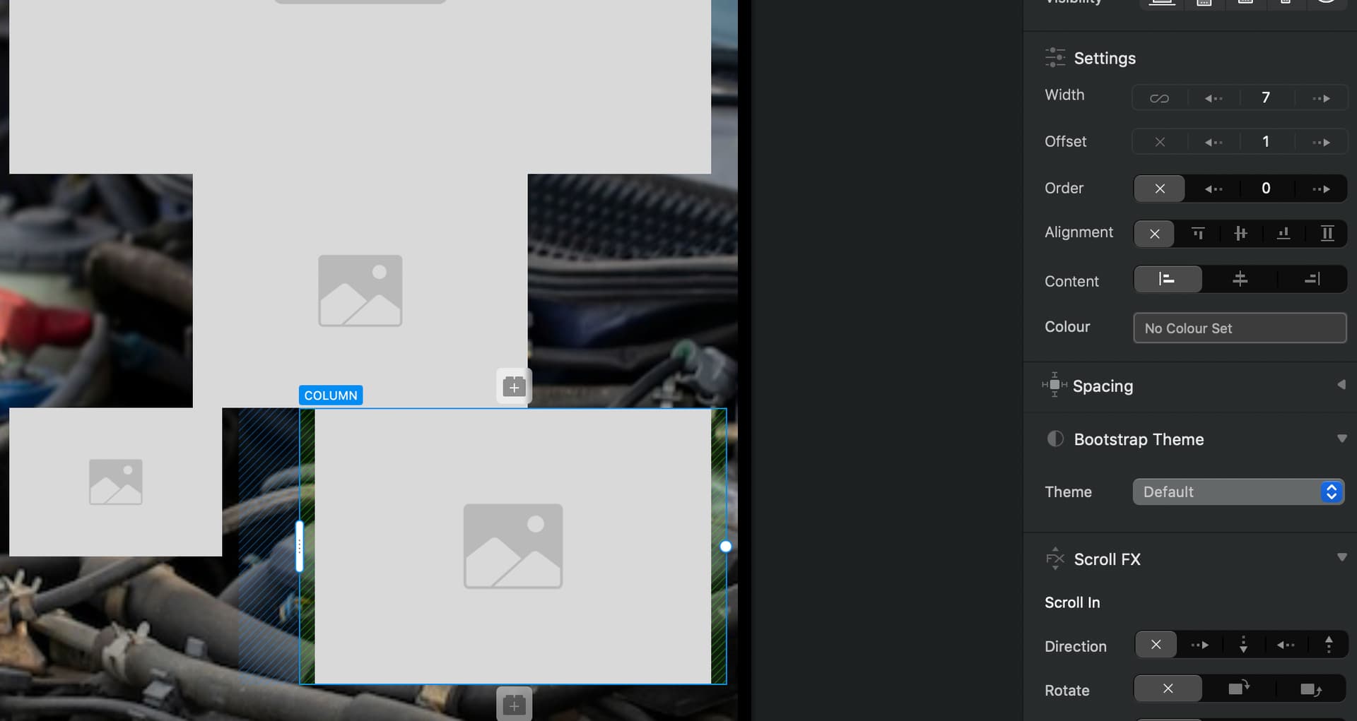
choose the break point u want to apply
LG, MD, SM, XS
then click on the column u want to work on and change the width and also offset, order etc etc
do it at each break point
and DONE
ps: infinity means auto so if you want to do what u want, it is not ok
you have to choose between 1 to 12
Ah! Yes got it thanks for the reply, that’s pretty nifty, I didn’t realise the button at the top was the layout at different breakpoints where things could be set differently, I thought that was just a preview to see how it will look at different sizes, I’m used to seeing on a properties panel in the same place as column settings for the breakpoints, no wonder I couldn’t find it, it wasn’t in there . Very good, each layout has its own settings exlusive to that layout, nice.
Thanks for the info, that’s really helpful. I’m seeing MUCH simularity between Stacks/Foundry combination of working, I guess because it is Bootstrap the same as Foundry (and Blacksmith for the CSS Classes), it is just a case of “right where is…” you know it can be done because it can be done in Foundry/Bootstrap, it’s more a case of adjusting to a diffrent interface, similar to when I bounce between Cheetah 3D and Blender for 3D work and similar to when I had to give up Flash and move to Hype. I have to say though I am really enjoying using Blocs, the inteface and way some things are done is really well thought out, the layout issue I had here for instance, different to what I’m used to, but really like it. I think today will have to be the day I now get the credit card out and adopt Blocs. Thanks again for your help, very much appreciated.
Hi Senek, This is what I have always done, however now when I set the column width over different break points it alters all of them. eg I set the withs at 12 on MD and it also change the LG setting. I am probably forgetting something. The column width setting seems to transfer across all break points? Not sure if this is a new bug or I am doing something wrong. All other break point settings seem to be OK just the column width casuing issues. Love your thoughts on this ciao Cathy
As simple user (not coming from coding field at all)
Blocs stacks “two different CSS systems”. (if I can say so)
Blocs Class Editor = CSS rules per breakpoint using max-width (desktop-first)
Blocs writes class styles (padding, colors, hover, etc.) using a “desktop” base, then applies max-width media queries for smaller screens.
In this model, a change made at a larger breakpoint becomes the baseline, and smaller breakpoints receive overrides via rules that trigger when the viewport width goes below a threshold. The behavior “LG is the base and it cascades down to MD/SM/XS”
Blocs relies on a global rule at the LG level, and other breakpoints are handled through max-width media queries that redefine the class for smaller sizes.
Bootstrap structure = responsive classes using min-width (mobile-first)
Bootstrap is built mobile-first: the -sm-, -md-, -lg- variants are triggered by min-width media queries, so a setting like col-lg-, d-lg-, justify-content-lg-* applies at LG and above.
to resume: Class Editor (Blocs): base + overrides when the screen gets smaller (max-width) → gives the impression it “cascades downward”. (CSS)
Grid/structure (Bootstrap): rules become active when the screen gets larger (min-width) → “cascades upward”. (Bootstrap)
it made me crazy for months (I created a topic about that)
BUT one you get used to it, it is super duper easy and somehow natural
Right now (I guess it is obvious for pro but I am not) I always work as it:
0/ creating a starter UI KIT on a page:
each fonts, behavior, colors palette etc etc, as reference (nothing crazy, just to define what I already choose for a brand/company)
Common way to work btw
then 1/ MOBILE FIRST (bootstrap philosophy):
from XS and up: structuring EVERYTHING (without speaking of color shape etc etc) just RESPONSIVE STRUCTURE
(CTA, containers, grid etc etc)
When everything work as it is planned in term of responsiveness then: 2/ ASPECT/DESIGN/ANIMATIONS:
from XL to down, I work the differents aspects of each part that I already created in “0” meaning I just harmonize the website, and making it appealing
on this structure I don’t speak about format of pictures, sizes, SEO etc etc
just structure *
**
As it for me it works pretty well and clearly pretty obvious*
 . Very good, each layout has its own settings exlusive to that layout, nice.