Hi!
I’m trying to figure out where the difference lays, I want to make a layout of 3 colums that shifts to 1 column at XS breakpoint. (It’s a BootStrap 5 project in Blocs 5.)
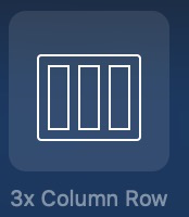
If I add a row 3 column structure Bric:
I get a 3 column row with no responsiveness set, it’s 3 columns all the way.
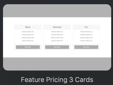
If I add a new Bloc using 3 columns, like 3 Cards:
I get a 3 column row with responsiveness, it shifts to 1 column at the SM breakpoint.
Inspecting the Rows and Columns in Blocs, it seem to me the difference is that the Cards Bloc is responsive because each column is set to have a Width of 4 for MD and larger. And for the columns in this row, I am able to set those to have a Width of 4 for SM as well, works fine.
But for the Row inserted by the 3x Column structure Bric, I am not able to change Width to 4 for XS or SM, it changes for all the breakpoints if I try …
Maybe same bug/related but as the one I mention here(?):
(Cards Bloc also adds some bootstrap margin-top classes, but that shouldn’t be relevant here.)
Hi @flips. I’m not in Blocs at the moment, so all from memory.
If you press ‘G’ (Menu, Page > Page Guides) you will see the underlying structure and what I’m calling ‘column guides’ - because I don’t know what else to call them.
Each of those columns in the 3-column bric structure are 4 column guides wide (making a grand total of the 12 column guide width).
Go to your XS breakpoint and set each individual column to 12 in the settings panel on the right of the screen and you will have 3 full width columns aligned above each other.
It’s possible that you may have to go back to the larger breakpoints and set them all to 4 column guides wide in the settings if it inherits from the smallest breakpoint.
@TrevReav and @Norm I know how to select column and change Width, Offset etc, and I know the BootStrap grid system.
But for the columns in the row created by inserting the 3x Column structure Bric, I cannot cange it for XS or SM, without it changing Width (or padding, margin etc) for ALL the breakpoints.
If I select the Column, select XS or SM, then change Width. Then that Width is defined also for MD and LG … And vice versa.
For the columns in the row from the mentioned Cards Bloc, it all works, I define Width for the different breakpoints without issue …
Yeah those controls can be a touch quirky. If you set them to fill on small breakpoint then apply the width and offset on the next breakpoint up those settings will travel up. Bootstrap column controls (unlike classes) travel up rather than down.
Oh, so, seems I got it to work when I selected XS, then changed Width for the column from 0 to something elseandback to 0, and then afterwards changing for SM to Width 4 …
Maybe some sort of selector for applying settings would be possible, similar to the one to select hiding/showing elements for different breakpoints?
I’m no GUI expert, though …
Changing Alignment for a Column in the sidebar/inspector doesn’t seem to work for different breakpoints, even if I start from XS or LG and work my way up or down. It seems whatever I change it to, is set for every breakpoint …
Trying to set “none” for LG, and the middle one for the rest.