Custom Javascript Snow effect

I am looking to add this snow effect to my header image. (example: Resident Evil Village | CAPCOM) I have found a source site but don’t know how to implement it in my site and also to only the header image. Source site: https://codepen.io/bsehovac/pen/GPwXxq

My site is snow season based and would love to try to make it work on the hero header image. Preferably as close to the example site as possible, as it is soft but realistic.

Any help would be great, thanks. First time user to blocs.

Hello @KOice, check if this one works for you:

Open page Settings.
Then in Code Tab, add in Header the following code:

<div class="snow"></div>
<style>
.editor-stage .snow {
  height:50px;
  background: #fff;
}
.snow{
  position:fixed;
  pointer-events:none;
  top:0;
  left:0;
  right:0;
  bottom:0;
  height:100vh;
  background: none;
  background-image: url('https://s3-eu-west-1.amazonaws.com/static-ressources/s1.png'), url('https://s3-eu-west-1.amazonaws.com/static-ressources/s2.png'), url('https://s3-eu-west-1.amazonaws.com/static-ressources/s3.png');
  z-index:100;
  -webkit-animation: snow 10s linear infinite;
  -moz-animation: snow 10s linear infinite;
  -ms-animation: snow 10s linear infinite;
  animation: snow 10s linear infinite;
}
@keyframes snow {
  0% {background-position: 0px 0px, 0px 0px, 0px 0px;}
  50% {background-position: 500px 500px, 100px 200px, -100px 150px;}
  100% {background-position: 500px 1000px, 200px 400px, -100px 300px;}
}
@-moz-keyframes snow {
  0% {background-position: 0px 0px, 0px 0px, 0px 0px;}
  50% {background-position: 500px 500px, 100px 200px, -100px 150px;}
  100% {background-position: 400px 1000px, 200px 400px, 100px 300px;}
}
@-webkit-keyframes snow {
  0% {background-position: 0px 0px, 0px 0px, 0px 0px;}
  50% {background-position: 500px 500px, 100px 200px, -100px 150px;}
  100% {background-position: 500px 1000px, 200px 400px, -100px 300px;}
}
@-ms-keyframes snow {
  0% {background-position: 0px 0px, 0px 0px, 0px 0px;}
  50% {background-position: 500px 500px, 100px 200px, -100px 150px;}
  100% {background-position: 500px 1000px, 200px 400px, -100px 300px;}
}
</style> 

Hope it helps you…

2 Likes

Wow, it worked in preview right away. @Pealco Next question is, would I be able to make the effect happen on just the header image, right now it affects the whole page. To no fault as my example showed the whole page. I have attached a screenshot of the homepage area. @Pealco, thanks so much! and here is the site http://www.sbgroomers.com for live preview reference

Hello @KOice, one of the ways is change fixed, to absolute, and then change the top, bottom, left, right and height to create snow only in the image area.

Desktop definitions:

.snow{
position:absolute;
pointer-events:none;
top:110px;
left:0;
right:0;
bottom:0;
height:700px;

Just try…

@Pealco yes that definitely helps, as the window resizes and smaller responsive windows get a little overflow but way better than the whole page so thumbs up. I also couldn’t get the top to come down off the Nav, but again, I can live with that as I’m happy its not over the whole thing.

@Pealco Looks like there are two sets of motions that repeat, can it be changed to just the second motion with has the foreground flakes going straight down? Sorry if that’s an easy fix, don’t want to break more things than I fix.

Thanks for your help on this! much appreciated.

How about containing it in an overlay?

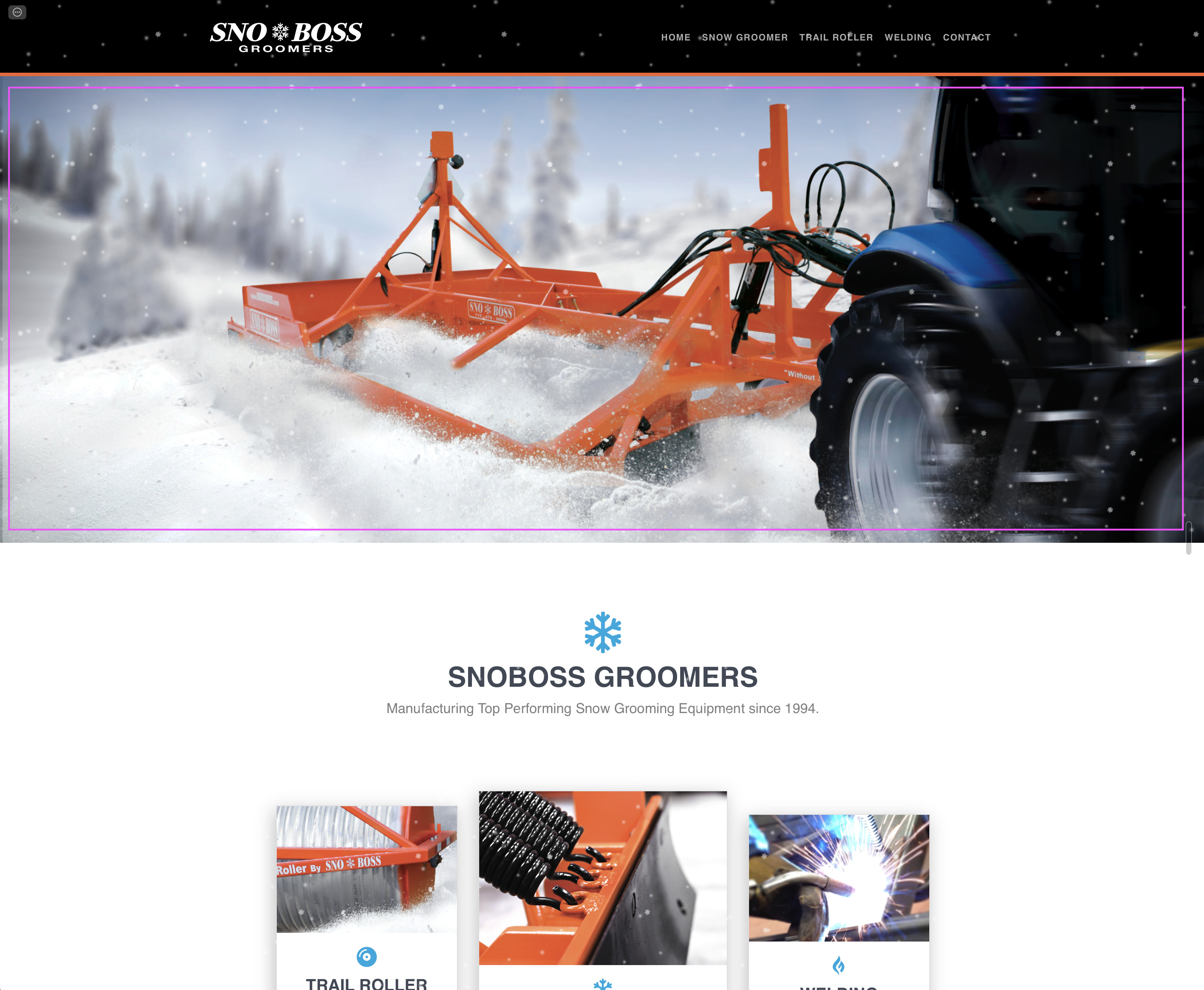
@KOice, about the responsiveness, what you could do is make the nav and picture only one block and with full height, so you can change the height to 100vh so it will have snow only in the screen when it opens, when you scroll it ends in the end of the page.

About the top padding, check if you add the px after the 110 and the ; in the end

Regarding the flow animations, it works like this:

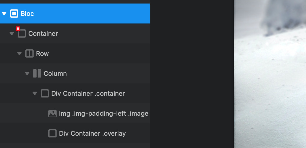
You have three images in this line of code:

background-image: url('https://s3-eu-west-1.amazonaws.com/static-ressources/s1.png'), url('https://s3-eu-west-1.amazonaws.com/static-ressources/s2.png'), url('https://s3-eu-west-1.amazonaws.com/static-ressources/s3.png');

Then you have the animation during 10 s and repeat infinitively in this line:

animation: snow 10s linear infinite;

Then you say to the system, regarding the browser: coz, ms, webkit what to do with the animation from 0% to 100% of the 10s in here:

0% {background-position: 0px 0px, 0px 0px, 0px 0px;}
50% {background-position: 500px 500px, 100px 200px, -100px 150px;}
100% {background-position: 500px 1000px, 200px 400px, -100px 300px;}

Now what means this?
0% = 0s animation
50% = 0s to 5s animation
100% = 5s to 10s animation

Then we have the animation for the fist image in the first group, second image in the second group and third image in the third group (0px 0px, 0px 0px, 0px 0px)

The first value is where the image starts regarding left place
The second value is where the image start regarding top place

So at 0% the image is 0px left and 0px top
At 50% the image moves from the 0px left to 500px left during 5s and moves from 0px top to 500px top during 5s
At 100% the images moves from 500px left to 500px left from 5s to 10s (this means the images not moves sideways) and from 500px top to 1000px top from 5s to 10s (this means the image only moves top to bottom)

The others images moves differently regarding the values they have, but the explanation is the same.

So for example lets say you only want the images moves from top to bottom, and each image at different speeds to make the images like 3d, so you can make it like this:

0% {background-position: 0px 0px,0px 0px,0px 0px;}
50% {background-position: 0px 500px,0px 200px,0px 150px;}
100% {background-position: 0px 1000px,0px 400px,0px 300px;}

Hope it helps you…

You can play with this in Here

But copy the following code down here and paste it in the right side, and you can change values and see it immediately on the left side…

<!DOCTYPE html>
<html>
<head>
<style> 
#myDIV {
  top:0;
  width: 100vw;
  height: 100vh;
  border: 1px solid black;
  background-color:#000;
  background-image:url('https://s3-eu-west-1.amazonaws.com/static-ressources/s1.png'), url('https://s3-eu-west-1.amazonaws.com/static-ressources/s2.png'), url('https://s3-eu-west-1.amazonaws.com/static-ressources/s3.png');
  background-position: top left;
  animation: snow 10s linear infinite;
}

@keyframes snow {
  0% {background-position: 0px 0px,0px 0px,0px 0px;}
  50% {background-position: 0px 500px,0px 200px,0px 150px;}
  100% {background-position: 0px 1000px,0px 400px,0px 300px;}

}
</style>
</head>
<body>

<div id="myDIV"></div>


</body>
</html>
1 Like

Sorry @PeteSharp I take more then 39 minutes to reply and didn’t see your reply, but you can help in different way if you want… :slight_smile:

@Pealco just adding my 2cent idea :wink:

@Pealco thanks for taking the time to explain that. I was able to quickly then play with some numbers and got something that I think will work. So you made that a lot easier to understand so thank you.

Can I get the nav to be an overlay but not full screen? This is the old site that I then rebuilt using blocs but couldn’t figure out how to get it to function like that, and in a way where the image wasn’t full height. The old site was, just like you said merged nav, and I simply added a darker gradient to the image so you could see it, lol.

Old site screenshot:

Not a huge deal breaker as you did help me get some snow to work. Mega pleased with that!

You want to replicate that website as it was before? or you want to use the new one?

Initially my plan was to replicate as much as possible. But I just used the ease of blocs to accommodate any new layout changes that I had to do. Being a transparent header would make the snow look better as it would appear to be in one “space” so to speak.

The old site was a template that I did some plug and play. lol, I am not a developer but a graphic designer so I gravitated to blocs being able to layout and adjust like a designer without the code knowledge.

Since we have a nice ongoing conversation, is the original js snow in my original post hard or not possible to implement with blocs?. Just out of curiosity

For me the codepen you send don’t work…

Taking the 2 cents of @PeteSharp he gets me to a different approach…

Where you have your image, add just next to it a DIV bric and then a new DIV bric.

Then on the left drag one div before the image,
Then drag the image inside the first div
Then drag the second div side the first div but after the image

And you end with a structure like this:

Then lets add classes:
Add a class to the first div: container
Add a class to the image: image
Add a class to the second div: overlay

Then open the page settings:
image

And in the Code tab, add the folowing code:

<style>
.container {
  position: relative;
  width: 100%;
}

.image {
  display: block;
  width: 100%;
  height: auto;
}

.overlay {
  position: absolute; 
  top:0;
  width: 100vw;
  height: 100vh;
  background-image:url('https://s3-eu-west-1.amazonaws.com/static-ressources/s1.png'), url('https://s3-eu-west-1.amazonaws.com/static-ressources/s2.png'), url('https://s3-eu-west-1.amazonaws.com/static-ressources/s3.png');
  background-position: top left;
  animation: snow 10s linear infinite;
}

@keyframes snow {
  0% {background-position: 0px 0px,0px 0px,0px 0px;}
  50% {background-position: 0px 500px,0px 200px,0px 150px;}
  100% {background-position: 0px 1000px,0px 400px,0px 300px;}
}
</style>

And voila, you have it responsive and contained to the image, thank you @Malachiman

Hope it helps you…

2 Likes